Pokemon Go concept redesign solves usability issues
This concept redesign addresses some of the UI shortcomings in the Pokemon Go app.
Unless you've been hiding under a rock recently, you will have heard of Pokemon Go. The augmented reality game, which sees players track down, capture and battle creatures from Nintendo's popular Pokemon games, has been the biggest app of the summer, even eclipsing the daily usage of the likes of Candy Crush, Facebook and Twitter. Despite its huge popularity, however, Pokemon Go isn't exactly a good example of how to make an app that works flawlessly.
Plagued with glitches that occur at inconvenient times (did you catch that Drowzee or didn't you?) as well as chewing through players' smartphone battery life, it seems that Pokemon Go still has some teething problems to sort out.
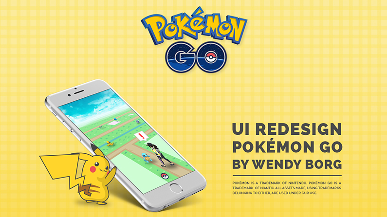
To show Nintendo and the developers behind the app, Niantic, how Pokemon Go can be improved, pokefan Wendy Borg has created a concept UI redesign which aims to address some of the game's imperfections.
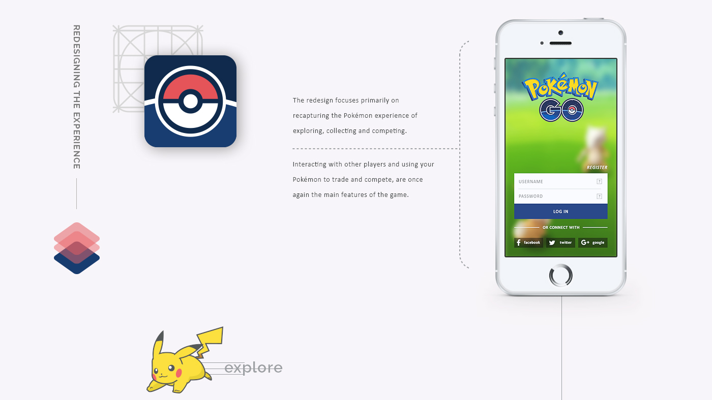
As a long time fan of the Pokemon franchise, Borg knows what Pokemon Go needs to change in order to become more appealing to users. At the heart of her redesign is an easy to use focus on exploring, collecting and competing with Pokemon, as well as putting the ability to trade creatures front and centre.
As it currently stands, Pokemon cannot be traded in the game, and it's a huge source of frustration amongst fans. With a few simple taps, Borg's design allows Pokemon to be exchanged and evolved, either on their own or as part of a group. With even Niantic CEO, John Hanke, unsure how trading will work, maybe they could take a few notes from this concept?
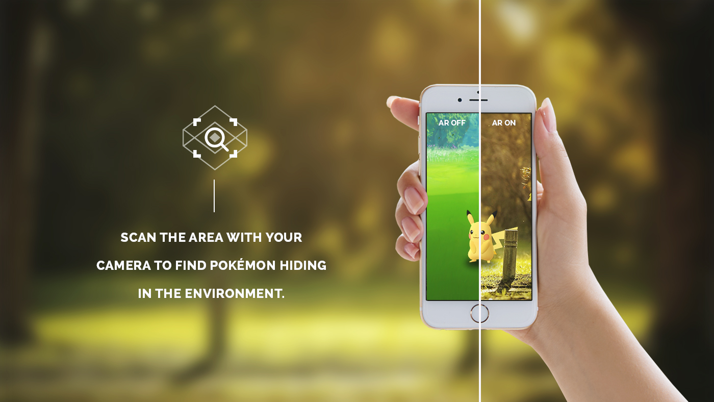
Finding Pokemon also becomes easier in Borg's concept, as players are able to scan their surroundings and head in the right direction according to what they see. No longer will people have to meander aimlessly around city centres in the hopes of catching a Vaporeon.
The mainstay of the original games, fighting, also gets a better integration thanks to this concept. Just as players used to get into tussles by making eye contact with opponents, this version allows users to instantly engage nearby trainers in a battle.
Get the Creative Bloq Newsletter
Daily design news, reviews, how-tos and more, as picked by the editors.
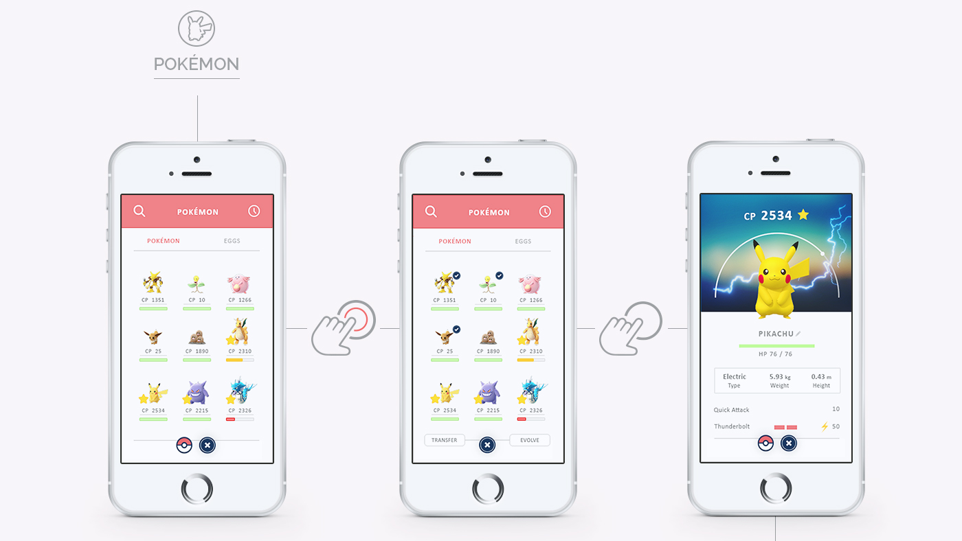
The straightforward UI also extends to shops and player profiles, making it easier for users to control what's in their inventory and view their own statistics.(This information would also be available to opponents, so the pressure is on to raise a strong team.)
Notifications finish off the redesign, including a useful alert that pops up when your battery life is running out. Users would also be able to sync the game with a smart watch companion app that would take some of the burden off phone batteries.

Thank you for reading 5 articles this month* Join now for unlimited access
Enjoy your first month for just £1 / $1 / €1
*Read 5 free articles per month without a subscription

Join now for unlimited access
Try first month for just £1 / $1 / €1

Dom Carter is a freelance writer who specialises in art and design. Formerly a staff writer for Creative Bloq, his work has also appeared on Creative Boom and in the pages of ImagineFX, Computer Arts, 3D World, and .net. He has been a D&AD New Blood judge, and has a particular interest in picture books.
