Some people actually think Pixar animation is getting worse
Yes, really.

Ah, Pixar. It's one of the world's most beloved animated movie studios, right? And its visuals have gone from strength to strength since 1995's Toy Story, right? The answer might seem obvious – but a pretty unbelievable Twitter debate suggests not everyone agrees.
The firestorm has begun in the build-up to Turning Red, the studio's latest feature film. Dealing with the trials and tribulations of growing up (and, of course, regularly turning into a red panda) as a young girl, it sounds like yet another delightful offering from Pixar. But the art style has attracted its fair share of detractors – and defenders.

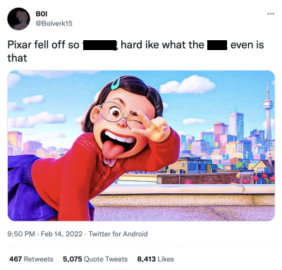
It all started with one rather mean-spirited tweet (above) declaring "Pixar fell off so f****g hard" alongside a screenshot of Turning Red, featuring 13 year-old protagonist Mei Lee. "I would be embarrassed to have my name attached to this project, I'd legitimately ask to have my name removed from the credits, this is bad and everyone involved should feel bad," the user adds, objectively.
It's hard to see exactly what @Bolverk15's problem is. Sure, Mei Lee is rendered in a cartoonish style and isn't ultra-realistic – but then again, neither are the characters in Cars. Some have speculated that some viewers just "can't stand seeing a female character who isn't perfectly adorable, and expressionless all the time." (Just wait until they hear about Aloy's facial hair in Horizon Forbidden West.)
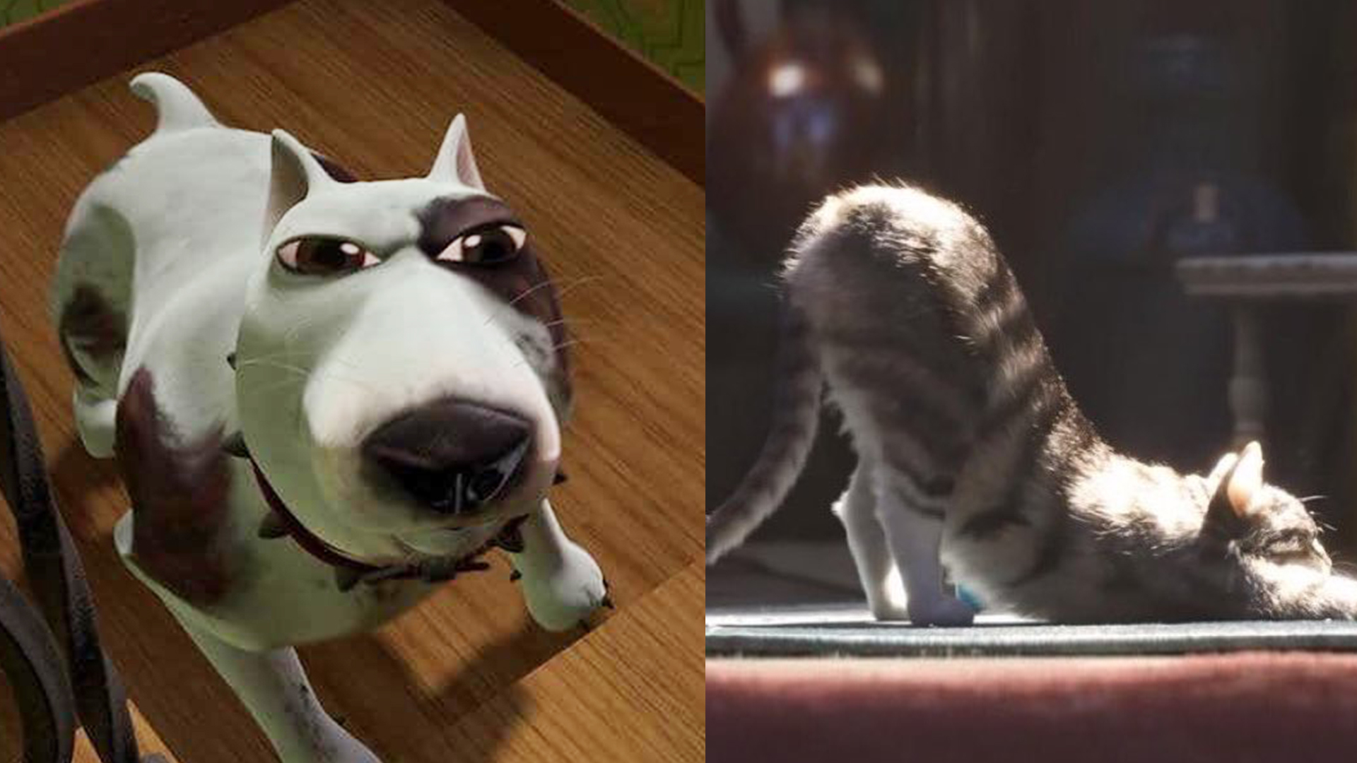
As if that wasn't enough, the tweet has given rise to a debate over whether Pixar's animation quality has got better or worse. Thankfully though, it's led to some pretty hilarious replies, with fans highlighting some of the, er, dodgier early animations as proof. Who can forget the dog from Toy Story?
bro pixar thought this was a dog in 1995 https://t.co/rr0oLfv6aR pic.twitter.com/0khiVHaopiFebruary 16, 2022
ah, yes, the "fall down" of pixar's facial animation pic.twitter.com/RcyU20Be3LFebruary 16, 2022
Pixar fell off so hard like what even is that https://t.co/7aTcUCvvNQ pic.twitter.com/rbsX4YdoyFFebruary 16, 2022
Of course, it's a little unfair to laugh at Pixar's efforts from 1995 – let's not forget that its animation was indeed cutting-edge at the time. But when the purpose is to highlight how much the animation has improved with time, it starts to feel a little more justified. And as these mind-boggling facts about the making of Toy Story 4 show, the contemporary animations are no walk in the park.
Either way, we can't wait for Turning Red. If you want to get your Pixar fill – if only to compare how the animations have changed over the years – check out our guide on how to get 15% off Disney Plus. And if you're inspired to create your own animation, here's how to download After Effects.
Get the Creative Bloq Newsletter
Daily design news, reviews, how-tos and more, as picked by the editors.
Read more:

Thank you for reading 5 articles this month* Join now for unlimited access
Enjoy your first month for just £1 / $1 / €1
*Read 5 free articles per month without a subscription

Join now for unlimited access
Try first month for just £1 / $1 / €1

Daniel John is Design Editor at Creative Bloq. He reports on the worlds of design, branding and lifestyle tech, and has covered several industry events including Milan Design Week, OFFF Barcelona and Adobe Max in Los Angeles. He has interviewed leaders and designers at brands including Apple, Microsoft and Adobe. Daniel's debut book of short stories and poems was published in 2018, and his comedy newsletter is a Substack Bestseller.
