The new Women’s Network logo looks, um, suggestive?
Who approved this?

From the MyoBalls logo that looked like 'my balls' to the Calendly logo that looks like the birdseye view of the toilet, we've seen plenty of design mishaps in our time. Creating a logo is not easy, but sometimes the blunders are so obvious we're left wondering whether they're even a mistake – much like this phallic design.
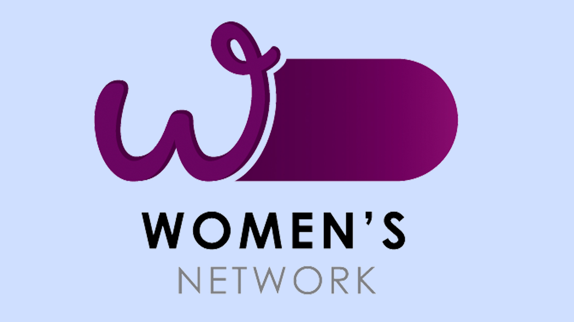
The Department of the Prime Minister and Cabinet in Australia has just released several new logos for its networks. However, the design for Women's Network already seems to be causing some upset. The logo features a thick purple line and the letter 'W', which unfortunately looks pretty phallic. If you're creating a logo and want to avoid a similar controversy, then make sure you check out our 15 golden rules of how to design a logo.

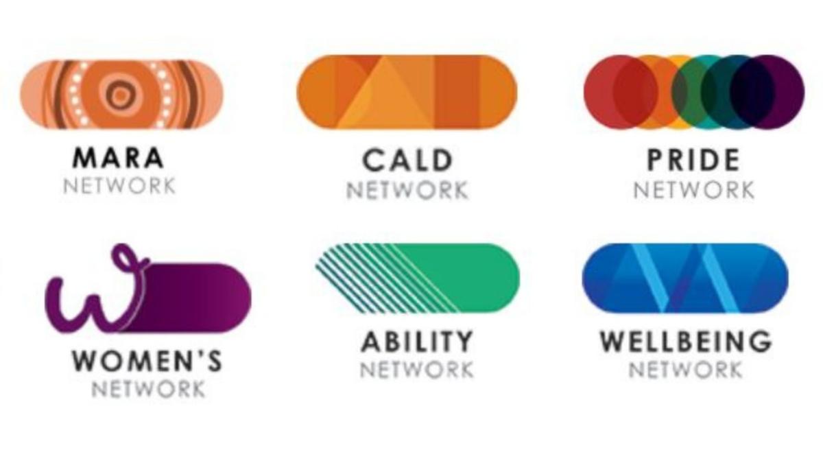
All of the new designs (see below) feature that thick stadium shape, however, the only logo that looks particularly phallic is the design for Women's Network (ironic, hey?). The Women's Network feels so strongly about the design that it has released a statement saying, "WNA is in no way affiliated with or associated with The Women's Network being promoted by the Department of the Prime Minister and Cabinet, or the logo for this group".
We have to admit that the curly 'w' and the girthy shape looks like a juvenile sketch of a penis, similar to something you'd find in a school textbook. The colour doesn't help either, as the purple shade immediately makes me think of the aubergine emoji, which has some, err, interesting connotations.

Many people have expressed how much they dislike the logo over on Twitter. One user tweeted, "I thought this was satire, but it is either thoughtless or an insult," and another, "Oh come on, this a joke. How much was paid for this garbage?". Yumi Lee at the Older Women's Network has said "We are very upset about how little they [Department of the Prime Minister and Cabinet] have thought about women".
It looks as though the Department of the Prime Minister and Cabinet has already taken its design back to the drawing board. Perhaps it should have a go with one of the best free logo designers and try to fix the logo. Or if you think you can do a better job, then why not download Adobe Illustrator and get creating?
Read More:
Get the Creative Bloq Newsletter
Daily design news, reviews, how-tos and more, as picked by the editors.
- How did I not know about this genius Nintendo Switch hack?
- This ingeniously grisly movie poster is a hit online
- These billboards are one big genius mistake

Thank you for reading 5 articles this month* Join now for unlimited access
Enjoy your first month for just £1 / $1 / €1
*Read 5 free articles per month without a subscription

Join now for unlimited access
Try first month for just £1 / $1 / €1

Amelia previously worked as Creative Bloq’s Staff Writer. After completing a degree in Popular Music and a Master’s in Song Writing, Amelia began designing posters, logos, album covers and websites for musicians. She covered a range of topics on Creative Bloq, including posters, optical illusions, logos (she's a particular fan of logo Easter eggs), gaming and illustration. In her free time, she relishes in the likes of art (especially the Pre-Raphaelites), photography and literature. Amelia prides herself on her unorthodox creative methods, her Animal Crossing island and her extensive music library.
