Peugeot's roar-some new logo divides opinion
An old classic has been rebooted.

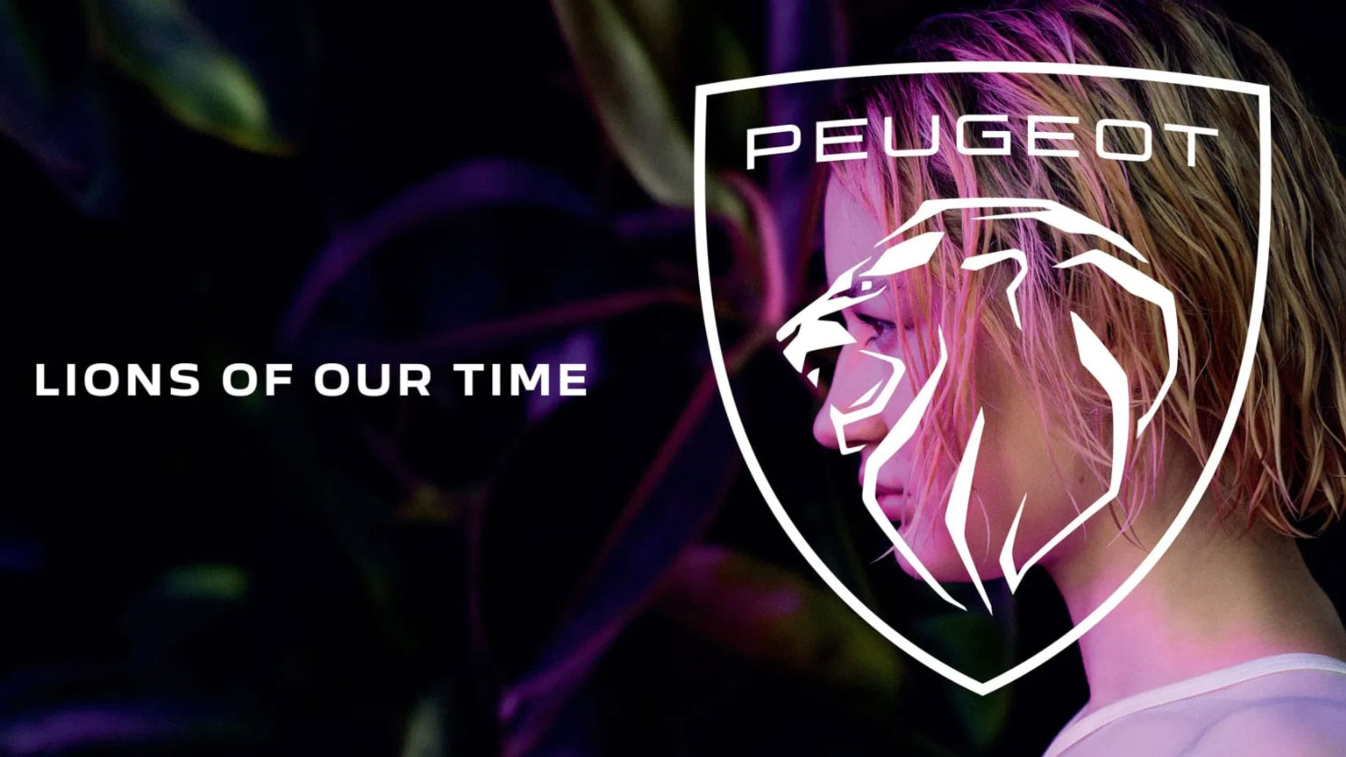
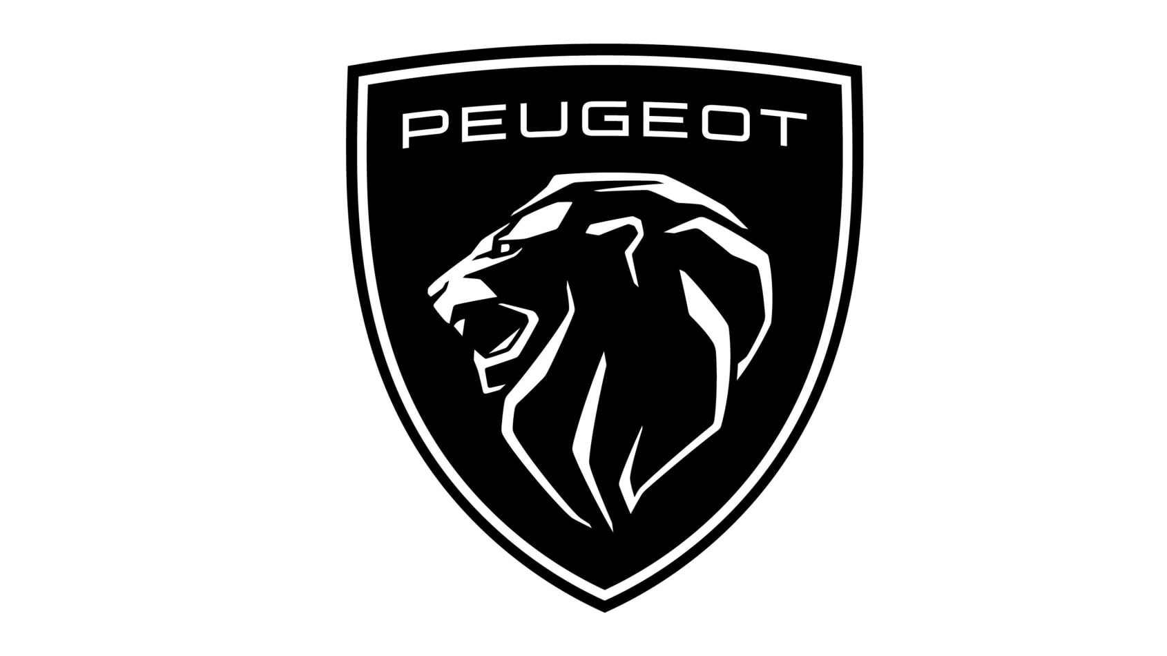
Peugeot has rebranded, ditching the previous silver-toned lion in favour of a clean, modern, monochrome design set on a shield. It's a reboot the brand's classic 1960's logo, but with a modern twist – one that Peugeot hopes will reposition itself as one of the more aspirational brands in the new Stellantis group.
At first glance, the new design stands out above the other flat design car rebrands of late because it's, well, still interesting to look at. And we have to say, we think it's a marked improvement on the cowardly Lion/Tin Man hybrid that has been a feature since 2010. But is it enough to rival our pick of the best logos?

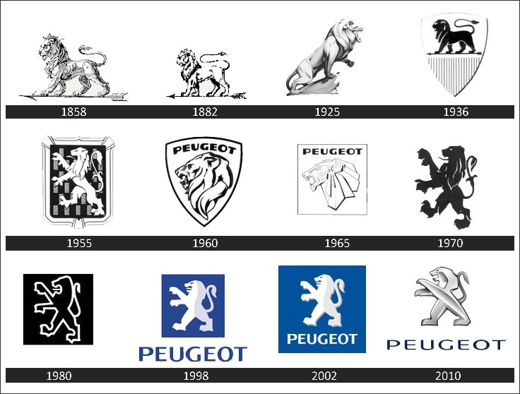
Featuring a structured lion's face, the new lion's head has beautifully angled features drawn in white line, which are shorter and thicker than the 1960's version (see the entire evolution below), taking up less of the lion's head and allowing the negative space to sing. Sat inside a shield (much like the Lamborghini logo), modern meets classic in a way that we think projects the upmarket vibe Peugeot was aiming for. The design is simple and clear enough to work across a range of interfaces, without feeling boring.

Peugeot implemented a retro design language for the redesign, which includes a new font. The new branding is to be found on new cars from now on – beginning with the 308 hatchback next month.
There are many opinionated folk pointing out the similarities to other car brands, including Lamborghini and Ferrari (it is an animal inside a shield, whichever way you look at it). But since Peugeot used a shield as far back as 1955, we're not sure this criticism has, erm, wheels when directed at Peugeot. Though of course, it may indicate a wider problem with branding across the car industry – is it becoming homogenous?
the Shield is like Lambo and then same ideasthey trying to go big pic.twitter.com/YeLYBuundjFebruary 26, 2021
This is pretty similar though...
I knew the new @Peugeot logo reminded me of another auto brand's badge... pic.twitter.com/rC68ZEyAcjFebruary 26, 2021
Other opinions are mixed, with some commenting on issues with the size...
Get the Creative Bloq Newsletter
Daily design news, reviews, how-tos and more, as picked by the editors.
They needed an update, but I'm not sure why they couldn't've just modernised their existing brand identity. Or just ignore Peugeot and go all in on DS.Also Lamborghini/(Scuderia) Ferrari shield vibes.February 26, 2021
Though there are some out there who just like the design.
Current peugeot`s have the best design out there in "cheap car" segment, hands down. and this logo looks cool, I think they have a winner on their hand. Their main issue is I think the "drivers image"February 25, 2021
Car brands are flocking to the flat redesign party at the moment, and we think this is one of the more successful attendees. It's not in the same trend-busting sphere as the recent sizzling Burger King rebrand, but we understand car redesigns are a more sedate affair, so this works just fine.
Want to know more about flat design? Check out our flat design guide.
Read more:

Thank you for reading 5 articles this month* Join now for unlimited access
Enjoy your first month for just £1 / $1 / €1
*Read 5 free articles per month without a subscription

Join now for unlimited access
Try first month for just £1 / $1 / €1

Georgia is lucky enough to be Creative Bloq's Editor. She has been working for Creative Bloq since 2018, starting out as a freelancer writing about all things branding, design, art, tech and creativity – as well as sniffing out genuinely good deals on creative technology. Since becoming Editor, she has been managing the site and its long term strategy, helping to shape the diverse content streams CB is known for and leading the team in their own creativity.
