Pepsi's huge marketing fail proves the importance of careful editing
The $33 million-or-a-jet lawsuit was totally avoidable.
Back in the '90s, branded merch was all the rage, something that soft drink giant Pepsi cottoned onto, prompting it to begin one of the biggest campaigns of all time – aptly named Pepsi Stuff. The basic premise was, consumers bought Pepsi goods, collected points and could trade them in for a bunch of, well, stuff. Sounds simple, right?
In case you hadn't yet heard, no, not simple at all. It actually turned out to be one of the biggest marketing disasters of the modern age – and it was all because of an aesthetic choice made on the editing room floor regarding a couple of zeros. This tale proves the importance of spot-on copy and careful ad choices (much like our favourite print adverts nailed, by the way).
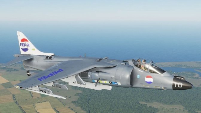
In case you haven't heard the story, here goes. Pepsi created a tiered system of goods, from hats to mountain bikes, and consumers could claim the merchandise for specific amounts of Pepsi points. The company created a fast-paced advert (above) and inserted a light-hearted joke, just for kicks – if you collected enough points, you could claim a Harrier Fighter Jet. A real one, valued at $34.7 million. What could go wrong?
The advert has text at the bottom to show how many points folk needed to claim each goody. And during the 'joke' portion of the ad, the small print explained you would need seven million points to get the jet. But unfortunately for Pepsi, one plucky individual decided seven million was totally doable, collected the points and then sued Pepsi (for $33 million) when they refused to pay out the jet. They were unsuccessful but it was a major headache for the brand, which had to get thoroughly lawyered up and fight in court.

But how did that seven million points get signed off? I hear you ask. It must have been through careful consideration of the consequences, and intricate number crunching, surely? Not according to the Pepsi, Where's My Jet? documentary streaming on Netflix, which shows it was a lackadaisical approach to the fine print that caused the issues.
Copywriter Vikki Ross shared the mind blowing decision-making process in a tweet. Read it below:
#HeyPepsiWheresMyJet #SpoilerAlert pic.twitter.com/oBJlnmpN1nDecember 5, 2022
In the editing room, the decision was made to drop the 700 million Pepsi points to just seven million because it was hard to read. And in one fell swoop, Pepsi proved just how important the correct copy is and the knife edge you walk in a marketing campaign. The world has clearly learned from Pepsi's blunder if the reams of small print found almost everywhere are anything to go by.
Get the Creative Bloq Newsletter
Daily design news, reviews, how-tos and more, as picked by the editors.
This isn't the only time Pepsi has taught creatives a lesson. We reported on a totally wild Pepsi-related design story earlier in the year, and it's ripe for a re-read. We present to you Pepsi's logo design style guide, which shows how not to word a style guide. It's so weird it must be satire. Surely.
Read more:

Thank you for reading 5 articles this month* Join now for unlimited access
Enjoy your first month for just £1 / $1 / €1
*Read 5 free articles per month without a subscription

Join now for unlimited access
Try first month for just £1 / $1 / €1

Georgia has worked on Creative Bloq since 2018, and has been the site's Editor since 2023. With a specialism in branding and design, Georgia is also Programme Director of CB's award scheme – the Brand Impact Awards. As well as immersing herself with the industry through attending events like Adobe Max and the D&AD Awards and steering the site's content streams, Georgia has an eye on new commercial opportunities and ensuring they reflect the needs and interests of creatives.
