Pepsi has given its cans a wild new look
And the cartoon-like designs are making me hungry.
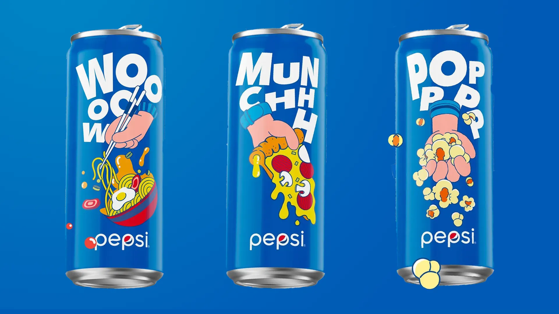
Pepsi's a cola brand that's been on the scene since 1893, but it likes to surprise us with a change of look now and again. It hasn't tweaked its logo since 2014, but it does turn out the occasional can redesign, and the latest effort is one of the most distinct yet. It's given its famous blue cans a comic book-style makeover as part of a 'Better with Pepsi' campaign focusing on food pairings.
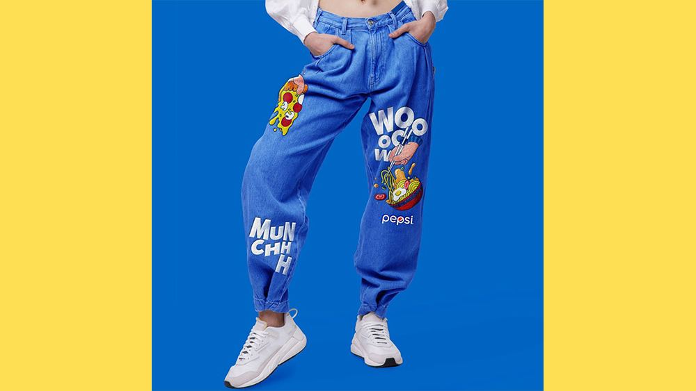
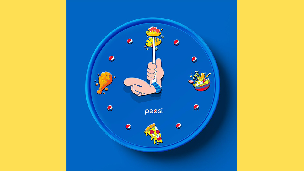
Of course, we're talking about Pepsi here, not a pinot noir, so the proposed food pairings are the kinds of things you'd be likely to combine with cola. The cans have been decorated with fun, quirky illustrations of simple feel-good grub like popcorn, pizza and ramen. And the fun doesn't stop there; the campaign appears to feature a range of merch, with jeans, magnets and, it seems, even a clock (see below), because who doesn't want a Pepsi clock to remind them to get their junk food fix four times a day? Strange merchandising aside though, this could be one for our roundup of the most inspiring packaging designs.
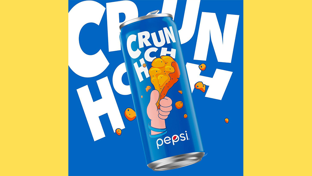
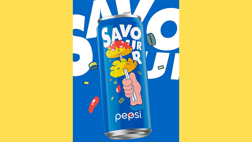
According to Dieline, The rebrand was designed by Pepsi's design team over in Bangkok and Shanghai, which is why some of the rebranded packages feature Asian street food like ramen and gyozas (see above). The comic-book style designs feature large, bubble-like fonts, that pair perfectly with the playful illustrations, and the bold and colourful graphics catch your eye from a mile off.
The vibrant primary colours in the designs not only match the Pepsi logo nicely but also give the cans a bubbly, child-like feel that suits the pre-established energetic Pepsi branding. As for the merchandise, well. We feel that maybe Pepsi has been inspired by Microsoft's new clothing line.
This isn't the first time we have seen PepsiCo rebrand its products with an interesting packaging design. Back in 2020, PepsiCo rebranded Pepsi No Sugar with a minimalistic new can. And just last month the snack company giant gave its crisp products a retro Stranger Things-Inspired makeover that we loved.
We're not certain when or where these cans will be launched into the wild, but it's safe to say I'll be excited if I spot them on shop shelves. While we wait, why not check out some examples of those who got things very, very wrong in our roundup of worst packaging design fails of all time? If you need to upgrade your software for your own design work, see how to download Illustrator.
Read More:
Get the Creative Bloq Newsletter
Daily design news, reviews, how-tos and more, as picked by the editors.

Thank you for reading 5 articles this month* Join now for unlimited access
Enjoy your first month for just £1 / $1 / €1
*Read 5 free articles per month without a subscription

Join now for unlimited access
Try first month for just £1 / $1 / €1

Amelia previously worked as Creative Bloq’s Staff Writer. After completing a degree in Popular Music and a Master’s in Song Writing, Amelia began designing posters, logos, album covers and websites for musicians. She covered a range of topics on Creative Bloq, including posters, optical illusions, logos (she's a particular fan of logo Easter eggs), gaming and illustration. In her free time, she relishes in the likes of art (especially the Pre-Raphaelites), photography and literature. Amelia prides herself on her unorthodox creative methods, her Animal Crossing island and her extensive music library.
