PBS logo gets a nose job ahead of 50th anniversary
The American public broadcaster gets a new look for 2020.
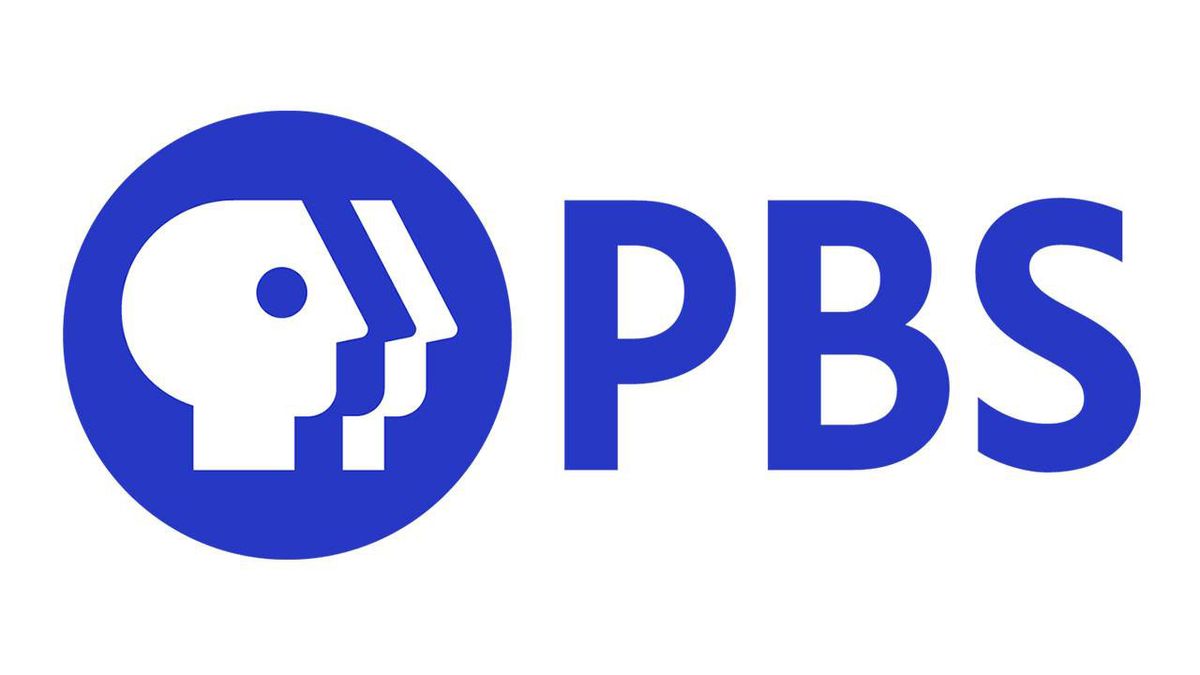
The American public broadcaster, PBS, has its first new logo in a decade. PBS has over 330 local member stations, and a massive audience of over 146 million people both online and through TV, making it a tricky brand to harness. PBS worked with global creative consultancy Lippincott for two years to create the new logo, which will roll out throughout 2020 to celebrate 50 years of broadcasting.
How has the logo changed exactly? In crude terms, it has gone from having three faces on top of each other in a black circle, with the logotype next to it, to a tweaked version of the faces in a blue circle, with an enlarged logotype beside it. And the lettering has also been tweaked, with new custom typeface, PBS Sans. (See more examples of how to rebrand, with our guide to logo design).
"The new brand identity also features a new, vibrant signature colour, PBS Blue, designed to convey a sense of trust and integrity," says PBS in a press release.
You'll also notice that the nose on the logotype is more rounded than before, which is basically the logo equivalent of a nose job. "We softened the sharp geometric features of the original symbol, with a subtle upward gaze that feels more engaging," explains Lippincott on its PBS project page.
You can see how the PBS brand has developed below.
As we launch our new look, see where we came from as we head toward the future. #ILovePBS pic.twitter.com/SW32zhn47yNovember 4, 2019
"PBS Sans – the brand’s new proprietary typeface – is human, engaging, and highly legible across all platforms," says Lippincott.
We can't help but feel that this is yet another example of an all-caps sans serif, the kind that we saw recently with Facebook's rebrand, and countless other rebrands of late.
Get the Creative Bloq Newsletter
Daily design news, reviews, how-tos and more, as picked by the editors.
What do we make of the logo? It's quite hard to get excited about it either way. That might be because we're not American. Or it might be because it's just not that exciting.
PBS says that over 70 per cent of local PBS member stations will be adopting the new branding next year. So while this new identity will definitely go some way to uniting the disparate brand, there's also a little way to go until it becomes entirely consistent.
Read more:

Thank you for reading 5 articles this month* Join now for unlimited access
Enjoy your first month for just £1 / $1 / €1
*Read 5 free articles per month without a subscription

Join now for unlimited access
Try first month for just £1 / $1 / €1
Rosie Hilder is Creative Bloq's Deputy Editor. After beginning her career in journalism in Argentina – where she worked as Deputy Editor of Time Out Buenos Aires – she moved back to the UK and joined Future Plc in 2016. Since then, she's worked as Operations Editor on magazines including Computer Arts, 3D World and Paint & Draw and Mac|Life. In 2018, she joined Creative Bloq, where she now assists with the daily management of the site, including growing the site's reach, getting involved in events, such as judging the Brand Impact Awards, and helping make sure our content serves the reader as best it can.
