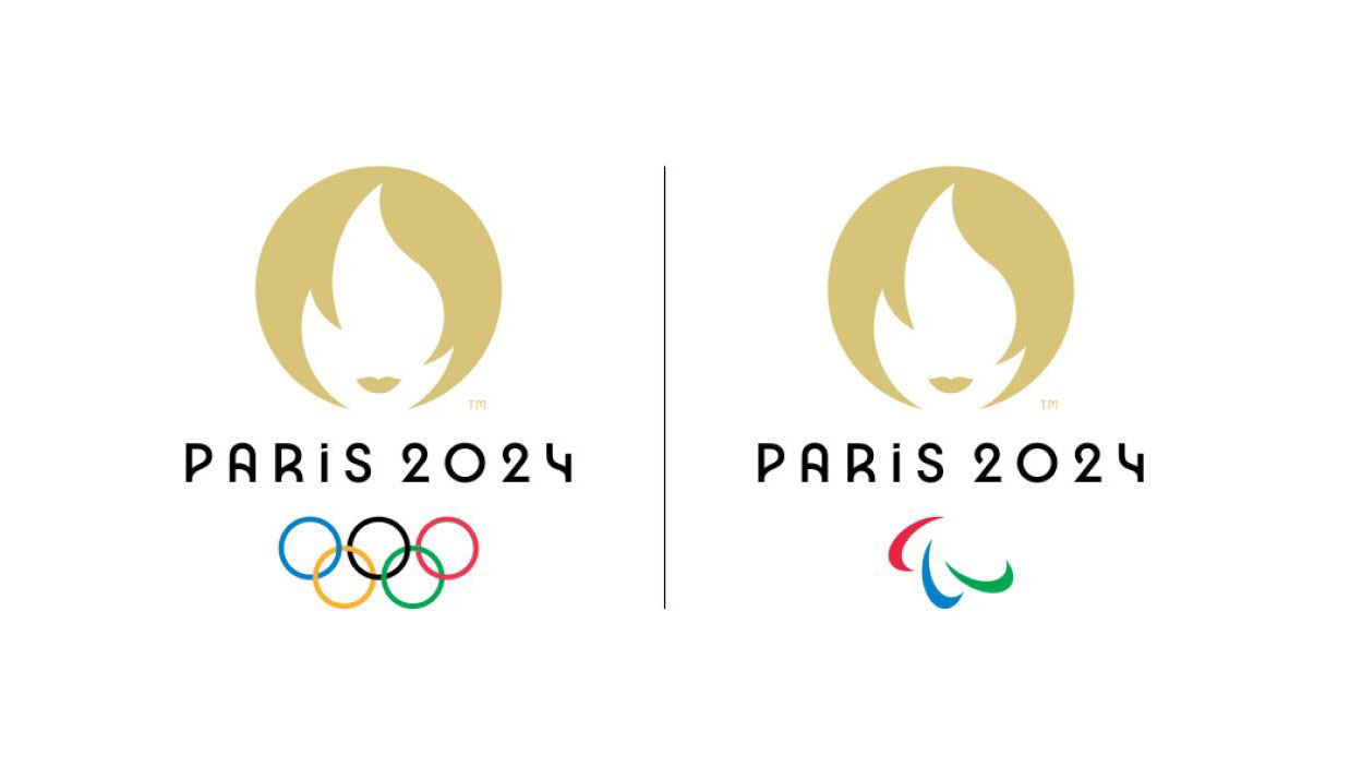
The Tokyo 2020 Olympic Games are in full swing, but the internet still can't get over the official logo for the next event to be held in Paris in 2024. First revealed back in October 2019, the logo makes use of negative space and three symbols: the Olympic rings, the Olympic flame and Marianne – a symbol of Republican France. At least that was the idea, but the design was ridiculed without mercy for looking like a woman with a bob.
The design was also mocked at the time for looking like a logo for a hairdresser's – or even a dating app thanks to its resemblance to the Tinder logo. But Paris stuck to its guns. Its problem is that the internet still ends up in stitches every time the organisers post the logo online (not what you want, as our logo design guide attests). More than 18 months on, Twitter users are still having fun comparing the logo to celebrity haircuts.
The logo's been compared to everyone from Victoria Beckham and Kristen Stewart to Sian Clifford in Fleabag and even Penelope Redd from The Sims. You can see some of the latest below. Meanwhile, see our selection of the best Olympic poster designs for some of the best design the games have inspired over the years.
Whoever designed the Paris Olympic logo is clearly a massive Twilight fan pic.twitter.com/w1Pa4K0rT2July 27, 2021
I can’t believe the Olympic Committee have confirmed that the Paris 2024 logo is heavily inspired by Penelope Redd. The Nintendo DS Sims 2 fandom keeps winning!! pic.twitter.com/dyX15KlZ3nJuly 26, 2021
Of course you’re all wrong!Paris 2024 logo is based on Victoria Beckham in 2007. pic.twitter.com/4CHJSUO2QjJuly 23, 2021
All I can see is her pic.twitter.com/PwTvPTkydTJuly 25, 2021
This is what I saw. pic.twitter.com/e4vn9wASDSJuly 26, 2021
Some continue to prefer the original Paris logo. That opted for a modern interpretation of the French capital’s most iconic symbol, the Eiffel Tower, and was used for three years until the current logo replaced it.
Feels like a good time to remind the timeline that Paris 2024 had literally the perfect logo that represented the number 24 and the Eiffel Tower, and then bombed it off for a logo that looks like a dating app for middle-aged women who yell at baristas. pic.twitter.com/KNLTirvmS0July 23, 2021
Of course, the logo for the Tokyo 2020 Olympic Games logo was not without its share of controversy either. If you're keen to avoid such pitfalls in your own logo designs, see our golden rules for crafting your logo strategy. And you might want to see below for the best current deals on Adobe Creative Cloud.
Read more:
- Is this Tokyo 2020 logo better than the official design?
- Design sheet for the iconic 1964 Olympic logo unearthed
- We can't stop watching these Tokyo 2020 pictograms
Get the Creative Bloq Newsletter
Daily design news, reviews, how-tos and more, as picked by the editors.

Thank you for reading 5 articles this month* Join now for unlimited access
Enjoy your first month for just £1 / $1 / €1
*Read 5 free articles per month without a subscription

Join now for unlimited access
Try first month for just £1 / $1 / €1

Joe is a regular freelance journalist and editor at Creative Bloq. He writes news, features and buying guides and keeps track of the best equipment and software for creatives, from video editing programs to monitors and accessories. A veteran news writer and photographer, he now works as a project manager at the London and Buenos Aires-based design, production and branding agency Hermana Creatives. There he manages a team of designers, photographers and video editors who specialise in producing visual content and design assets for the hospitality sector. He also dances Argentine tango.
