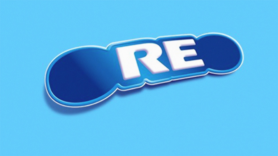
Why did the O's go missing from the Oreo logo?
Biscuit brand turns its logo O-negative.

People can get very twitchy when a company plays with its own logo design, so it's understandable that there was a bit of concern recently when Oreo posted a Facebook image of its logo, but with the O's at the beginning and end missing. What could it possibly mean?
Thankfully a few hours later Oreo clarified this latest version of its iconic logo design on Twitter (read our guide to logo design here): it was taking part in an initiative set up by the American Red Cross to encourage people to sign up for World Blood Donor Day.
Our O’s are missing! Help us fill them up for #WorldBloodDonorDay by clicking the link and signing up with the American Red Cross to donate your O’s, A’s, and B’s. #MissingTypes https://t.co/56DRujTVxf pic.twitter.com/s9LT3kZmzIJune 14, 2019
As the day went on and people signed up, the Oreo cookie filled up with delicious creamy goodness until, later on, it finally filled up and the missing O's were returned.
Our O’s are back! Thanks for helping us by donating your O’s, A’s, and B’s to the American Red Cross for #WorldBloodDonorDay! #MissingTypes pic.twitter.com/pZa9Gd33rIJune 14, 2019
If you're not entirely sure what missing letters of the alphabet have to do with donating blood, it's all to do with blood types. The ABO blood group system covers all the different variants in blood type, and the American Red Cross had a clever idea to use this to drum up support for World Blood Donor Day this year.

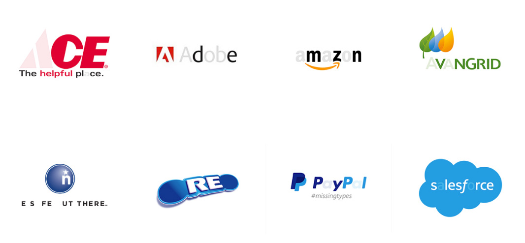
For its #MissingTypes campaign, it asked a whole load of companies to remove the letters A, B and O from their logos. Plenty signed up, including Adobe, Google and Facebook, some of them fading out the letters and others deleting them altogether in the drive to encourage people to donate blood.
The American Red Cross has also produced a free Missing Types ebook, answering frequently asked questions about donating blood and debunking popular myths. To get a copy, and to find out more about the #MissingTypes campaign and the brands that supported it, head for the American Red Cross Missing Types page.
Related articles:
Get the Creative Bloq Newsletter
Daily design news, reviews, how-tos and more, as picked by the editors.

Thank you for reading 5 articles this month* Join now for unlimited access
Enjoy your first month for just £1 / $1 / €1
*Read 5 free articles per month without a subscription

Join now for unlimited access
Try first month for just £1 / $1 / €1

Jim McCauley is a writer, performer and cat-wrangler who started writing professionally way back in 1995 on PC Format magazine, and has been covering technology-related subjects ever since, whether it's hardware, software or videogames. A chance call in 2005 led to Jim taking charge of Computer Arts' website and developing an interest in the world of graphic design, and eventually led to a move over to the freshly-launched Creative Bloq in 2012. Jim now works as a freelance writer for sites including Creative Bloq, T3 and PetsRadar, specialising in design, technology, wellness and cats, while doing the occasional pantomime and street performance in Bath and designing posters for a local drama group on the side.
