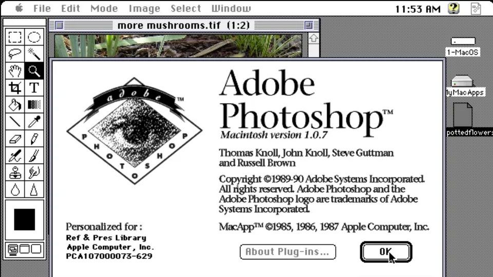
Online museum tracks Photoshop's design history
Can you believe this is what the software used to look like?

We all had an awkward phase when we were growing up, and Photoshop is no exception. And thanks to this visual history, you can now track the design history of the popular Adobe software from 1990 all the way through to its current form.
This is thanks to the Version Museum, an online resource which showcases the visual history of popular websites, games, apps and operating systems. While you might not find perfect examples website layout here, you will find an amusing glimpse into the history of your favourite platforms.
"Much like walking through a real-life museum, Version Museum aims to illustrate the visual, tangible elements of various versions of technology, rather than just the written history behind it," the site explains on its about page.
And what better place to show how far design has come than Photoshop? After all, it's the platform we'd use to airbrush out all the dodgy haircuts and poor fashion choices from our own, unfashionable histories.
- The best Adobe Creative Cloud discount
For readers of a certain age, the Design History of Photoshop will make you feel warmly nostalgic. For our younger audience, it'll make you look on in amused fascination that these pixelated controls were once considered cutting edge.
Check out some of its iterations in the gallery below, the head on over to the Design History of Photoshop to see the full archive.


The screen shots in the Version Museum have been compiled from a variety of sources, including fandom.com, winworldpc.com and guidebookgallery.org.
Get the Creative Bloq Newsletter
Daily design news, reviews, how-tos and more, as picked by the editors.
It's interesting to see how some elements of Photoshop have changed radically, such as its logo design which morphed from an eye, to a feather, to the 'Ps' lettering we all know today. Meanwhile other parts, such as the Color Picker controls, have just been given a spit polish over the years.
If this has whetted your appetite for more retro web designs, check out the responses to the 10 year challenge, which saw the world's biggest websites reveal what they looked like back in 2009.
Related articles:

Thank you for reading 5 articles this month* Join now for unlimited access
Enjoy your first month for just £1 / $1 / €1
*Read 5 free articles per month without a subscription

Join now for unlimited access
Try first month for just £1 / $1 / €1
Dom Carter is a freelance writer who specialises in art and design. Formerly a staff writer for Creative Bloq, his work has also appeared on Creative Boom and in the pages of ImagineFX, Computer Arts, 3D World, and .net. He has been a D&AD New Blood judge, and has a particular interest in picture books.