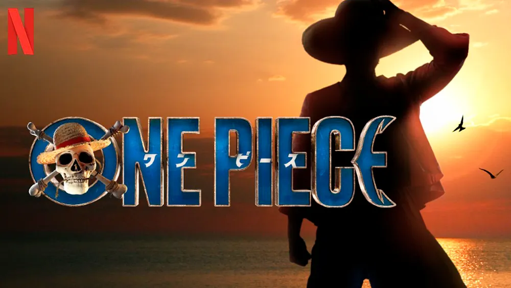
New logos for TV series sometimes come in for as much scrutiny as the production itself these days, but Netflix seems to have a winner with a whole treasure trove of One Piece logos. Each episode of the screening platform's live-action manga adaptation features a different design.
Fans love the variations, which are all based on the look of the original logo from the manga series (see the Reddit post below). It makes this one series for which you shouldn't skip the title credits after the first episode, no matter how much you might be tempted if you're binge watching (see our pick of the best TV logos of all time for more pieces of treasure).
Netflix's One Piece is an adaptation of Eiichiro Oda’s much loved manga series developed by Matt Owens and Steven Maeda. It stars Iñaki Godoy, Emily Rudd, Mackenyu, Jacob Romero Gibson, and Taz Skylar as key members of the Straw Hat pirates who head out in search of the eponymous One Piece.
Latest Videos From Creative Bloq
The main logo was designed by New York-based Arisu Kashiwagi based on the logo for the original manga series, right down to the colours and Monkey D. Luffy's straw hat on the skull. She has said that to differentiate the series from other pirate shows, she retained many elements of the original logo but simplified it by pairing a bold sans serif typeface with a photorealistic Jolly Roger and inclusion of the original title in Japanese Katakana letters inside the English letters.
But the logo shown at the start of series changes with each of the eight episodes, retaining only the font and the original Japanese title. The hat changes in each design, creating Jolly Roger-like designs for different characters. And the colours also change, while some designs also feature patterns and other references. Fans seem to appreciate the initiative.
"This was my favorite touch. They are all just so good," one fan wrote on Reddit. "They didn't have to do it. But they did! Love it," someone else wrote. "I really liked this! The live action version of eyecatchers," another person added.
Fans have been choosing their favourites and are even already speculating about what logo designs they will see in a second season (if one is made; Netflix hasn't yet officially confirmed it). "I’m so glad they gave Sanjis the curly eyebrows in his logo," another person wrote. "Give us one for Chopper, Ace, Crocodile, Vivi, and one Alabasta themed one for next season," someone else urged.
Get the Creative Bloq Newsletter
Daily design news, reviews, how-tos and more, as picked by the editors.
Fancy making your own swashbuckling versions of the logo. Check out the best prices on Adobe's Creative Cloud software suite below. For more logo news, check out the new Ford logo.
Thank you for reading 5 articles this month* Join now for unlimited access
Joe is a regular freelance journalist and editor at Creative Bloq. He writes news, features and buying guides and keeps track of the best equipment and software for creatives, from video editing programs to monitors and accessories. A veteran news writer and photographer, he now works as a project manager at the London and Buenos Aires-based design, production and branding agency Hermana Creatives. There he manages a team of designers, photographers and video editors who specialise in producing visual content and design assets for the hospitality sector. He also dances Argentine tango.