Are these some of the world's oldest logo designs?
It's an interesting time for logo design. We've seen lots of brands go back to their old logos, but in recent months we've also seen a brand drop one of the oldest logos that had been in continuous use. But just how far back does the history of logos go? just what was the first logo?
There's a popular myth that the Stella Artois logo is the oldest in the world, or at least the oldest that's still used today. Alas, the beer brand's current logo only carries a visual reference to that original Den Hoorn brewery logo from 1366. But a fascinating new book explores designs that could have been among the first logos created and how they influence the logos of today (see our pick of the best new logos).

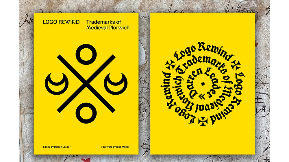
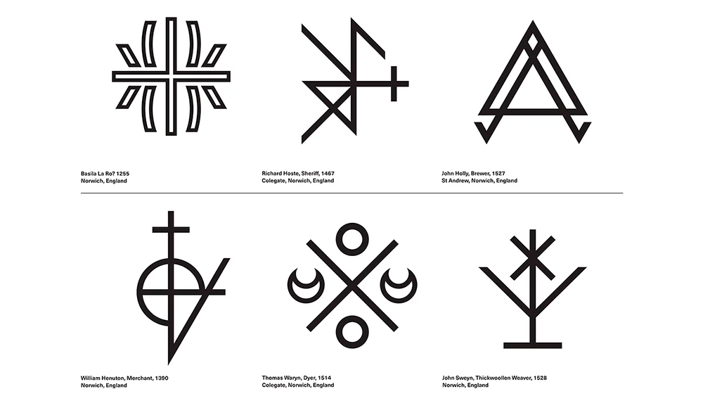
The designer and researcher Darren Leader's Logo Rewind focuses on the merchant marks used by tradespeople in medieval Norwich, in the south east of England. He's collected more than 200 such marks from between the the 13th to the 17th centuries and explores how they may have influenced logo design. While these may not have been the first tradespeople to use some kind of symbol to distinguish themselves, the phenomenon is revealing.
What's clear is that already at this stage, merchants saw a need to visually distinguish themselves from their competitors. And since at this time much of the population was illiterate, it was important that the distinguish be a visual mark rather than a word.

And these early logos weren't merely shop signs either. Various tradespeople, from tapestry weavers to tanners, saddlers, goldsmiths, bakers, grocers and bookbinders would put their symbol on their products to foster customer recognition, creating a form of brand identity, exactly the purpose of logos today.
In the book’s foreword, the graphic designer Jens Müller writes: “The rediscovery of Norwich merchant marks from the 13th to the 17th century is a graphic gem and an important piece of the puzzle in the early history of the development of the modern logo."

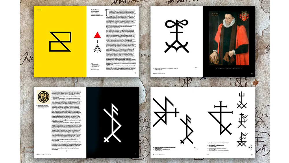
The books recreates the medieval logos in digital form in order to make them easier to see. Each image is accompanied with data to provide context, with the name, occupation and location of the merchant and the estimated year. The book also contains some insightful essays from a range of experts and academics as well as Leader himself. These delve into how and why the marks were made and how they may have influenced the development of logo design.
Sign up to Creative Bloq's daily newsletter, which brings you the latest news and inspiration from the worlds of art, design and technology.
Looking at the designs in the book, the simple lines and geometric shapes don't feel so removed from logos today. Some of them may seem complex or look more like cryptic code than logos, but it's clear that there's a search for simplicity and ease of replication that feels familiar (see our guide to how to design a logo).
Logo Rewind: Trademarks of Medieval Norwich is available from UEA Publishing.

Joe is a regular freelance journalist and editor at Creative Bloq. He writes news, features and buying guides and keeps track of the best equipment and software for creatives, from video editing programs to monitors and accessories. A veteran news writer and photographer, he now works as a project manager at the London and Buenos Aires-based design, production and branding agency Hermana Creatives. There he manages a team of designers, photographers and video editors who specialise in producing visual content and design assets for the hospitality sector. He also dances Argentine tango.
