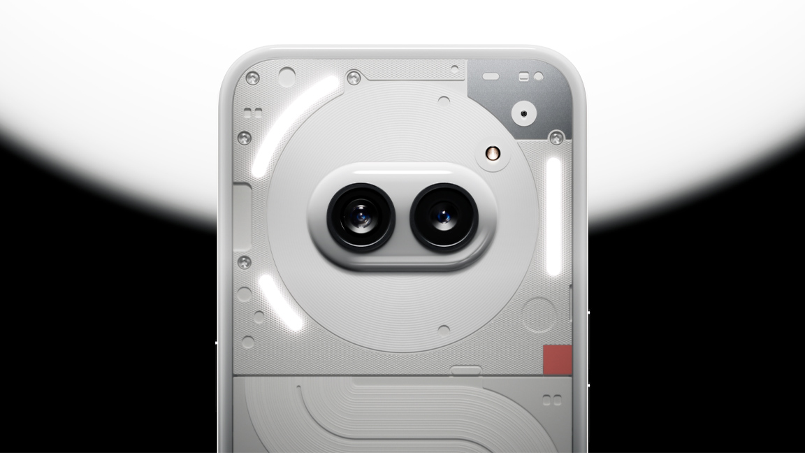
I love the look of the new Nothing Phone 2a. This new smartphone feels like everything modern product design isn't – the anamorphic concept is fresh and alive, more John Lasseter than Jony Ive.
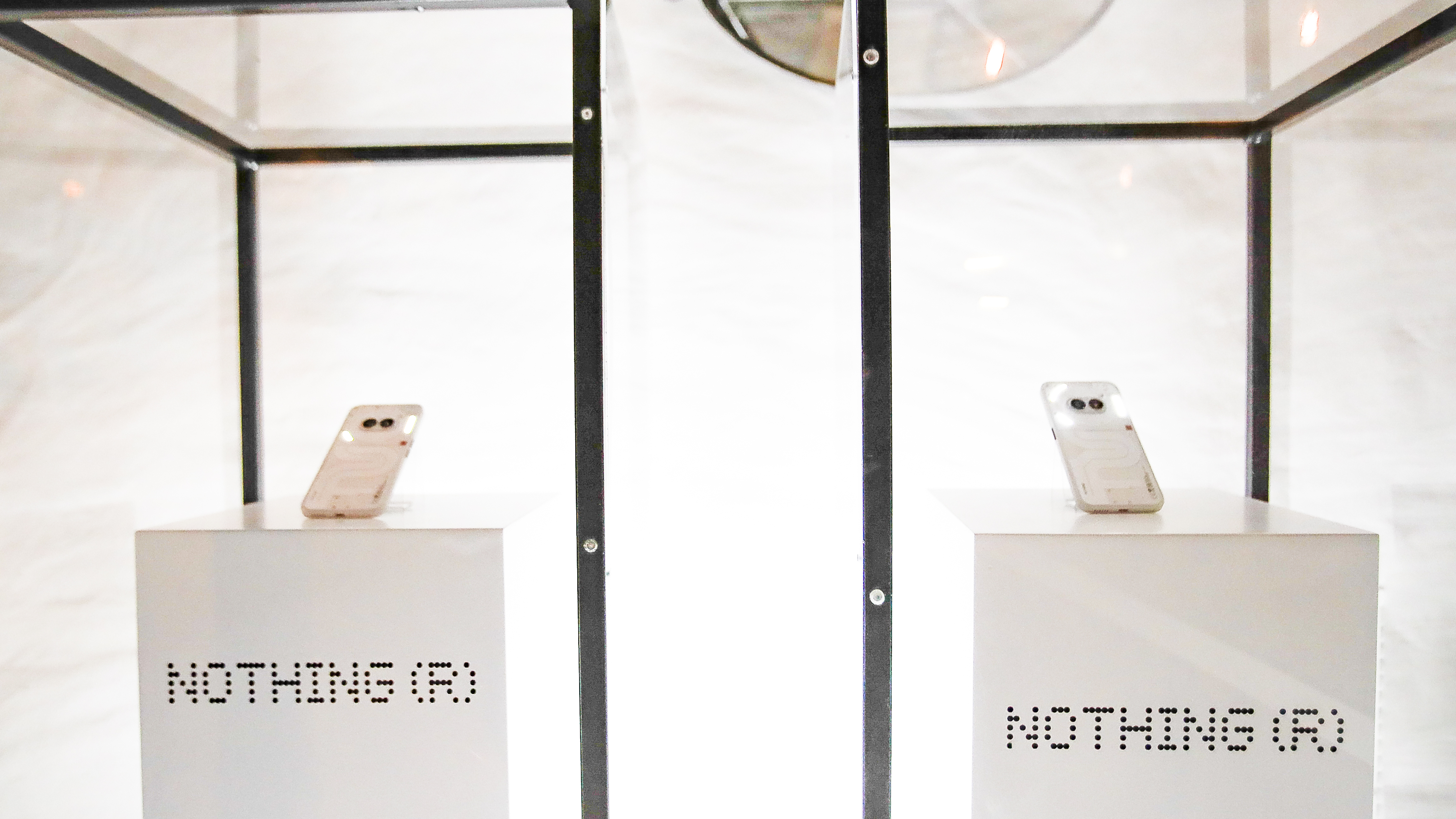
The design of Nothing Phone 2a is unrepentant in its quirkiness. The phone's official reveal last night at an event off the back of Mobile World Congress in Barcelona demonstrates the gloves are now off, personality matters more than tweaking a tried and trusted idea.
A big play is made of the phone's cameras now sitting in the middle-top of the phone, inside the NFC coil, resembling 'eyes', combined with the brand's LED glyphs surrounding it, Nothing says this signifies the phone's 'brain'. What this really tells me is, finally, here's a phone designed around an idea, a memorably goofy aesthetic, a concept; the design doesn't let technology lead the way.
Digging behind the phone's face is the same inside-out look that makes previous Nothing Phones so iconic, but also the inspiration for this brand is becomes even clearer. The curvy, elephant-like squiggle that runs down the rear of Nothing Phone 2a (and around Nothing Phone 2) is clearly visible, and its reference to Massimo Vignelli’s New York subway map more obvious.

Let me be upfront, I bought a Nothing Phone 1 at launch and am now wedded to the Nothing Phone 2; I'm a brand bore, I constantly show off the unique rear-mounted notification LEDs dancing as music plays or how it ticks down to a meeting. Queue eye rolls and friends returning to the safety of their iPhones.
I'm one of those people. I'm not an iPhone user and it's saddened me over the years how the Apple way of doing things has dominated product design, particularly when it comes to smartphones. The cameras are always positioned in the same place, the familiar rounded finishes, the curved edges, the same old arguments over bezel sizes – it's all so, well… boring.
I get it, technology dictates design. But the impact of this is we've had a decade of the same kind of smartphones; some larger, some smaller, some coloured green, but they're all variants on an iPhone-shaped theme. I can visualise other smartphone designers picking fluff from their navels in excitement of designing this year's new model – oh, it's purple now.
Get the Creative Bloq Newsletter
Daily design news, reviews, how-tos and more, as picked by the editors.

The Nothing Phone brand started life as a disruptive idea, a clever play on how we can and perhaps should interact with our mobiles. The LED glyph notification system is a novel way to relearn how to use a smartphone, with less screen time it feels more freeing. With Nothing Phone 2a the idea is becoming more playful, it feels like a smartphone designed by Pixar, not by committee, and I love it even more for being so daft.
I can reveal on 5 March if Nothing Phone 2a works as well as I think it looks, when the review embargo lifts. Right now, I'm gleefully playing with its deeper features and staring into its little face, I swear I saw it wink. In some ways this phone's performance is a mute point, the fact it even exists could finally force other brands to rethink what they're doing, to finally consider if following Apple is the right move, or perhaps, just maybe, doing something different is a better play.

Thank you for reading 5 articles this month* Join now for unlimited access
Enjoy your first month for just £1 / $1 / €1
*Read 5 free articles per month without a subscription

Join now for unlimited access
Try first month for just £1 / $1 / €1

Ian Dean is Editor, Digital Arts & 3D at Creative Bloq, and the former editor of many leading magazines. These titles included ImagineFX, 3D World and video game titles Play and Official PlayStation Magazine. Ian launched Xbox magazine X360 and edited PlayStation World. For Creative Bloq, Ian combines his experiences to bring the latest news on digital art, VFX and video games and tech, and in his spare time he doodles in Procreate, ArtRage, and Rebelle while finding time to play Xbox and PS5.
