Holding a Nothing Phone (2) feels quite unlike any other smartphone. It’s thin, light and has a curved, pillowed back; the unique Glyph lighting and haptics that made Nothing Phone (1) are back but show more promise. The design ambition of the Nothing brand could find its voice with the Nothing Phone (2), and perhaps even rival Apple.
The Nothing brand was founded by CEO Carl Pei as a disruptor, with the goal of ‘removing the barriers between people and technology’. I see this in the design of the Nothing Phone (2), which is light to hold, made from thin textured recycled aluminium and curved glass. It’s weightless and elegant, there’s an artistry to the subtle design that impresses.
Can it rival Apple? It's obviously a big as but after playing around with a Nothing Phone (2) I can see many people who love good design moving across to Android. (If you do want an Apple, we're tracking the latest Amazon Prime Apple deals.)
Turning on the Nothing Phone (2) and the brand’s goal of seamless technology becomes more apparent. The innovative Glyph system has been upgraded; the phone’s rear LED light cluster pulses and glows depending on who is messaging, calling or contacting you. I already covered how Nothing Phone (2)’s UI design and Glyph Composer has been improved over the Nothing Phone (1) by enabling you to customise your own ringtones, but this now extends further to creating bespoke light and sound sequences for your contacts and apps. (New audio packs will launch through the year with big name artists, too.)
One interesting new feature is the Glyph timer. A small light bar in the Glyph cluster that smoothly ticks away over time, which is nice, but it’s the application of this with third-party apps that demonstrates how Nothing Phone (2) could really change how we interact with this smartphones.
My hands-on experience has Uber pre-installed, and the LED timer smoothly ticks over as the driver gets closer. It’s another way Nothing is putting brand identity into practice as the urge to keep grabbing the phone to check on updates is gone, I can see it without needing to fumble through apps and options. I’m told Nothing will open the Glyph system to more third-party apps over time.
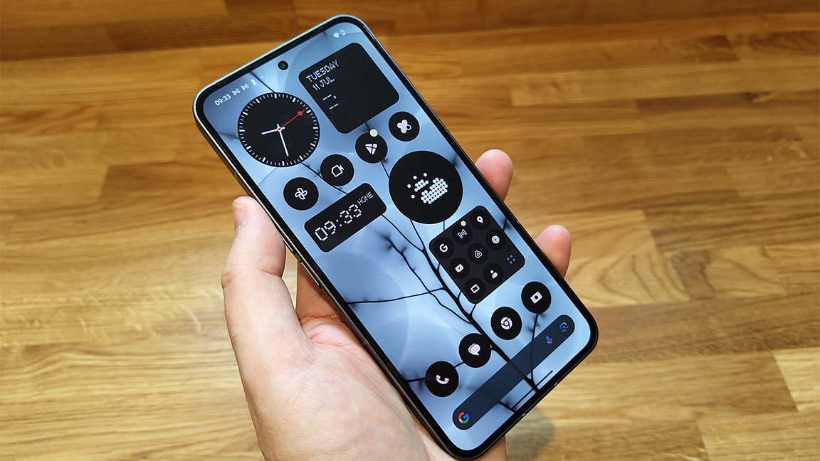
Flipping the Nothing Phone (2) over and the same treatment to UI and design continues. The new Nothing OS 2.0 turns everything monochrome. We’re used to being bombarded with colourful icons and app logos when using a smartphone, and Nothing Phone (2) is a very different. The idea is it reduces distractions and creates a clean minimalist UI that removes the frenzy of modern phone home screens.
Get the Creative Bloq Newsletter
Daily design news, reviews, how-tos and more, as picked by the editors.
Nothing is bringing a sense of mindfulness to its design and how we use smartphones, and I won’t lie, it takes some time to get used to. At first I missed the clutter of colourful app logos but over time I’ve become adjusted to the new, simpler way of accessing this phone.
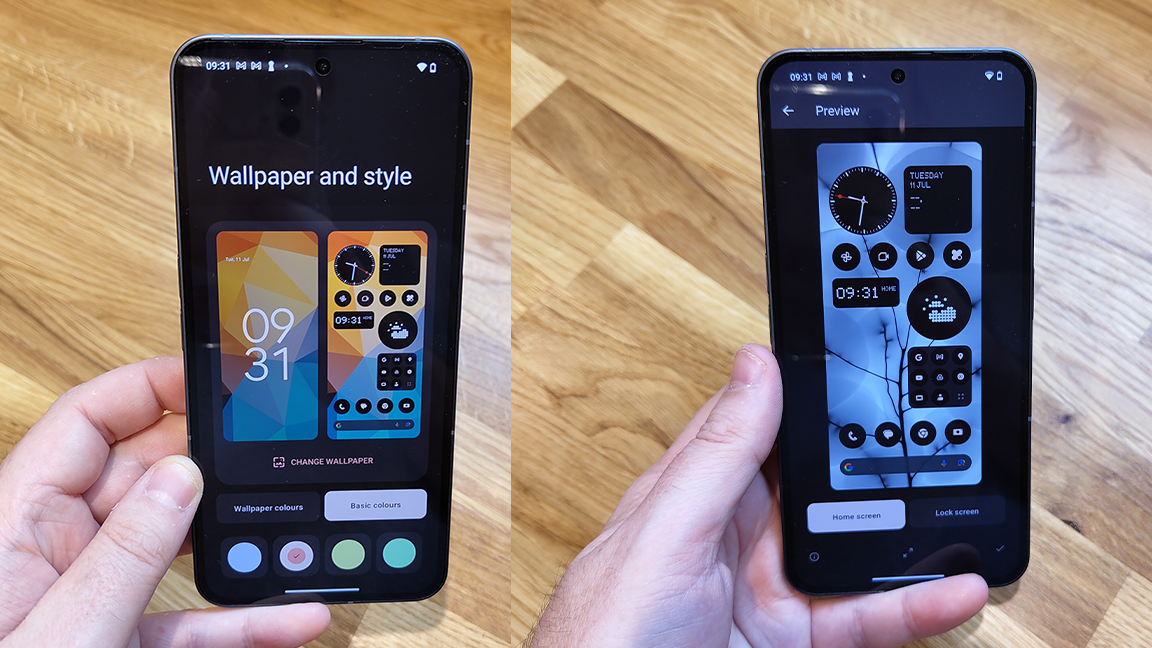
I particularly love the new home screen design that enables you to fully adjust the layout of apps, and it’s possible to coral them into small blocks so you can separate how you use the phone – one block for work and one for home life. You can even divide up your Gmail account between clusters. There's a clear purpose to the design approach of Nothing, looking behind the eye-catching visuals it's really about making life easier.
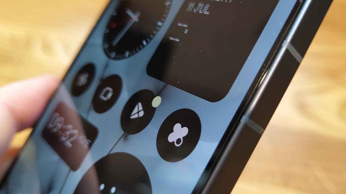
Nothing Phone (2) doubles down on the use of the dot matrix, pixel art style for custom app widgets, font and icons. My weather app has a little cloud made from dots, for example. Holding my finger on the Nothing Phone (2) screen accesses the customisation options where I can adjust these icons. I can customise the grid design, widget size, and colour themes; removing app names goes a step further to creating a true minimalist smartphone for the masses.
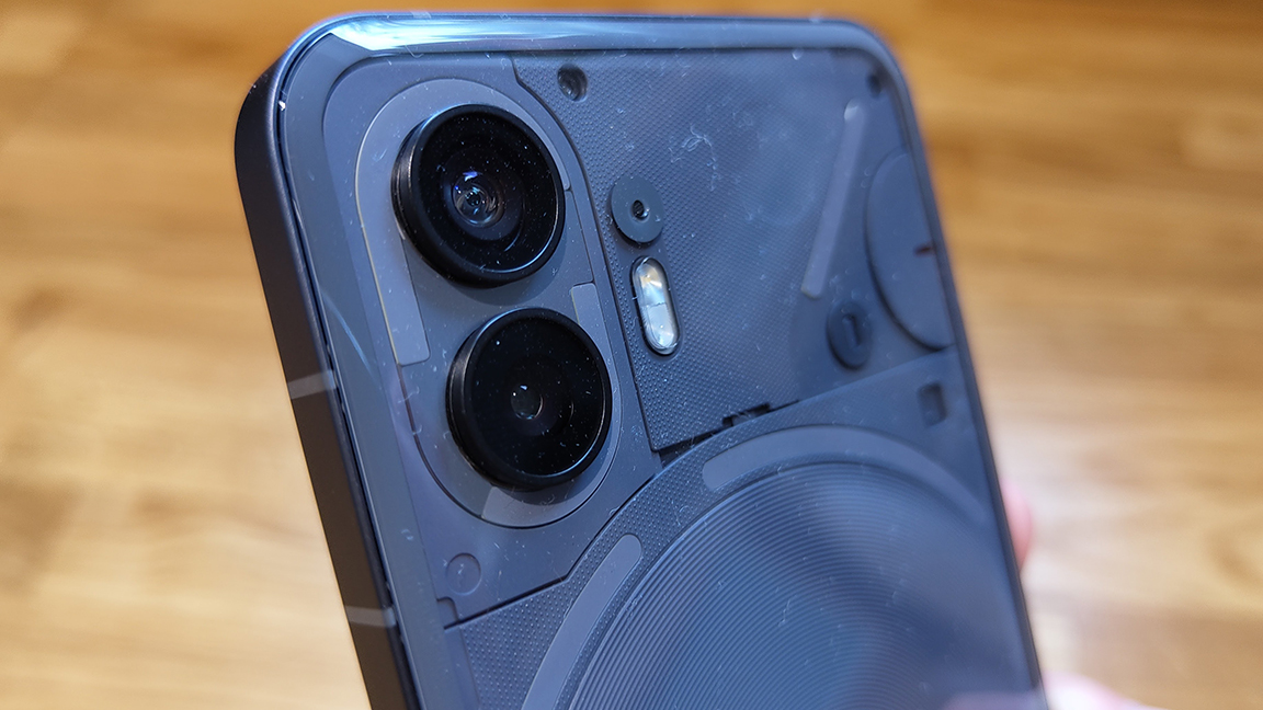
It would be lazy to consider the Nothing Phone (2) in the context of the ‘dumb phones’ trend, simple smartphones with paired back use, because this new mobile packs in all of the thrills you’d need. It’s powered by the latest Snapdragon 8+ Gen 1 Mobile Platform, features a 50MP dual rear camera and a crisp 6.7-inch OLED display with LTPO. Nothing Phone (2) is a smart phone that places design at the heart of its philosophy and is now matched with the latest Android tech.
Whereas Nothing Phone (1) felt like a work in progress, a design idea not fully fleshed out, the new Nothing Phone (2) has the power and capabilities to compete. Nothing isn’t content with stuffing its new phone with the latest CPU/GPU and camera tech, it’s put as much, if not more, thought into the design, and how the Nothing Phone (2) is used. Introducing mindfulness into a smartphone’s UI design when every other brand is crowding its phone screens is a bold statement. So yes, design lovers, you finally have an Apple alternative to cherish.
Nothing Phone (2) will start from £579 for the 8GB / 128GB model all the way up to the £699 12GB/512GB variant. It goes on sale 13 July, but pre-orders are open now from the Nothing website.

Thank you for reading 5 articles this month* Join now for unlimited access
Enjoy your first month for just £1 / $1 / €1
*Read 5 free articles per month without a subscription

Join now for unlimited access
Try first month for just £1 / $1 / €1

Ian Dean is Editor, Digital Arts & 3D at Creative Bloq, and the former editor of many leading magazines. These titles included ImagineFX, 3D World and video game titles Play and Official PlayStation Magazine. Ian launched Xbox magazine X360 and edited PlayStation World. For Creative Bloq, Ian combines his experiences to bring the latest news on digital art, VFX and video games and tech, and in his spare time he doodles in Procreate, ArtRage, and Rebelle while finding time to play Xbox and PS5.
