Nightmarish new Spider-man logo is an epic design fail
Sorry, Spidey.

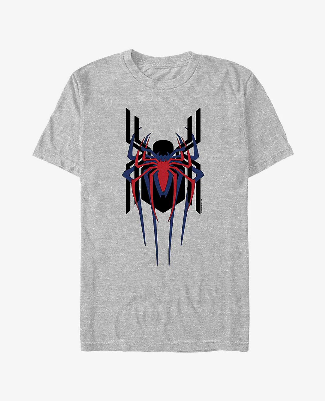
Unless you've been living under a rock, you've probably heard about the latest Spider-Man movie that's been taking over the world (literally). And unless you've been absent from all social media, you probably know by now that all three of the live-action Spider-Men throughout history star in the film. To celebrate the ambitious cross-over, Marvel has released a collection of spidey-themed merch – with one t-shirt sporting an unseen logo for the film.
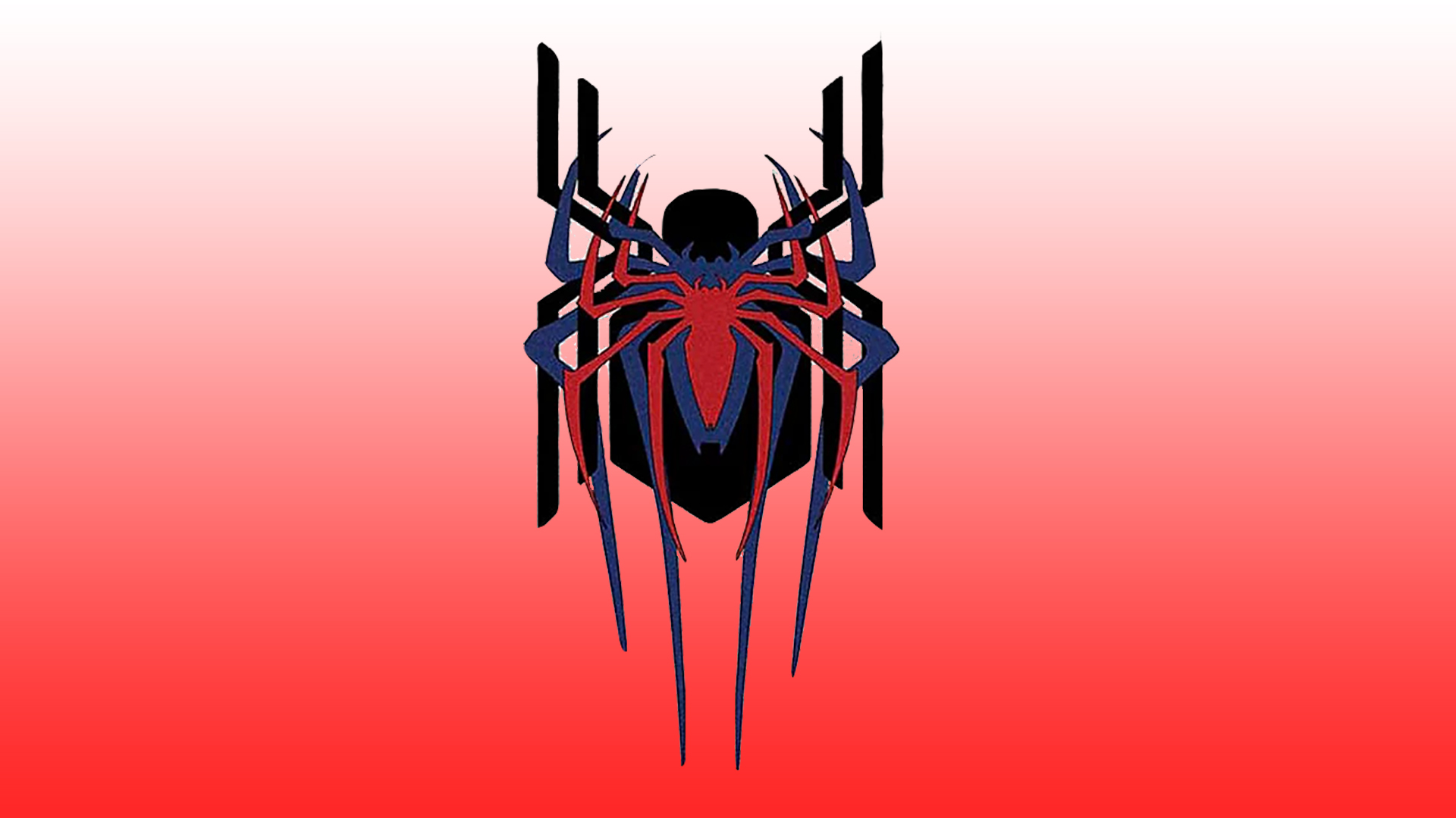
The new design was shared on the official Marvel website and features all three of the Spider-Man logos from the 2002, 2012 and 2017 movies stacked on top of each other. The t-shirt is retailing for $29.90 on the Box Lunch website, but after seeing the design, we're not convinced that it's worth it. If you're also unimpressed by the design and want to have a go at making your own, then make sure you check out our roundup of the best Cricut machines and start creating.

We're seriously underwhelmed by this design and think there was so much room for a more exciting spider crossover design - they are superheroes after all. The design looks messy with its stacked spiders and awkward heavy black outlines. We also think that the black spider looks disproportionally large in comparison to the two others. This isn't the first time we've seen the Spider-Man franchise make some weird design choices, back in 2019 it released a nightmarish Spider-Man: Far from Home poster.
It seems as though some of the internet agrees with us, and users over on Twitter have been sharing their thoughts on the design. One user tweeted, "This is a weird take," and another said, "It looks like two spiders and a tick". However, despite the slander, many fans still like the logo with one responding to the logo, "This is so dope," and another saying, "I love this design so much".
tom's logo is ruining whole thing https://t.co/DeTjxketr6January 26, 2022
Ordered the shirt IMMEDIATELY! https://t.co/UKgYzFF0aYJanuary 26, 2022
a 12 year old could do this https://t.co/dT6Q2g9IWiJanuary 26, 2022
Even though we're not fans of this design, there's still some cool spidey-merch on the Marvel website. If you think you can create a logo better than this one then why not have a go at making your own following these 15 golden rules of logo design.
Read More:
- This optical illusion has been baffling people since the 1970s
- Artists are going bananas for this fun Photoshop Easter Egg
- The 8 hottest graphic design trends in 2022
Get the Creative Bloq Newsletter
Daily design news, reviews, how-tos and more, as picked by the editors.

Thank you for reading 5 articles this month* Join now for unlimited access
Enjoy your first month for just £1 / $1 / €1
*Read 5 free articles per month without a subscription

Join now for unlimited access
Try first month for just £1 / $1 / €1

Amelia previously worked as Creative Bloq’s Staff Writer. After completing a degree in Popular Music and a Master’s in Song Writing, Amelia began designing posters, logos, album covers and websites for musicians. She covered a range of topics on Creative Bloq, including posters, optical illusions, logos (she's a particular fan of logo Easter eggs), gaming and illustration. In her free time, she relishes in the likes of art (especially the Pre-Raphaelites), photography and literature. Amelia prides herself on her unorthodox creative methods, her Animal Crossing island and her extensive music library.
