Is the new Ninja logo really as bad as people think?
I'm not hating the streamer's new look.

In case you hadn't heard, video game streaming is rather popular these days. And when you're as big as Ninja, the most followed Twitch streamer in the world, you're probably going to need a striking logo design. But Ninja's new look isn't proving a hit online.
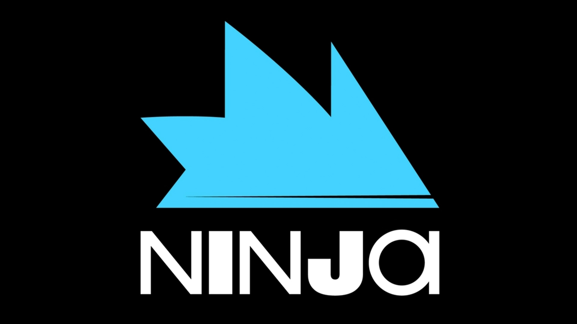
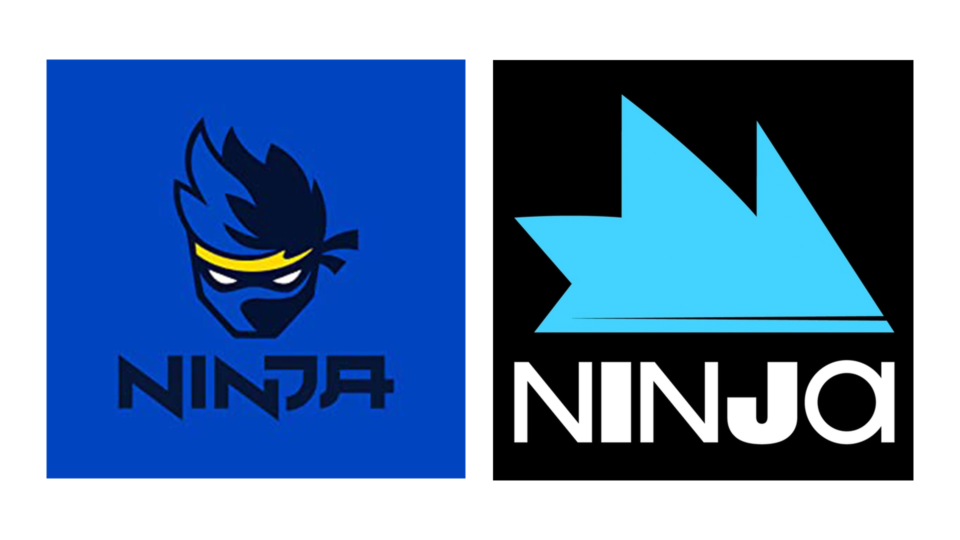
Gone is the streamer's iconic cartoon ninja face and retro typeface (below), replaced with something a lot more geometric in the new rebrand. And the stark symbol, along with the combination of heavy and light lettering, has led to a hefty dose of criticism online. (Want to start gaming? Check out the best Nintendo Switch deals available now.)
Same Ninja... new branding 💎 pic.twitter.com/RvSKoSlx0YApril 19, 2022
One of the main things fans have taken issue with is the somewhat illegible wordmark – and the fact that it looks like it might read 'Nin Joi'. "Artistically it's awful," one Twitter user comments. "No reason for I and J to be so bold. The spikes look like a Sonic production. Really I don't get it as a brand/logo."

Indeed, there's definitely something a little Sonic the Hedgehog about the icon (which, many Twitter users have suggested, is supposed to represent the streamer's spiky hair). And the combination of letter weights is certainly, er, bold.
https://t.co/0YXxDS2paB pic.twitter.com/wwplsYX2nGApril 20, 2022
Somebody got paid to make this new logo. I’m baffled. https://t.co/6t1hqEjmyMApril 20, 2022
But while Twitter clearly isn't having it, I wouldn't say it's an awful design. In a world of almost medical-looking flat designs (even Bandai Namco's logo is now impossibly dull), it's almost refreshing to see something a little less conventional. And hey, anti-design is one of 2022's coolest design trends, didn't you know?
So, while not everyone's convinced, it isn't exactly game over for Ninja's new logo. It's hardly one of the best logos of all time, but then it isn't one of the worst logos of the year either. Indeed, as unfortunate designs go, this is no Calendly. Want to design your own? Check out our guide on how to design a logo.
Read more:
Get the Creative Bloq Newsletter
Daily design news, reviews, how-tos and more, as picked by the editors.

Thank you for reading 5 articles this month* Join now for unlimited access
Enjoy your first month for just £1 / $1 / €1
*Read 5 free articles per month without a subscription

Join now for unlimited access
Try first month for just £1 / $1 / €1

Daniel John is Design Editor at Creative Bloq. He reports on the worlds of design, branding and lifestyle tech, and has covered several industry events including Milan Design Week, OFFF Barcelona and Adobe Max in Los Angeles. He has interviewed leaders and designers at brands including Apple, Microsoft and Adobe. Daniel's debut book of short stories and poems was published in 2018, and his comedy newsletter is a Substack Bestseller.
