Why Nike's latest rebrand oozes flexibility
Nike's custom design service gets a suitably creative refresh.
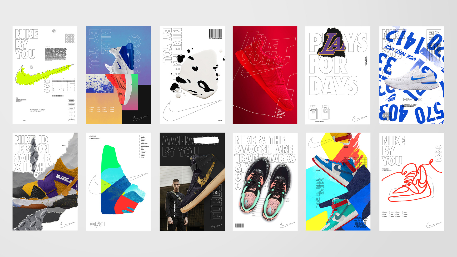
Sportswear company Nike has shaken up its customisation service with the launch of Nike By You. Taking over from where NIKEiD left off, the recently unveiled Nike By You is an overhaul of the service that gives shoppers the opportunity to inject their design thinking into their wardrobe and create bespoke Nike shoes.
Set up back in 2000, NIKEiD was the first sportswear customisation offering of its kind. But with technology making bespoke products more accessible, Nike decided it was time to reposition its co-creation tool as a service rather than just another product.
To do this, Nike worked with creative agency Gretel to develop a new visual identity, including a new logo design. This is a rare move for Nike as it doesn't usually farm out this sort of project, but it's a decision that stays true to the spirit of collaboration that's at the heart of the Nike By You service.
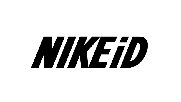
As part of the rebrand, Gretel produced a new logo design that stays true to the rest of the Nike brand while clearly standing apart visually. Whereas NIKEiD used the same italicised typeface as the rest of Nike's branding, Nike By You straightens it up and hollows it out, reducing the lettering to a thin outline. See how the old logo compares to the new one by clicking left to right in the gallery below.
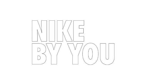
With its stripped back black-and-white colour palette, Nike By You cleverly invites user interaction. The empty lettering and famous swoosh logo look like they're waiting to be coloured in or customised by shoppers, which is a perfect reflection of the personalisation service.
"The identity has a broad scope for modification to suit any product, consumer or high-profile co-creation," says Daniel Edmundson, strategy director at Gretel in a statement.
To see this modification in action you only need to look at the various publicity assets that have accompanied the launch. There are swoosh ticks that look like they've been filled in by hand, chaotically positioned shoes, and purposefully distressed layouts. It's an identity that is as flexible as its footwear.
Get the Creative Bloq Newsletter
Daily design news, reviews, how-tos and more, as picked by the editors.
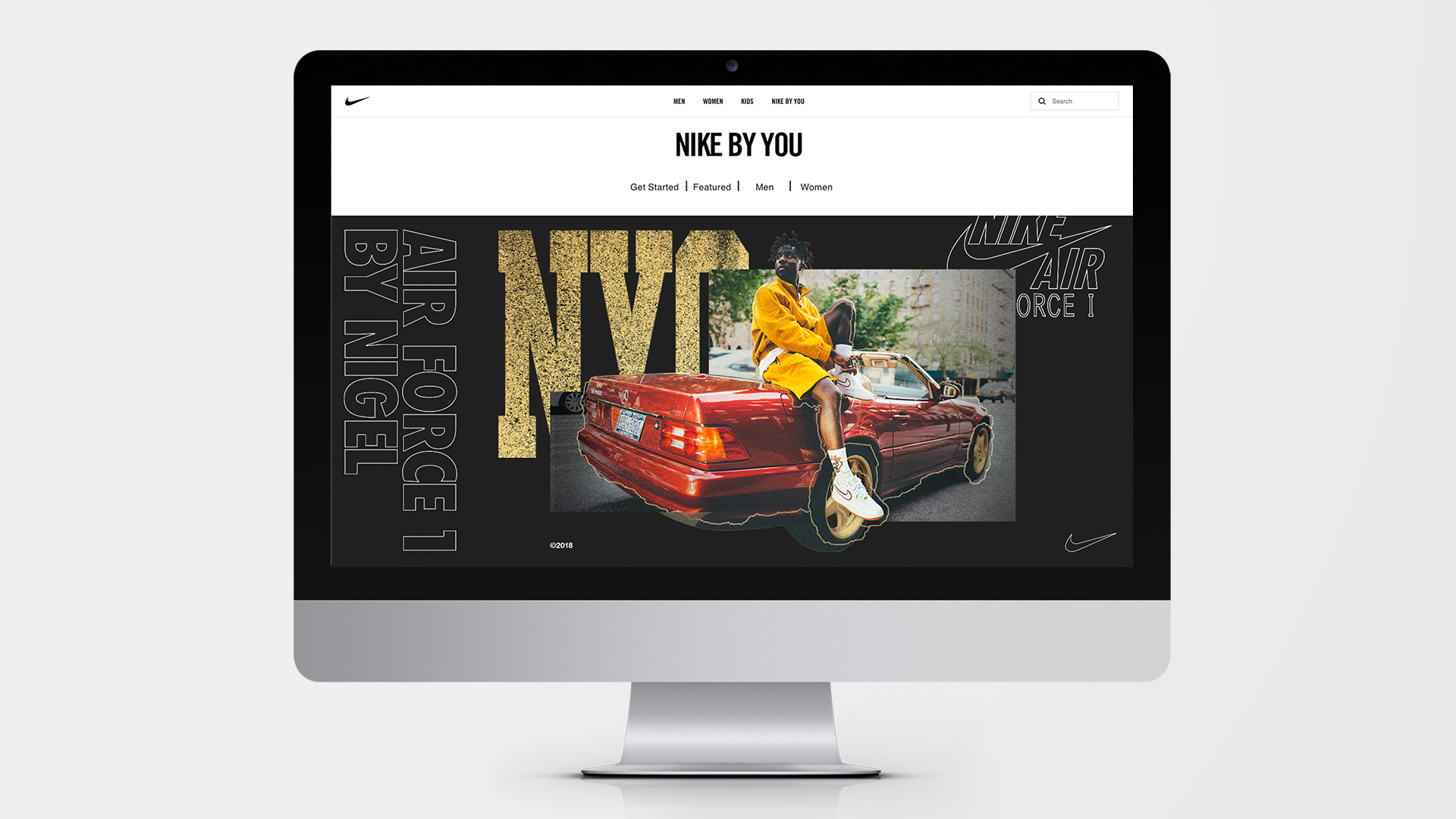
The launch of Nike By You builds on Nike's track record of creating powerful branding. Earlier this year its 'Just do it' tagline was voted the most memorable brand slogan.
Consisting of two layers, Nike By You sets a high bar when it comes to customisation as there's room for independent expression across all facets of its identity.
"The first layer is Nike, a technical, black-and-white layer, representing Nike’s expertise," says Edmundson. "It leverages the core elements of the Nike brand – the swoosh, the Futura Extra Bold Condensed typeface – but places them in a new context."
"The second layer is ‘You’ which includes colour, expression and personality. While the base layer is controlled and functional, the ‘You’ layer is free and expressive with endless possibilities for iteration."
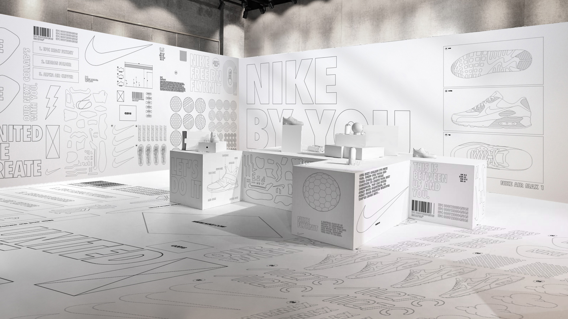
"Nike's audience craves creative input and the chance to be heard," adds Edmundson, "and Nike needed a pivot not only in how they spoke about customised experiences, but also what the entire offering meant across the brand, inside and out. With this launch Nike is celebrating individuality, the value of being unique and standing out from the crowd."
Related articles:

Thank you for reading 5 articles this month* Join now for unlimited access
Enjoy your first month for just £1 / $1 / €1
*Read 5 free articles per month without a subscription

Join now for unlimited access
Try first month for just £1 / $1 / €1

Dom Carter is a freelance writer who specialises in art and design. Formerly a staff writer for Creative Bloq, his work has also appeared on Creative Boom and in the pages of ImagineFX, Computer Arts, 3D World, and .net. He has been a D&AD New Blood judge, and has a particular interest in picture books.
