Brands often struggle to hit the right tone when they contribute to commemorative events and campaigns, but a new NFL logo will go down as a particular low. The biggest league in US sport has announced its participation in National Hispanic Heritage Month with a new logo that suggests it knows very little about Hispanic heritage.
The National Football League has unveiled a 'Latin-flavoured' version of the regular NFL logo, with just a couple of simple tweaks, and it's been savaged on Twitter for misusing one of the best-known symbols of the Spanish language. Suffice it to say, this won't make it to our pick of the best logos of all time.

National Hispanic Heritage Month (from 15 September to 15 October) is intended to recognise the influence and contributions of Hispanic Americans to the history, culture, and achievements of the United States. Various brands and organisations have announced initiatives, but the NFL's shot has landed a long way from the goal line.
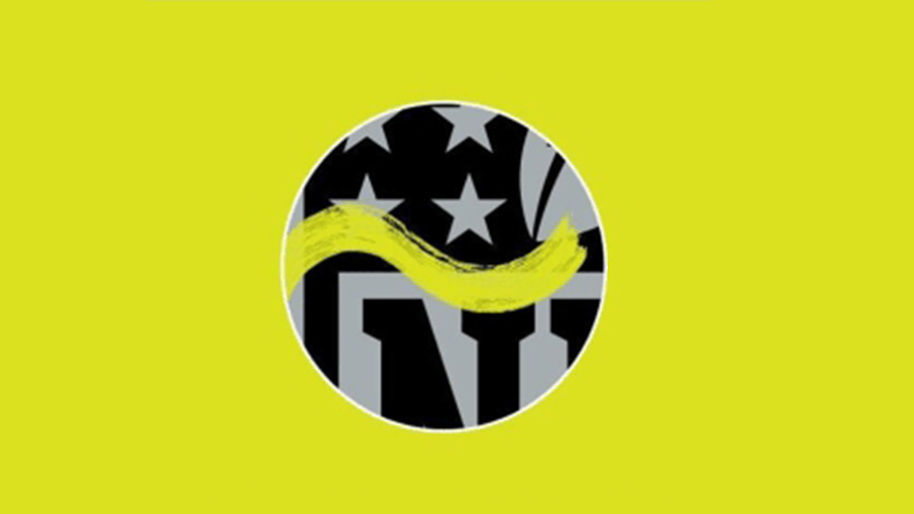
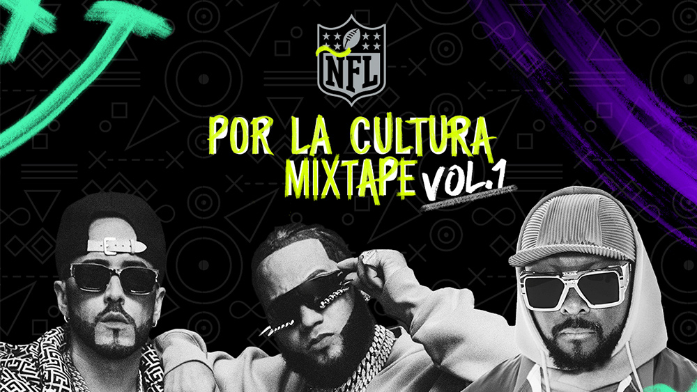
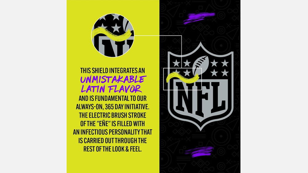
Under the slogan 'Por la cultural' (For Culture), the NFL will sponsor the Hispanic Heritage Sports and Fitness Youth Awards and has launched a mixtape featuring tracks from Yandel, El Alfa and Will.I.Am. The campaign logo paints a bright yellow tilde, or virgulilla, over the 'N' of the regular NFL logo. There are also some scratchy purple lines because... no, actually we've no idea.

I can imagine how someone could have thought this was a triumph. The 'Ñ' or 'eñe' is often used to symbolise Spanish and Hispanic identity, even by Spanish language institutions such as the Instituto Cervantes. The problem is that on the NFL logo, it just makes no sense.
'Ñ' is a distinct letter in the Spanish alphabet with its own pronunciation (it sounds a little like the 'nio' in the word 'onion'). Unsurprisingly, this isn't how Spanish speakers pronounce 'NFL'. The translation of 'national' in Spanish is 'nacional', not 'ñacional', which would be practically unpronounceable.
Por La Cultura. pic.twitter.com/pFoGGASAWtSeptember 15, 2022
Perhaps as bad as the logo itself is the NFL's overblown but patronising tweet about its launch. "This shield integrates an unmistakable Latin flavor and is fundamental to our always-on, 365-day initiative," it said. "The electric brush stroke of the 'eñe' is filled with an infectious personality that is carried out through the rest of the look and feel."
Get the Creative Bloq Newsletter
Daily design news, reviews, how-tos and more, as picked by the editors.
The reaction didn't take long to come. While there have also been suggests that the tilde makes the NFL football look like a sperm, most of the criticism targets the use of the tilde itself, with several people suggesting it meant there was nobody in the NFL marketing department who speaks any Spanish. The sports journalist Nate Atkins tweeted: "Putting a Ñ in NFL to highlight Latino culture is so lazy and probably cost a lot of time and money to get approved."
The Mexican-American author Julissa Natzely Arce Raya said: "This is embarrassing. There is no eñe in the world nacional. We don’t say Eñe F L we say NFL. Apologize." The memes and visual gags were quick to follow, with many comparing the incident to a scene from the US version of the sitcom The Office in which BJ Novak as Ryan Howard draws tildes on a bottle of lemonade to make it 'Mexican'.
Nobody:The NFL during Hispanic Heritage Month: pic.twitter.com/gJOEBHI2JvSeptember 15, 2022
Fueled by the NFL, I've spent countless hours designing this new Braves logo for Hispanic Heritage MonthÃtlanta BravesSeptember 15, 2022
This would have been better at this point 😂 pic.twitter.com/xZa92hm8qNSeptember 16, 2022
According to the #NFL, I’m eating at Iñ-ñ-Out tonight in celebration of #HispanicHeritageMonth https://t.co/ZNZHUpo2pA pic.twitter.com/FCJl3B4mHvSeptember 16, 2022
The @Seahawks knows how to do it right. pic.twitter.com/Zmv4XXLxvPSeptember 15, 2022
The NFL log debacle might be one for our roundup of the worst logos of 2022. It's not the only recent backlash we've seen at a brand tuning its logo to link up with a campaign or event. In Canada, the fastfood chain Wendy's recently faced a backlash after it came out against age discrimination by turning the hair of its Wendy's logo grey. We suggest everyone should see our guide to how to design a logo.

Thank you for reading 5 articles this month* Join now for unlimited access
Enjoy your first month for just £1 / $1 / €1
*Read 5 free articles per month without a subscription

Join now for unlimited access
Try first month for just £1 / $1 / €1

Joe is a regular freelance journalist and editor at Creative Bloq. He writes news, features and buying guides and keeps track of the best equipment and software for creatives, from video editing programs to monitors and accessories. A veteran news writer and photographer, he now works as a project manager at the London and Buenos Aires-based design, production and branding agency Hermana Creatives. There he manages a team of designers, photographers and video editors who specialise in producing visual content and design assets for the hospitality sector. He also dances Argentine tango.
