Is the sleek new White Sox logo sexier than intended?

white sox logo
(Image credit: Contino)

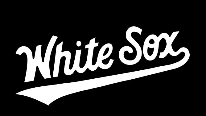
American baseball team Chicago White Sox have had a huge range of logos in the past – the team's featured 10 primary logos, 20 headwear marks and a whopping 77 lettering variations adorning its jerseys. Despite this logo overload, the name of the team, 'White Sox' hadn't been used on the team's jerseys since 1990. 

Now, design agency Contino, has rectified this by creating a sleek new 'White Sox' logo for the team's home jersey. The new wordmark draws on elements from the previous 'White Sox' logos as well as elements of the 'Chicago' script also in use in the team's visual identity (see our free script fonts for more cursive fonts). That script font is a custom typeface called South Side Script, and has one feature that may be slightly contentious (more on that later). 

Thank you for reading 5 articles this month* Join now for unlimited access

Enjoy your first month for just £1 / $1 / €1

*Read 5 free articles per month without a subscription

Join now for unlimited access

Try first month for just £1 / $1 / €1

Rosie Hilder

Rosie Hilder is Creative Bloq's Deputy Editor. After beginning her career in journalism in Argentina – where she worked as Deputy Editor of Time Out Buenos Aires – she moved back to the UK and joined Future Plc in 2016. Since then, she's worked as Operations Editor on magazines including Computer Arts, 3D World and Paint & Draw and Mac|Life. In 2018, she joined Creative Bloq, where she now assists with the daily management of the site, including growing the site's reach, getting involved in events, such as judging the Brand Impact Awards, and helping make sure our content serves the reader as best it can. 

Latest in Logos & Icons
Microsoft To Do
People have some Very Strong Opinions on the Microsoft To Do icons
Clippers logos old vs new
New LA Clippers logo is an instant classic
WLCO logo design
This hip neighbourhood's logo is totally loopy, but I love it
The superman logo as based on a potential design from Superman: Legacy
Possible new Superman logo divides fans
Lyle's Golden Syrup and Lyles Black Treacle tins showing the lion logo
Lyle's apologises for its Golden Syrup logo redesign as even the church expresses dismay
Steve Jobs and the Google logo
Apparently Steve Jobs hated the Google logo on his iPhone
Latest in News
Chupa Chups logo
The Chupa Chups logo was created by an art legend in just one hour
DC Sonic the Hedgehog comic collaboration
Sega reveals first glimpse of the Sonic DC collaboration we never knew we needed
The Dell 8K monitor on a green background, next to the text, 'Lowest price'.
The only commercially available 8K monitor is on sale with $1,771 off, and I'm intrigued
Tesla Cybertruck
Another day, another Tesla Cybertruck design fail
Dove ad
Dove's new campaign wants to break you out of the selfie cycle
Crayola crayons eight colours
Crayola's nostalgic limited edition packs bring back 'lost' colours retired since 1990 – plus a Million Crayon Giveaway