New Volkswagen logo breaks its own rules
Updated logo is minimal, on-trend and doesn't care about tradition.
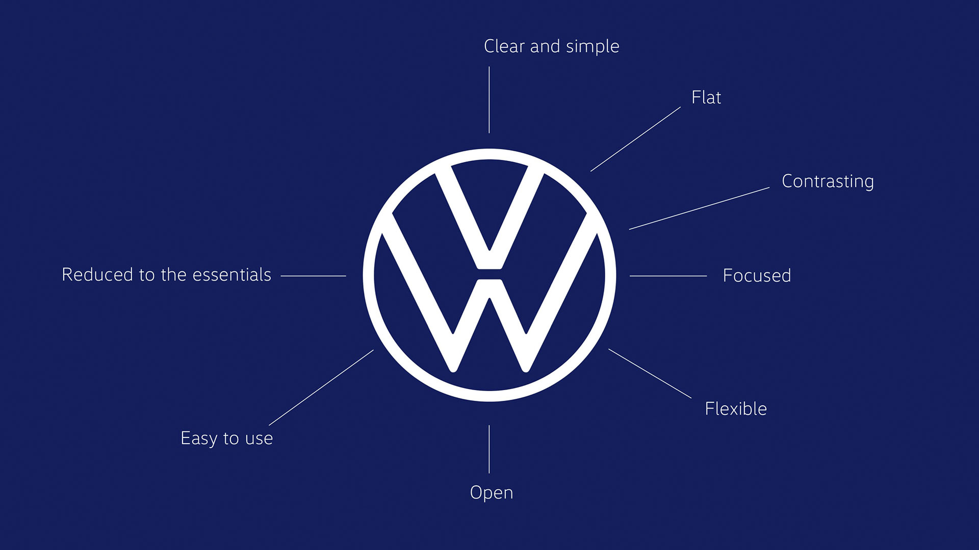
Volkswagen has revealed a new brand design and logo at the 2019 IAA motor show in Frankfurt, and while at a glance it looks like yet another refresh of the VW logo that's been adorning its cars since the 1930s, sharp-eyed designers will note that there are a few unexpected departures from its usual formula.
What's instantly noticeable about the new logo design isn't that it's a thoroughly contemporary flat logo as we reported recently; plenty of its logos over the years have been monochromatic and minimal. And so it makes perfect sense to revert to that look in a world where a good logo design has to scale gracefully, down from massive versions to display outside corporate headquarters, down to tiny mobile icons.
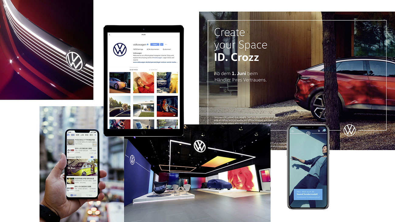
In that respect, Volkswagen had most of its work already done. What really stands out, though, is that this is a much more slimline iteration than earlier logos. The line width is much thinner than in any other VW logo, and it's particularly noticeable when seen next to the previous model, which had a sharp embossed look that gave it extra weight.
You'll also have noticed that in this new version, the 'W' doesn't connect with the circle at the bottom of the logo, and is instead left hanging, and if you look even closer you'll see that all the corners on the 'V' and 'W' are distinctly rounded; it's particularly noticeable at the bottom of the 'W'. Interestingly, though, at the point where the letters intersect with the circle, the angles are sharp as you like, so this isn't just some all-over softening of the logo.
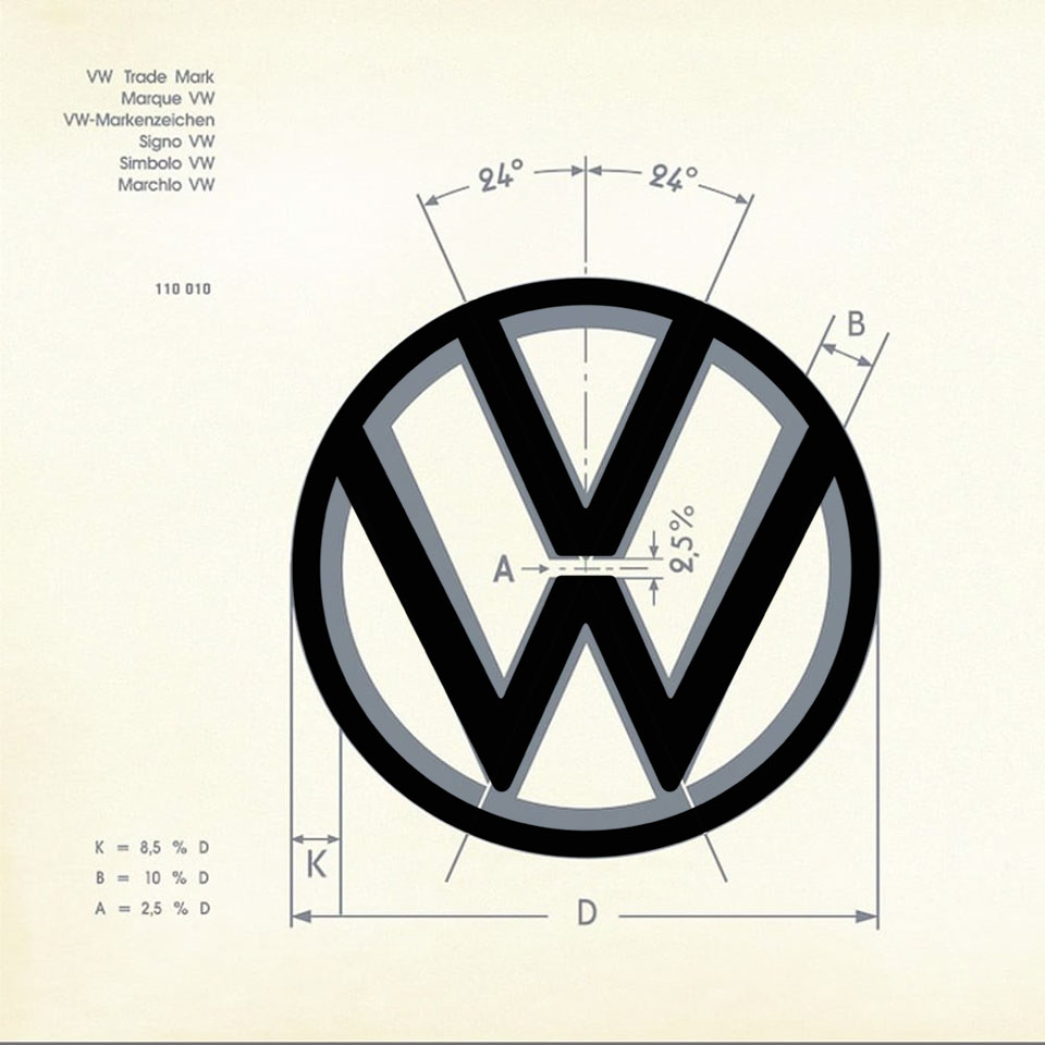
The really fun thing, though, is that this new design flagrantly breaks Volkswagen's own trade mark rules on how the logo should be drawn. We've mentioned Volkswagen's vintage logo specs before, and how they lay down exactly how the VW logo should look. It specifies precise formulae for calculating the line width in relation to the width of the logo, the angles for the lines making up the letters, and even the exact gap between the 'V' and the 'W'.
And as far as we can tell, the new design throws the rule book out of the window; the lines are far too thin, the angles of the letter strokes are all over the place, and the gap between the letters is too wide. Honestly, it show blatant disregard for the rules, and for that reason we love it.
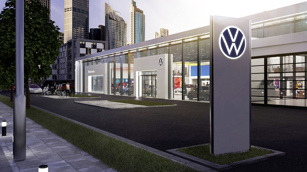
Volkswagen's been under a bit of a cloud in recent years thanks to its doctored emissions test results, and this fresh new logo – along with bolder and more colourful visual language, a new audio logo and the switch to using a female voice in its advertising rather than traditional male tones – allows it to make a much-needed break with its past.
Get the Creative Bloq Newsletter
Daily design news, reviews, how-tos and more, as picked by the editors.
Related articles:

Thank you for reading 5 articles this month* Join now for unlimited access
Enjoy your first month for just £1 / $1 / €1
*Read 5 free articles per month without a subscription

Join now for unlimited access
Try first month for just £1 / $1 / €1

Jim McCauley is a writer, performer and cat-wrangler who started writing professionally way back in 1995 on PC Format magazine, and has been covering technology-related subjects ever since, whether it's hardware, software or videogames. A chance call in 2005 led to Jim taking charge of Computer Arts' website and developing an interest in the world of graphic design, and eventually led to a move over to the freshly-launched Creative Bloq in 2012. Jim now works as a freelance writer for sites including Creative Bloq, T3 and PetsRadar, specialising in design, technology, wellness and cats, while doing the occasional pantomime and street performance in Bath and designing posters for a local drama group on the side.
