Minimal new apple logo is bold and fruity
This organic new visual identity is a delicious slice of branding.

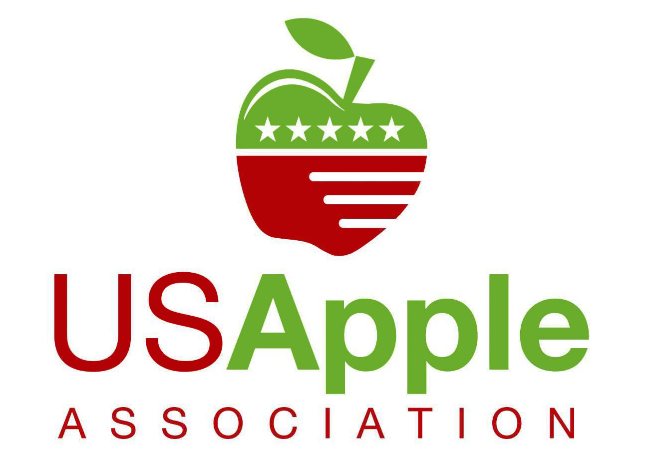
We were as surprised as anyone to learn this morning about the launch of a brand new apple logo and visual identity, especially one that's a radical departure from the previous version. But that's just what's been announced by the U.S. Apple Association this week, and this minimal redesign has left a pretty sweet taste in our mouths.
The U.S. Apple Association represents America's apple growers, apple associations and apple-related companies, and its previous logo design was a strong piece of work – a stylised red-and-green apple with stars-and-stripes detailing – but was looking a little dated.

The new visual identity is the work of branding agency Mekanic, and features an abstract and minimal design; it's still red and green, albeit in much brighter, more saturated shades than the old logo's autumnal tones, and it's still clearly an apple, but it's drawn with just a pair of bold, curved and weighty strokes.
USApple explains that the new logo evokes the idea of seasonality, cycles and new growth, and also points out that the leaf and stem point forward, representing the association's commitment to advancing the industry through advocacy and leadership.
Getting to this new logo design has been a fairly long process for both USApple and Mekanic. USApple's director of communications, Tracy Gondine, says that the process, and Mekanic's vision for the brand, has been informed by two years of discovery work, including interviews with growers, suppliers, leadership and Young Apple Leaders.

The result of all this work is a logo that really gets to the core of the association and provides it with an exciting new visual direction. And while a radical new design such as this is normally the sort of thing that provokes howls of outrage online, so far we haven't seem any adverse reaction to this at all, which is an encouraging sign.
Alongside the new logo and visual identity, USApple is also working on updating its website in order to provide better functionality and the most informative user experience, as well as following current best practices. The new USApple site will be unveiled within the next few weeks.
Get the Creative Bloq Newsletter
Daily design news, reviews, how-tos and more, as picked by the editors.
Related articles:

Thank you for reading 5 articles this month* Join now for unlimited access
Enjoy your first month for just £1 / $1 / €1
*Read 5 free articles per month without a subscription

Join now for unlimited access
Try first month for just £1 / $1 / €1

Jim McCauley is a writer, performer and cat-wrangler who started writing professionally way back in 1995 on PC Format magazine, and has been covering technology-related subjects ever since, whether it's hardware, software or videogames. A chance call in 2005 led to Jim taking charge of Computer Arts' website and developing an interest in the world of graphic design, and eventually led to a move over to the freshly-launched Creative Bloq in 2012. Jim now works as a freelance writer for sites including Creative Bloq, T3 and PetsRadar, specialising in design, technology, wellness and cats, while doing the occasional pantomime and street performance in Bath and designing posters for a local drama group on the side.
