Toyota has unveiled a new logo in its first redesign since 2009. Not only has the brand ditched the famous red in favour of a monochrome colour palette, it has also taken the bold step of removing its wordmark altogether – an indication of a level of brand confidence seen by the likes of Apple and Nike (read more about those in our best logos list).
According to Dan Beckett, head of art at The&Partnership, which masterminded the redesign, the new look is focused on "bringing the brand identity up to date, but preparing it for years to come". Along with the new logo comes a bespoke typography: Toyota Type, to be used across the brand.
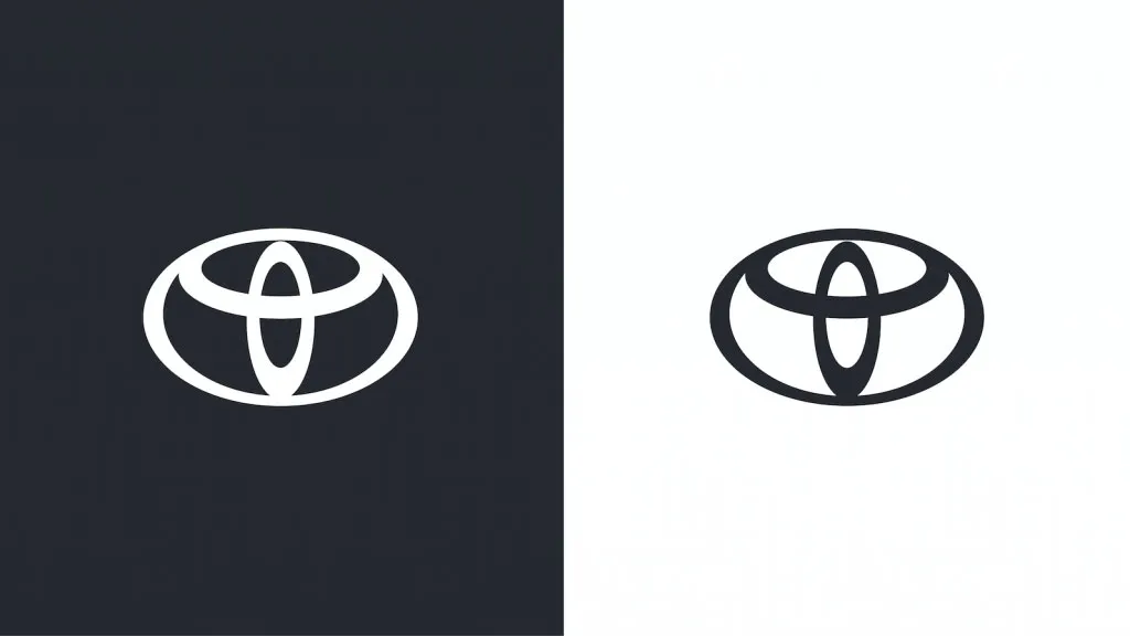
The previous Toyota logo (Image credit: Toyota)
While the basic logo design remains the same (see the old version directly above), with the three signature loops intersecting to create the T, the logo has been transformed into, you've guessed it, 2D flat design, to help its transition across digital platforms. Just recently we reported on how the Toyota logo is cleverer than it looks, which is the part of the design that remains.
Latest Videos From Creative Bloq
Toyota's website says that Toyota Type (see it below), aims to be "approachable, human and highly technical, and it has been conscientiously engineered." It comes in four preferred and two optional weights, with each weight coming in upright and italics.
Toyota Type is the bespoke typography system created for the rebrand (Image credit: Toyota)
The new brand identity is to be put into action across Europe, seeking to bring a "more premium feeling", whilst simplifying the brand architecture, says Beckett.
Toyota's new logo joins the hoards of brands joining the flat design party (see Nissan's redesign here), and its simplicity is sleek, clean and modern. Maybe the next brand to redesign could take a leaf out of Apple's book and reinstate some skeuomorphism, though – just to keep things interesting.
Read more:
Get the Creative Bloq Newsletter
Daily design news, reviews, how-tos and more, as picked by the editors.
Georgia has worked on Creative Bloq since 2018, and has been the site's Editor since 2022. With a specialism in branding and design, Georgia is also Programme Director of CB's award scheme – the Brand Impact Awards. As well as immersing herself with the industry through attending events like Adobe Max and the D&AD Awards and steering the site's content streams, Georgia has an eye on new commercial opportunities and ensuring they reflect the needs and interests of creatives.