New Sonic logo proves difficult to swallow
US fast food chain makes a massive misstep with 2020 rebrand.
US fast food chain Sonic has had a rebrand, and its new look isn't going down as smoothly as you might hope. Officially named Sonic Corp., this drive-through chain is based in Oklahoma City and has restaurants across 46 states. The company announced its new look in a tweet, with the message 'We take "new year, new me" VERY seriously', apparently unaware that it's already February.
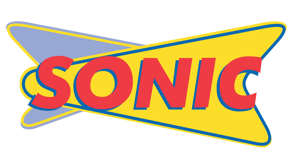
Let's take a very quick tour of Sonic's various logos before we explore the response to the new look. The logo you're probably familiar with, and the one that appears on most restaurant signage, is pictured below. (For more iconic brand design, see our guide to the best logos ever.)

There is some dispute about what those overlapping shapes were meant to represent. Some see a connection to atomic orbits, others think it has a more '50s car tailfin vibe.
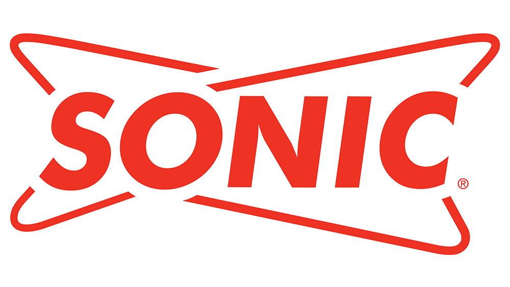
However, this isn't the most recent version of Sonic's logo. Officially, Sonic replaced this classic Americana-style logo with a single-colour version (shown below). This keeps the vibe of the very recognisable original logo, but simplifies the styling and loses elements such as the drop-shadow.

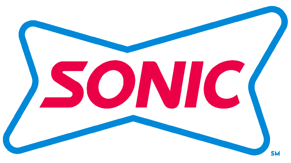
For its new look, the company decided to take the simplification a step further still, stripping the logo of charm and taking it into much more corporate territory. Gone is any hint of the retro-cool overlapping background shapes, replaced by a kind of wonky loop. There's also a bizarre font update that manages to pack an impressive number of typographical oddities into so few letters.

The new look is not going down well. The background shape has been likened to everything from a dog bone to the Budweiser bowtie, and that typography isn't gaining the company any new fans.
Brand New has a particularly savage review: "The new frame... looks like a crooked bowtie on a sad party clown and the typography is atrocious... Overall, a solid bad job from start to finish." Or perhaps Don McAllister puts it better with his succinct: "It looks as beautiful as their food is healthy." Gulp.
Get the Creative Bloq Newsletter
Daily design news, reviews, how-tos and more, as picked by the editors.
Read more:

Thank you for reading 5 articles this month* Join now for unlimited access
Enjoy your first month for just £1 / $1 / €1
*Read 5 free articles per month without a subscription

Join now for unlimited access
Try first month for just £1 / $1 / €1

Ruth spent a couple of years as Deputy Editor of Creative Bloq, and has also either worked on or written for almost all of the site's former and current design print titles, from Computer Arts to ImagineFX. She now spends her days reviewing small appliances as the Homes Editor at TechRadar, but still occasionally writes about design on a freelance basis in her spare time.
