Snapchat updated its icon and everything's ruined
A chunky new Snapchat ghost is spoiling everyone's Monday.

A big redesign is the perfect way to get internet blood boiling, but nothing could have prepared us for the howls of online anguish this morning over Snapchat's new app icon.
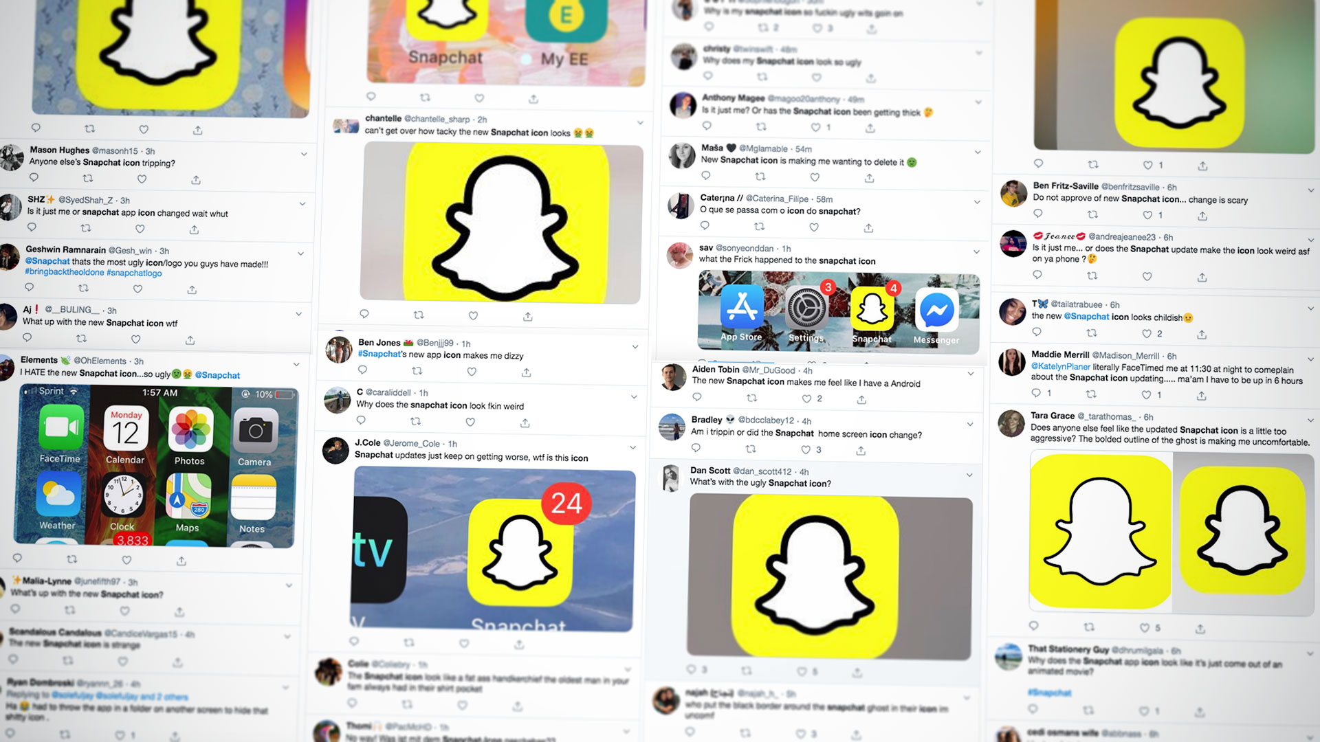
Twitter is currently awash with angry young things voicing their displeasure over the new icon, which started turning up on people's iPhone and Android apps last night with the latest update. So it must be a pretty radical redesign, right?

Actually, no. It's almost identical to the old logo; the only difference is that the stroke width on the spooky Snapchat ghost has been increased a bit. And considering that the icon features a white ghost on a yellow background, this is a pretty good move from an accessibility point of view.
However it hasn't gone down at all well with Snapchat's users, who are waking up today, discovering that their beloved phantom is a bit chunkier around the edges, and by Jiminy they're furious, variously describing this bold new look as ugly, aggressive and, weirdly, like the cartoon version of something that got stuck in the real world. It seems to be making plenty of users uncomfortable and lots them of are resorting to taking the icon off their home screens and hiding it away where it can't upset them.
What’s with the ugly Snapchat icon? pic.twitter.com/aUSmaLUor8August 12, 2019
The new Snapchat icon looks like the cartoon version of something that got stuck in the real worldAugust 12, 2019
Does anyone else feel like the updated Snapchat icon is a little too aggressive? The bolded outline of the ghost is making me uncomfortable. pic.twitter.com/QiOSS4WmF4August 12, 2019
Snapchat updated its icon and I’m so uncomfortable for some reasonAugust 12, 2019
If this seems like a bit of an overreaction, bear in mind that last year 1.2 million users signed an online petition demanding that Snap reverse a redesign that they felt uncomfortable with. And while we're not sure if this latest redesign is going to provoke quite that level of ire, considering that Snap's response to last year's petition was to basically say tough luck, we can be pretty sure that this new icon's here to stay.
And while you probably feel that the new icon really isn't different enough to warrant so much online anger, we kind of understand. For Snapchat's young users, that icon is a familiar totem that they've known for a long time. For it to unexpectedly change overnight is a big deal to them; it's like, oh, Elvis dying, or Zayn leaving One Direction, or (trigger warning) BTS taking a break.
We get it. We feel your pain. And all we can say to you right now is that, hey, you'll get used to it. Just take it one day at a time. Everything's going to be all right. Promise.
Get the Creative Bloq Newsletter
Daily design news, reviews, how-tos and more, as picked by the editors.
Related articles:

Thank you for reading 5 articles this month* Join now for unlimited access
Enjoy your first month for just £1 / $1 / €1
*Read 5 free articles per month without a subscription

Join now for unlimited access
Try first month for just £1 / $1 / €1

Jim McCauley is a writer, performer and cat-wrangler who started writing professionally way back in 1995 on PC Format magazine, and has been covering technology-related subjects ever since, whether it's hardware, software or videogames. A chance call in 2005 led to Jim taking charge of Computer Arts' website and developing an interest in the world of graphic design, and eventually led to a move over to the freshly-launched Creative Bloq in 2012. Jim now works as a freelance writer for sites including Creative Bloq, T3 and PetsRadar, specialising in design, technology, wellness and cats, while doing the occasional pantomime and street performance in Bath and designing posters for a local drama group on the side.
