The new Pringles logo has the internet divided — but we love it
Mr. P's looking smarter than ever.

In recent years we've seen plenty of logos getting a flat redesign, and while some look like a fresh upgrade, others don't always hit the mark. According to some, the lovable Pringles mascot is the latest to have fallen victim.
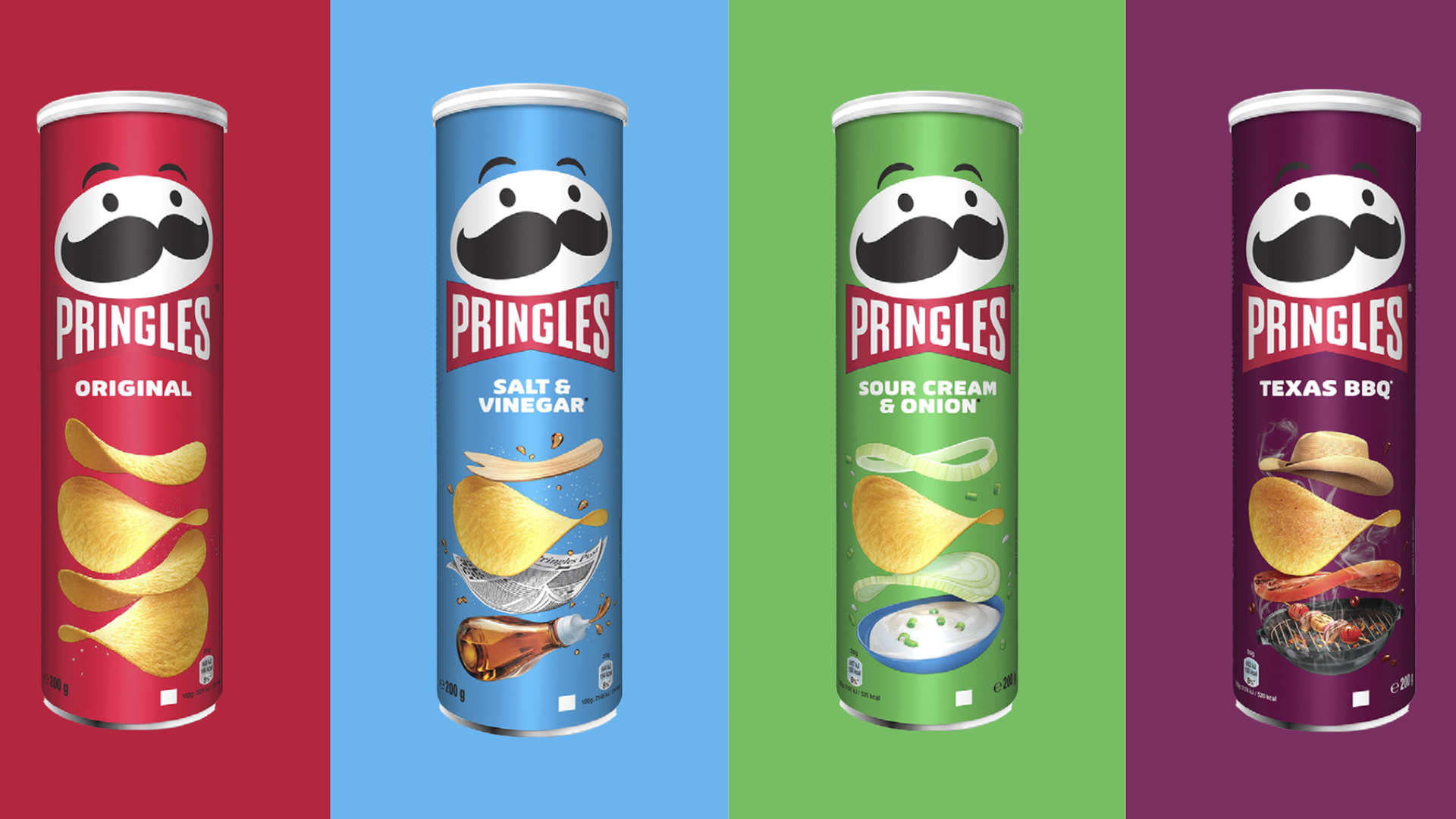
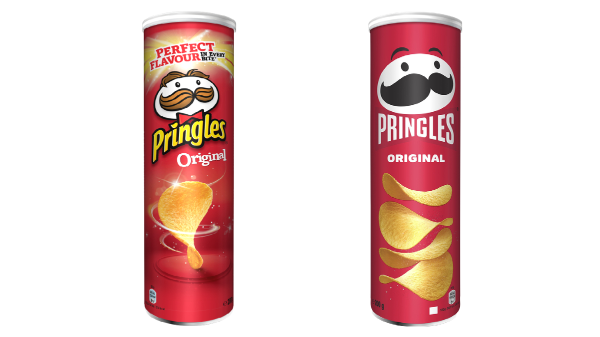
The crisp company has rebranded with a spanking new logo, font and packaging design for the first time in 20 years. It's still the same old Julius Pringles we know and love (because apparently he has a name), but he's now sporting a flat design instead. If you're looking to redesign your logo, make sure you check out our 15 golden rules for crafting a logo.

Pringles has described its glow up in a press release as "youthful" and "eye-catching". Its even said that the new design was meant to give Mr.P a "modern emoji-style look" and we can totally see that. One user on Twitter even pointed out that every shape in the new logo could be a Pringle – which is genius.
Not only has the logo had a rebrand but the entire packaging has, sporting a simpler and less abrasive design on the can. The solid colour on the background combined with the bold and simplistic redesign of the font and logo make the can look a lot cleaner. The word Pringles has been shaped to look like Mr. Pringle's famous red bow tie.
Despite the company singing the rebrand's praises, it has not gone down well on the internet, with Twitter users sending the crisp company some pretty passionate thoughts on the new design. Whenever a familiar company rebrands people are going to talk, and of course, make lots of jokes about it.
Saw someone compare King Bob-omb to the Pringles logo and...Can't unsee... pic.twitter.com/YlFYqDnn4SMay 18, 2021
MR. P GOT A BUZZ CUTDecember 31, 2020
New Mr P looks like he has been through scary hours.September 21, 2021
We are going to have to wait and see if the new design grows on the internet, but we love the fresh new look here at Creative Bloq. We might not like it as much as the Burger King's rebrand, but it's far better than the Warner Bros flat design. Still after your logo design fix? Have a go at guessing the top ten most memorable logos of all time.
Read More:
Get the Creative Bloq Newsletter
Daily design news, reviews, how-tos and more, as picked by the editors.
- The colour of the sun isn't yellow (and everyone's totally confused)
- Baffled by the new iOS 15 Safari design? Here's how to fix it
- 63 of the best infographics

Thank you for reading 5 articles this month* Join now for unlimited access
Enjoy your first month for just £1 / $1 / €1
*Read 5 free articles per month without a subscription

Join now for unlimited access
Try first month for just £1 / $1 / €1

Amelia previously worked as Creative Bloq’s Staff Writer. After completing a degree in Popular Music and a Master’s in Song Writing, Amelia began designing posters, logos, album covers and websites for musicians. She covered a range of topics on Creative Bloq, including posters, optical illusions, logos (she's a particular fan of logo Easter eggs), gaming and illustration. In her free time, she relishes in the likes of art (especially the Pre-Raphaelites), photography and literature. Amelia prides herself on her unorthodox creative methods, her Animal Crossing island and her extensive music library.
