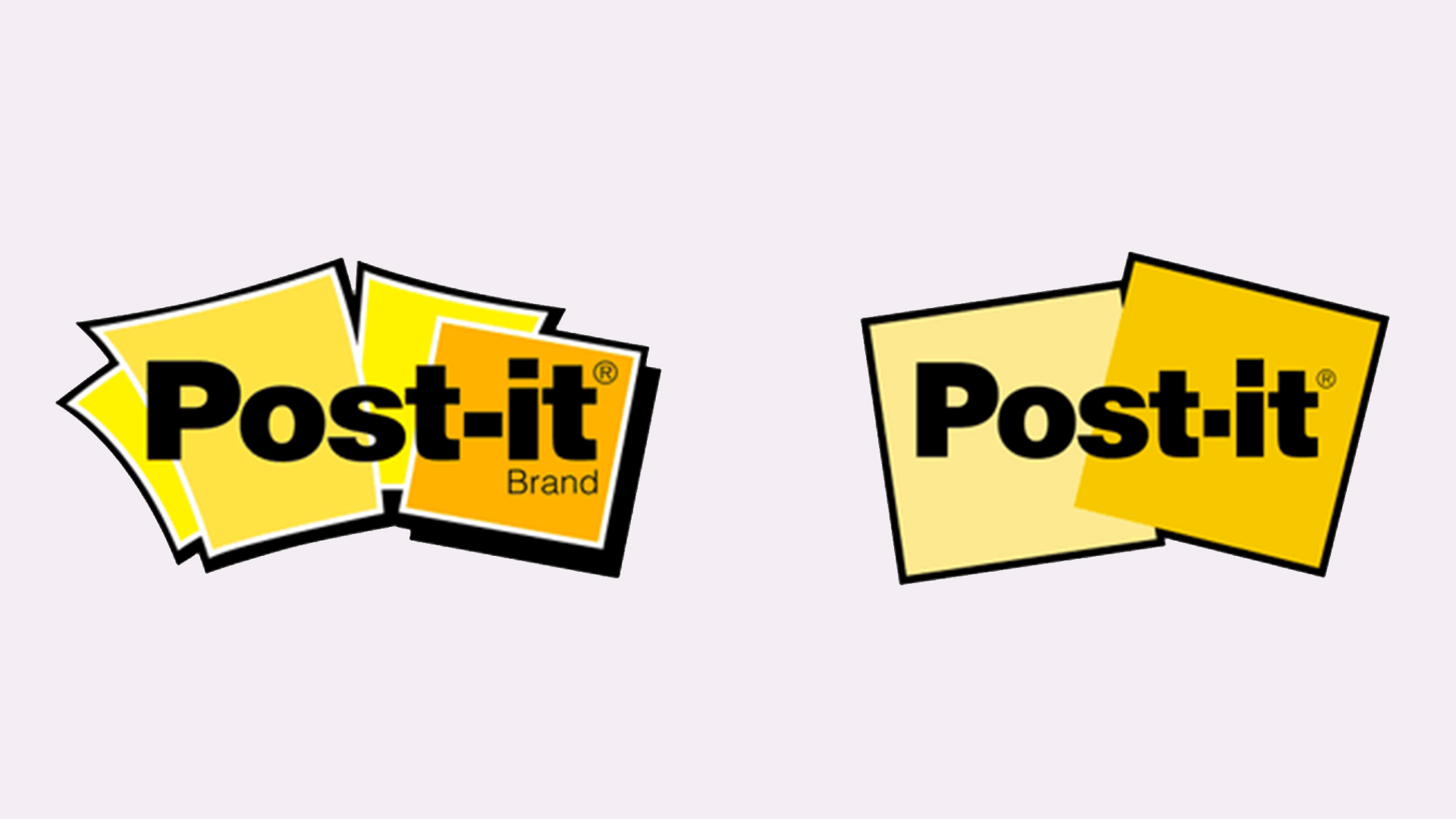
Slick new Post-It logo has the internet divided
Some Like-It, others Hate-It.
Less than a month into 2021, we've already seen a fair few rebrands and logo redesigns, from Burger King to, er, the CIA. The latest comes courtesy of everyone's favourite brand of small pieces of paper with a re-adherable strip of glue on its back (thanks, Wikipedia) – and it's yet another example of a brand simplifying its existing design.
The new logo for Post-It brand (the brand behind, you guessed it, Post-It notes) was quietly rolled out this month, but it's already been noted by the internet. It seems users are divided by the geometric new look (below), with some finding it a pleasingly clean new design, and others not so sure. Check out our best logos of all time if you're looking for more inspiration.

At first glance, the most obvious change is the simplification of the Post-It notes behind the wordmark. Gone are the four cartoonish, curved-edged depictions, and in their place are two perfectly square versions. It's an immediately more utilitarian look, and we'd say the new flat design is pleasingly modern compared with the previous, slightly messy design – although anyone who's ever plastered their workspace with Post-It notes will know that messy just about sums it up.
But there's another, more subtle change at hand. While the sans-serif typeface appears largely unchanged, both the hyphen and dot above the 'i' have been stretched upwards into squares. You know, like Post-It notes. It's a tiny yet ingenious detail that adds a knowing wink to what could otherwise be seen as a rather serious design.
Whether or not you appreciate the new logo will depend where you sit on the flat design debate. As this recent Twitter thread shows, many are growing tired of the trend towards overly simplified, minimal logos – and Post-It Brand's new design is certainly, well, simplified and minimal.
While Post-It Brand doesn't appear to have officially announced the new look, many Twitter users have already made their feelings known – and it seems this one has split opinion down the middle:
To me it looks cleaned-up, simplified, streamlined, and modernized. It respects the brand heritage while removing clutter. It’s so simple you could draw it in the sand—one test of a good mark, IMO.January 23, 2021
Looks boring 😴January 23, 2021
I dig the simplificationJanuary 22, 2021
If we're honest, we can see both sides. We wonder whether it's entirely on brand for a product designed for spontaneous thoughts and bursts of creativity, but the execution of Post-It's minimal new logo is clean and slick enough for us to let it slide.
Get the Creative Bloq Newsletter
Daily design news, reviews, how-tos and more, as picked by the editors.
From Warner Bros's new logo to Burger King's juicy new rebrand, it's clear that flat design isn't going anywhere in 2021 – and while a certain lack of fun and character will no doubt continue to be a sticking point for some, we're still seeing some brilliant new examples of minimal logos. Can't decide whether to go flat or 3D? Don't fret – our logo design guide has you covered.
Read more:

Thank you for reading 5 articles this month* Join now for unlimited access
Enjoy your first month for just £1 / $1 / €1
*Read 5 free articles per month without a subscription

Join now for unlimited access
Try first month for just £1 / $1 / €1

Daniel John is Design Editor at Creative Bloq. He reports on the worlds of design, branding and lifestyle tech, and has covered several industry events including Milan Design Week, OFFF Barcelona and Adobe Max in Los Angeles. He has interviewed leaders and designers at brands including Apple, Microsoft and Adobe. Daniel's debut book of short stories and poems was published in 2018, and his comedy newsletter is a Substack Bestseller.
