Brilliant new Pepsi logo is more than just nostalgia
Fans are calling it a 'massive improvement'.

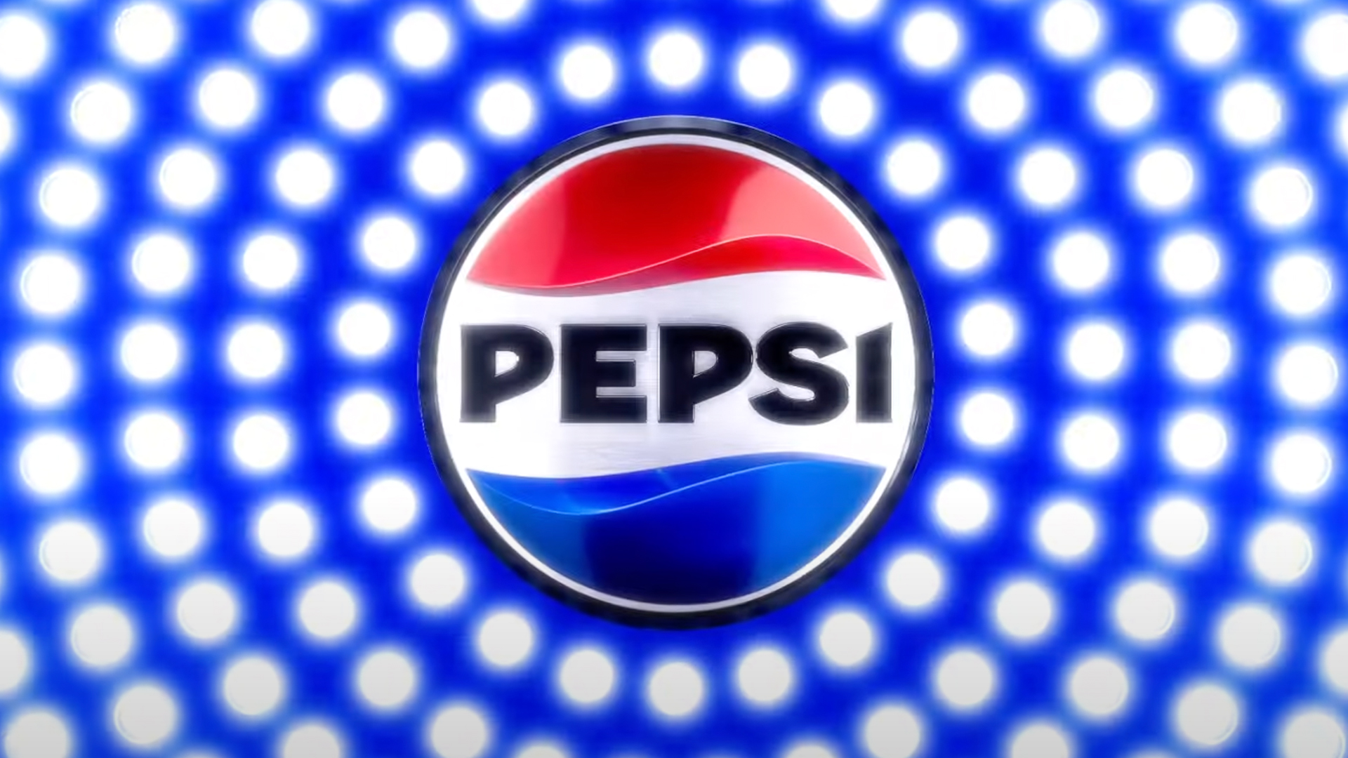
Three months into 2023 and we've already seen some pretty major rebrands from the likes of Nokia and Burberry. Now Pepsi has entered the ring with its first new logo design since 2008 – and it's a step both backwards and forwards.
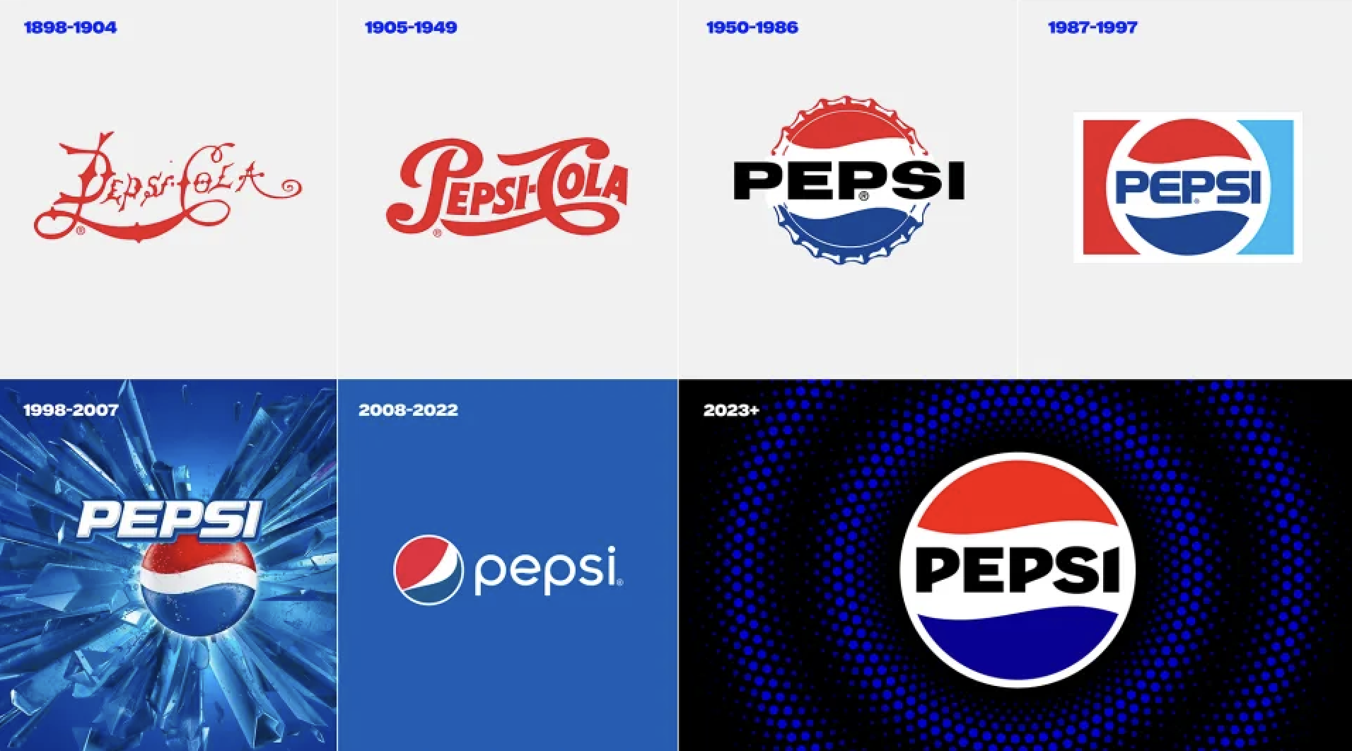
Revealed today, Pepsi's first major rebrand in 15 years includes a new logo with a remarkably retro feel. The brand's iconic 'globe' design has been straightned out, and the wordmark (now a bold, upper-case sans serif) is right there in the middle of the logo. Which might feel slightly familiar to soda fans of a certain vintage. (Looking for design inspiration? Check out the best logos of all time.)

From 1962 - 1991, the name 'Pepsi' sat in the white negative space of various iterations of the logo, and this new design places it right back where it belongs. But rather than a carbon(ated) copy of a previous design, this new version features bold, black text, designed to highlight a move away from high sugar content.
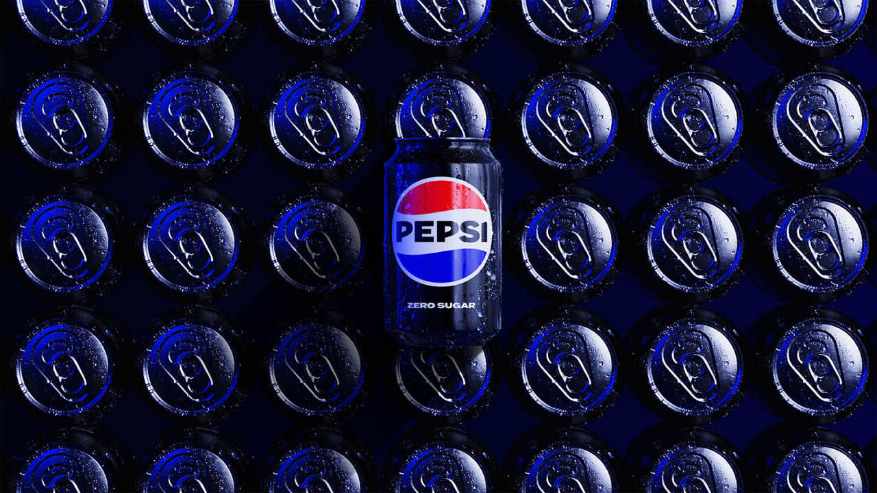
“A lot of people don’t even notice the black is there,” Todd Kaplan, CMO of Pepsi, says in a press release. “It’s an intentional colour we added in with Zero Sugar, which will be the lead brand we use marketing. It can act as a master brand statement."

Along with the new logo, PepsiCo has also announced that standard Pepsi will now contain 57% less sugar. The company says it has been "working to reformulate this product so that it has less sugar but still maintains the great taste people expect."
This logo looks amazing & it kinda looks like an old school Pepsi logo too 👍🏻 https://t.co/N27ftg0N6eMarch 28, 2023
And in what feels like a rare occurrence these days (see: Nokia), the initial response to Pepsi's new logo seems largely positive. "I like it a lot more than the current version. The slanted white stripe bothers me," one Twitter user comments, while another adds, "It no longer looks like an airline logo. It’s a modern nod to the past, which is good." Indeed, it seems the previous design wasn't hugely popular – perhaps in part because of the utterly ridiculous design process that led to its inception. Still, at least that logo leant itself to a pretty awesome print campaign a couple of years back.
Read more:
Get the Creative Bloq Newsletter
Daily design news, reviews, how-tos and more, as picked by the editors.

Thank you for reading 5 articles this month* Join now for unlimited access
Enjoy your first month for just £1 / $1 / €1
*Read 5 free articles per month without a subscription

Join now for unlimited access
Try first month for just £1 / $1 / €1

Daniel John is Design Editor at Creative Bloq. He reports on the worlds of design, branding and lifestyle tech, and has covered several industry events including Milan Design Week, OFFF Barcelona and Adobe Max in Los Angeles.
