New Nokia logo reminds people of another controversial rebrand
Hello Kia, our old friend.

Remember Nokia? Once the king of mobile phones, the brand was overtaken by the likes of Apple and Samsung after the advent of the smartphone. And now, to signal a shift away from mobile phones, Nokia has unveiled a radically new logo.
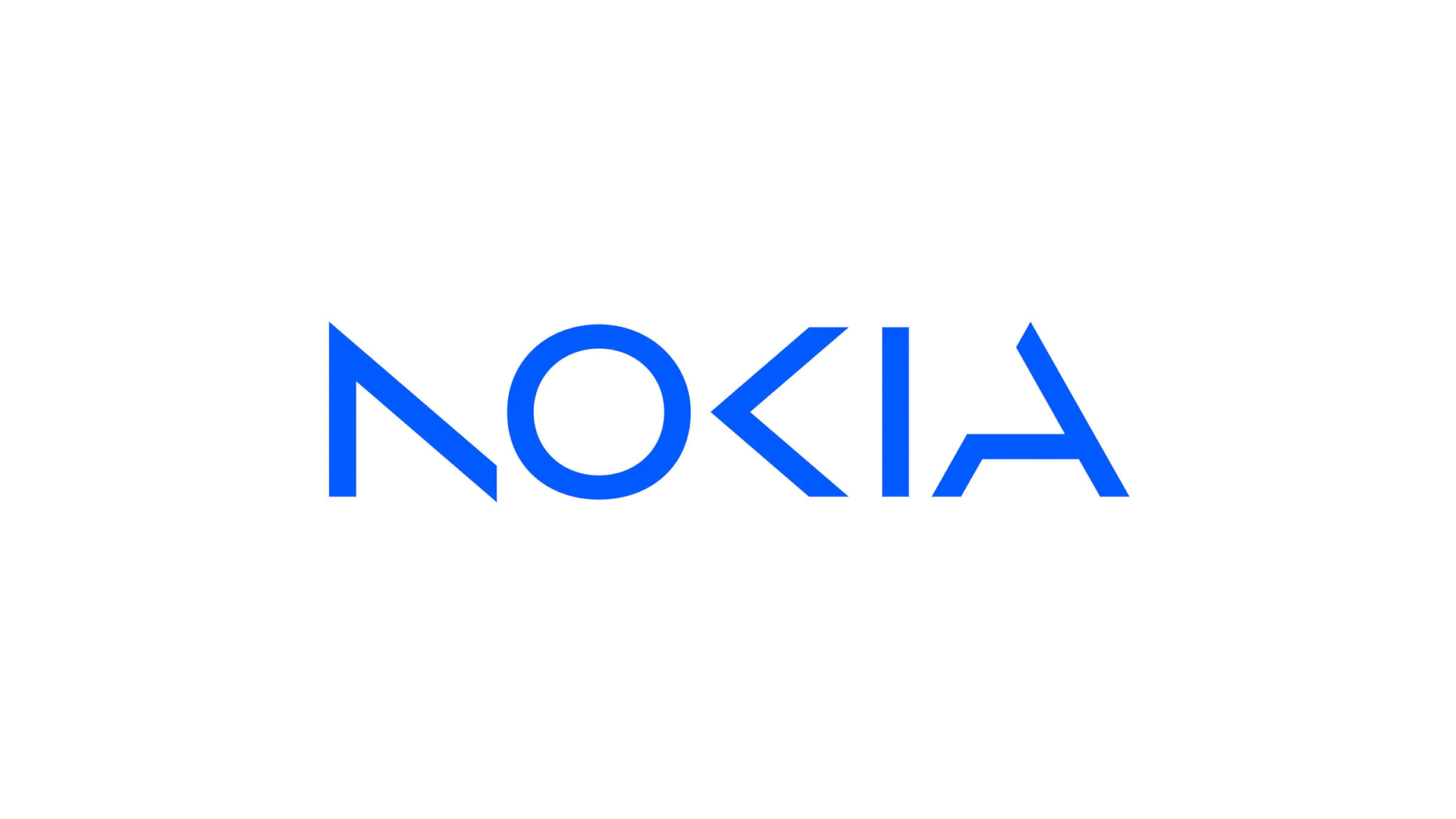
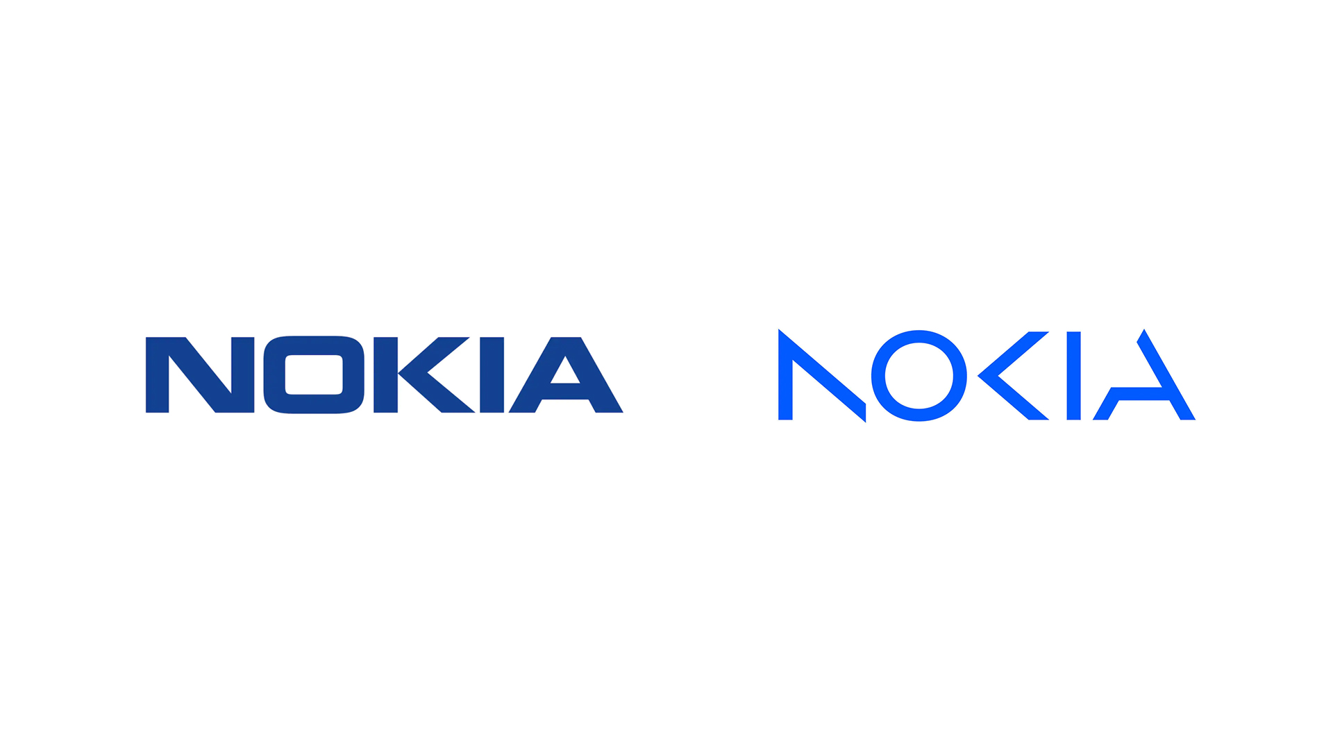
Revealed before the official start of Mobile World Congress Barcelona this week, the new logo does away with Nokia's iconic typeface and navy blue colourway, replaced with a much lighter series of disembodied shapes. And the whole thing is reminding the internet of another recent (and much derided) rebrand. Looking for design inspiration? Check out the best logos of all time.

"We are updating our strategy, and, as a key enabler, we are also refreshing our brand to reflect who we are today: a B2B technology innovation leader pioneering the future where networks meet cloud," Nokia has announced. "In most people’s minds, we are still a successful mobile phone brand, but this is not what Nokia is about. We want to launch a new brand that is focusing very much on the networks and industrial digitalisation, which is a completely different thing from the legacy mobile phones."
The new logo, designed by creative consultancy Lippincott, features a series of lightweight lines and circles, which loosely spell out the word Nokia. As seems to be the trend with various recent rebrands, several of the letters have chunks missing, which some are arguing negatively impacts legibility. And, yep, a lot of people are comparing it with the recent Kia rebrand.
To all big companies out there...Please stop ruining your logos. pic.twitter.com/fnUj2CXq0AFebruary 26, 2023
The Ultimate Rebrand: AOKN #nokia #kia #aocia #kn pic.twitter.com/NnbewtTFfuFebruary 27, 2023
if i had a nickel for every time a company whose name contains ‘kia’ changed their logo and eschewed glyphs from the letterforms to make everything appear minimal and angular, i’d have two nickels, which isn’t a lot, but it’s weird that it happened twice (first one is nokia) pic.twitter.com/9WJVvuApCfFebruary 26, 2023
But if you're devastated about the loss of the old Nokia logo, don't despair – it might not be gone yet. The actual mobile phones division of Nokia has belonged to HMD Global since 2016, and that company owns the rights to use the Nokia branding for its own phones. Whether HMD will keep the old logo alive remains to be seen, but if it decides to make a change, rather than opting straight for the new Nokia wordmark, it might want to check out our guide on how to design a logo.
Read more:
- Turns out the new Buick logo design happened by accident ...
- The Nike logo: a history
- New Prime Video branding makes clever use of the Amazon logo
Get the Creative Bloq Newsletter
Daily design news, reviews, how-tos and more, as picked by the editors.

Thank you for reading 5 articles this month* Join now for unlimited access
Enjoy your first month for just £1 / $1 / €1
*Read 5 free articles per month without a subscription

Join now for unlimited access
Try first month for just £1 / $1 / €1

Daniel John is Design Editor at Creative Bloq. He reports on the worlds of design, branding and lifestyle tech, and has covered several industry events including Milan Design Week, OFFF Barcelona and Adobe Max in Los Angeles.
