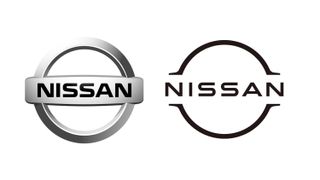
New Nissan logo joins the flat design party
A slick, digital-friendly new look.
Recent trademark filings gave us our first glimpse of a new logo for car manufacturer Nissan, adding it to the long list of companies eschewing 3D for a flat, minimalist design. And now, Nissan has finally announced the new look.
Moving in a similar direction to other car brands, Nissan has adopted a more minimalist take on its existing branding. Not only has the chrome badge been replaced with a thin, monochromatic version, but the 'Nissan' font is now a straighter sans-serif affair. There'll have been no shortage of competition for Nissan to take tips from within the car industry – but if you're looking for logo ideas, check out our guide to finding logo design inspiration.

In a news post on its website , Nissan says the design process began in 2017, and the team was led by three keywords: "thin, light and flexible". The process started in 3D and then developed in 2D, resulting in what the company calls "a transition from a hard-edged, industrial feel to a refined, familiar and digital-friendly look".
It's not surprising to see another car manufacturer join the flat design party. BMW recently revealed a minimalist redesign of its logo, designed with "openness and clarity" in mind. Less minimal is Nissan's launch video for the logo (below), in which it is impressively rendered in various natural and textural forms.
The switch to simplicity makes sense – a logo needs to work across websites, social media and various types of digital media as well as a car bonnet. Nissan says the new logo will appear from July across mediums "from letterhead and dealership signs to social media and digital advertising". Nissan's electric vehicles will feature an exclusive illuminated logo, lit by 20 LEDs.
We're fans of Nissan's new logo which, with removal of all colour entirely, is perhaps an even bolder transformation than BMW's. Whether the flat design trend will disappear and 3D logos make a triumphant return in a few years is anybody's guess, but for now, we'd say Nissan's slick, digital-friendly new look is a winner.
Related articles:
Get the Creative Bloq Newsletter
Daily design news, reviews, how-tos and more, as picked by the editors.

Thank you for reading 5 articles this month* Join now for unlimited access
Enjoy your first month for just £1 / $1 / €1
*Read 5 free articles per month without a subscription

Join now for unlimited access
Try first month for just £1 / $1 / €1

Daniel John is Design Editor at Creative Bloq. He reports on the worlds of design, branding and lifestyle tech, and has covered several industry events including Milan Design Week, OFFF Barcelona and Adobe Max in Los Angeles.