The Dutch mock new tulip logo (and it’s very entertaining)

New logo - Netherlands
(Image credit: NBTC)

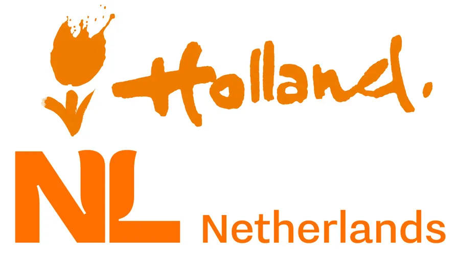
What do you think of when you think of Holland, or the Netherlands? The Netherlands Board of Tourism & Conventions are hoping it's the colour orange (associated with the Dutch royal family) and tulips, judging by its new logo for the country. We wonder if they got any top tips from our logo design inspiration post?

The fresh logo is the result of a strategy developed to more clearly show what the Netherlands has to offer. The Dutch government decided it was time to ditch the old brush-style tulip and hand-drawn 'Holland' text logo and be recognised internationally by a new, more representative logo. Yes tulips are still there, and so is the colour orange, but the two are brought together in a more subtle and contemporary style. And can you spot a hidden tulip hiding in the forms of the 'N' and the 'L'?

The informal 'Holland' text also got the heave-ho. Holland is a region of the Netherlands, and while commonly used as the country's name in the outside world, inside the country many think this is misrepresentative. Hence the change to Netherlands in the new-look logo. 

While the government might like the new logo, it seems Dutch designers have not been so complimentary, as you can see from the comments on Twitter (below). 

Thank you for reading 5 articles this month* Join now for unlimited access

Enjoy your first month for just £1 / $1 / €1

*Read 5 free articles per month without a subscription

Join now for unlimited access

Try first month for just £1 / $1 / €1

Steven Jenkins is a freelance content creator who has worked in the creative industry for over 20 years. The web and design are in his blood. He started out as a web designer before becoming the editor of Web Designer magazine and later net magazine. Loud guitars, AFC Bournemouth, Photoshop, CSS, and trying to save the world take up the rest of this time. 

Latest in Logos & Icons
Microsoft To Do
People have some Very Strong Opinions on the Microsoft To Do icons
Clippers logos old vs new
New LA Clippers logo is an instant classic
WLCO logo design
This hip neighbourhood's logo is totally loopy, but I love it
The superman logo as based on a potential design from Superman: Legacy
Possible new Superman logo divides fans
Lyle's Golden Syrup and Lyles Black Treacle tins showing the lion logo
Lyle's apologises for its Golden Syrup logo redesign as even the church expresses dismay
Steve Jobs and the Google logo
Apparently Steve Jobs hated the Google logo on his iPhone
Latest in News
Absolut vodka
Why Absolut's 'bottle' print ad is the greatest of all time
Democratic Party donkey logo
People are mocking the Democrat's new logo, but a rebrand was needed
Mark looks at a crystal cube from Lumon in Severance
Why prop design is so important in Apple TV's Severance
Audi EV billboard adverts
Ingenious Audi billboards soar above the chaos in EV branding
Chupa Chups logo
The Chupa Chups logo was created by an art legend in just one hour
DC Sonic the Hedgehog comic collaboration
Sega reveals first glimpse of the Sonic DC collaboration we never knew we needed