New NBC logo is a subtle but brilliant update

NBC logo
(Image credit: NBC)

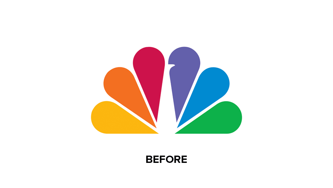
We're big fans of the NBC logo, thanks to its clever (yet not overly obvious) use of negative space. At first glance it looks like a simple coloured fan, but factor in that white centre and it becomes clear that you're looking at a peacock. And a subtle redesign has just made the effect even clearer.

Viewers have noticed the TV channel quietly rolling out an updated logo design, giving the peacock brighter feathers and a more prominent beak. It's a subtle tweak, but not only is it cleaner, but it makes the animal itself that little bit more obvious. (Looking for inspiration? Check out the best logos of all time.)

Thank you for reading 5 articles this month* Join now for unlimited access

Enjoy your first month for just £1 / $1 / €1

*Read 5 free articles per month without a subscription

Join now for unlimited access

Try first month for just £1 / $1 / €1

Daniel John
Design Editor

Daniel John is Design Editor at Creative Bloq. He reports on the worlds of design, branding and lifestyle tech, and has covered several industry events including Milan Design Week, OFFF Barcelona and Adobe Max in Los Angeles.

Read more
Capital One logo design
Capital One’s controversial new logo faces out of this world design comparisons
Walmart new visual identity
Ignore the hate, Walmart's bold new branding is the definition of a glow up
YouTube logo
YouTube finally explains its subtle logo redesign
Poster with young model and the slogan "Not your mother's Tiffany'
The best rebrands of all time
Squid Game
Squid Game is actually a brilliant lesson in brand design
Oatly
The best rebrands of the 2010s, chosen by experts
Latest in Logos & Icons
Microsoft To Do
People have some Very Strong Opinions on the Microsoft To Do icons
Clippers logos old vs new
New LA Clippers logo is an instant classic
WLCO logo design
This hip neighbourhood's logo is totally loopy, but I love it
The superman logo as based on a potential design from Superman: Legacy
Possible new Superman logo divides fans
Lyle's Golden Syrup and Lyles Black Treacle tins showing the lion logo
Lyle's apologises for its Golden Syrup logo redesign as even the church expresses dismay
Steve Jobs and the Google logo
Apparently Steve Jobs hated the Google logo on his iPhone
Latest in News
Shot of AI augmented A Different World
Netflix's AI 'fix' turned an 80s sitcom into a horror movie
Screenshots from KFC Original Fake Games
KFC takes a bite out of annoying fake game ads and turns them into real games
Tesla Cybertruck
Why some Tesla owners are covering up the logo
Magnum billboards on a roadside
Magnum abducts our radio waves with ingenious sonic branding ad
Korean Air new logo in use
Korean Air has rebranded for first time since the '80s
The new Galari digital art frame, on a small stand, sat next to an orange flower.
As an art lover, I'd rather buy this new e-paper digital art frame than an art TV