New MGM logo isn't exactly a roaring success
Leo the lion gets a controversial update.
Fire up any James Bond film and the first thing you'll see isn't the famous white dots of the opening gun barrel sequence. Before that, we're always treated to the roar of the MGM lion in one of the most iconic movie studio logos of all time. But the opening ident is about to look rather different.
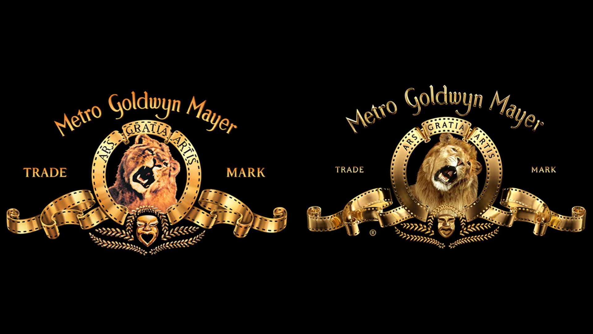
For the first time in over six decades, the lion has been reimagined in an evolution of MGM's renowned logo. In a somewhat controversial move, Leo (yep, he has a name) has been rendered in CGI – and the transformation is causing some alarm online. (Check out our top character design tips if you're looking for inspiration).
The new MGM logo is worth its weight in gold. #ArtForArtsSake #MGM pic.twitter.com/ch5H5LR51TMarch 8, 2021
Originally slated to launch in front of the delayed No Time to Die, the new logo (above) is described by MGM as "an evolution, not a revolution". Talking to Adweek, the studio's chief marketing officer, Stephen Bruno, says the design is a "commitment to the timeless, golden art deco design that has defined the brand since 1924".

Surprisingly, perhaps the most noticeable thing about the new design is how faithful it remains to the original. While the crisp and shiny new finish certainly looks more contemporary, the decorative design is a breath of fresh air in a world of flat, simplistic logo redesigns (we're looking at you, Warner Bros).
If anything, with the emphasised CGI lighting on that familiar gold film, we'd say the this design is a rare beast: a new logo that's actually more 3D than its predecessor. This is one design that's bound to please anyone suffering from flat design fatigue.
An evolution 97 years in the making. #ArtForArtsSake #MGM pic.twitter.com/2t0MiX9KixMarch 8, 2021
What isn't clear is exactly why MGM decided to replace the live action lion with a CGI version. Once you spot that Leo isn't real, it's difficult to unsee – which is already causing controversy online. Indeed, Twitter has (as Twitter does) already made its feelings known on the new design. Many users are loving the fact that the logo hasn't been overly simplified:
They didn’t take away all the detail and make it flat! https://t.co/q6L3HKEWjqMarch 8, 2021
I’m glad that all they did was some slight tweaking. The logo is too classic to change. Glad they didn’t do an oversimplified logo like a lot of companies are doing.March 8, 2021
But there are also plenty of users who aren't overly sold on the new CGI lion:
Get the Creative Bloq Newsletter
Daily design news, reviews, how-tos and more, as picked by the editors.
Is it just me, or does Leo the Lion look like a really bad deepfake in the new #MGM logo? https://t.co/E1gCVEkHXYMarch 8, 2021
https://t.co/v7MAmFaVrB pic.twitter.com/NLaOg1bnIUMarch 8, 2021
While we're fans of the pleasingly extravagant design as a whole, it's clear from the response to CGI Leo that MGM's new logo isn't exactly a roaring success. We can't help but wonder why the studio didn't opt to include the live action version of the beloved mascot inside the new design. For now, it seems our best logos round up is safe from the MGM lion.
Still, in the world of logo design, there are worse mistakes to be made than over-reliance on CGI. Just ask Amazon, whose new app icon recently came under fire thanks to a very (very) unfortunate resemblance.
Read more:

Thank you for reading 5 articles this month* Join now for unlimited access
Enjoy your first month for just £1 / $1 / €1
*Read 5 free articles per month without a subscription

Join now for unlimited access
Try first month for just £1 / $1 / €1

Daniel John is Design Editor at Creative Bloq. He reports on the worlds of design, branding and lifestyle tech, and has covered several industry events including Milan Design Week, OFFF Barcelona and Adobe Max in Los Angeles.
