New Marvel film logo is a nostalgia overload for designers
The new trailer for Thor: Ragnarok features a logo with a subtle nod to a famous comic book artist.
Yesterday was a big day for comic fans as they were treated to the trailer for the upcoming Thor: Ragnarok film. The movie, which will be the 17th instalment in the Marvel Cinematic Universe, sees Thor going head-to-head with another Marvel favourite, the Incredible Hulk, in what promises to be an epic confrontation.
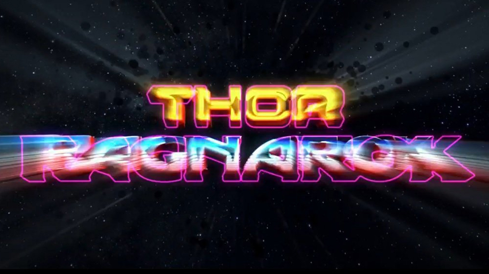
However there's plenty more for eagle-eyed designers to get excited about. Interspersed throughout the trailer is a distinctive logo design and word mark (see above) packed with 80s charm and the signature technique of renowned comic book artist Jack Kirby.
That's right, the faint blob shapes which appear in the light beams blasting out from behind the logo are what fans call the Kirby Krackle. This artistic convention represents mysterious energies and dates back to Jack Kirby's work on the Fantastic Four and Thor comics in the 1960s.
On top of this nod to Marvel heritage, the Thor: Ragnarok wordmark is filled with details that have got designers pining for the past. Whether it's the transition effect that echoes the Superman films from the late 70s and 80s, or the shiny, blocky typeface that wouldn't look out of place on a Commodore 64 game, there's plenty to enjoy. And, a usual, they've taken to Twitter to praise the design work...
Everyone is posting gifs of Loki and no-one is posting gifs of the Masters of the Universe style logo. #ThorRagnarok pic.twitter.com/DFmv5FrQ5WApril 10, 2017
I do like that the logo looks like there will be an amazing Commodore 64 tie in game. #ThorRagnarok pic.twitter.com/Fn0uoh09RZApril 10, 2017
Not sure if this was a visual reference for the RAGNAROK design… but I sure hope it was. pic.twitter.com/vRWw7yWwxuApril 10, 2017
My only irk is that the Thor logo is a bit too much like Guardians. They're both using similar effects and vibe.April 10, 2017
LOOK AT THIIIIIIIIIIIIS 🙌🏻🙌🏻🙌🏻 #ThorRagnarok pic.twitter.com/pd5ezQSkC6April 10, 2017
I'm loving the #KirbyKrackle around the #ThorRagnarok logo in the new trailer. So much #JackKirby in one trailer..... pic.twitter.com/OvcXQp5qeYApril 10, 2017
But those Kirby cosmic dots in the #ThorRagnarok logo!!! #jackkirby #marvel #thor #HULK pic.twitter.com/ApGkkgIgFmApril 10, 2017
Related articles:
- Marvel Studios unveils new logo
- 10 best movie posters from the 1990s
- 15 most imaginative movie wallpapers
Get the Creative Bloq Newsletter
Daily design news, reviews, how-tos and more, as picked by the editors.

Thank you for reading 5 articles this month* Join now for unlimited access
Enjoy your first month for just £1 / $1 / €1
*Read 5 free articles per month without a subscription

Join now for unlimited access
Try first month for just £1 / $1 / €1
Dom Carter is a freelance writer who specialises in art and design. Formerly a staff writer for Creative Bloq, his work has also appeared on Creative Boom and in the pages of ImagineFX, Computer Arts, 3D World, and .net. He has been a D&AD New Blood judge, and has a particular interest in picture books.

