It's torn up the script on a 135-year-old wordmark.
(Image credit: Johnson and Johnson)
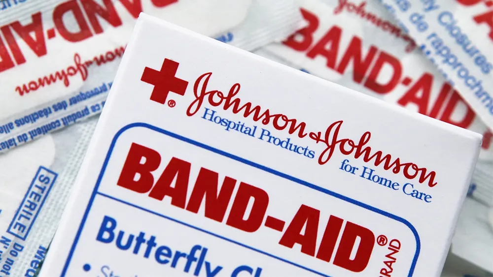
Johnson & Johnson is one of the world's biggest pharmaceutical companies. It also laid claim to having one of the world's oldest logos still in use – a widely recognised cursive design based on co-founder James Wood Johnson’s signature.
But that familiar flowing script will be no more. After 135 years, the company has revealed a new Johnson & Johnson logo that's, well... perhaps a lot like what you would expect from a pharma logo in 2023. It's cleaner and easier to read but could be seen to lack distinction. It might seem a strange decision to ditch a widely recognised design - imagine if Coca-Cola announced it was ditching its script for a sans serif logo (see our pick of the best cursive logos for other examples). But there are reasons for the change.
The new Johnson and Johnson (bottom) replaces a design that's remained almost unchanged in over 100 years (Image credit: Johnson and Johnson)
The new Johnson & Johnson logo follows the line of recent trends towards cleaner, simpler designs, dropping the handwritten type for a sans serif font in a brighter shade of red while keeping the ampersand and the lack of word spacing to ensure continuity.
Latest Videos From Creative Bloq
The decision to introduce a new logo after so long was perhaps partly due to changing times. In an era when many children no longer learn to write cursive script, the legacy logo is showing its 135 years, and it's not exactly the most legible, even among script logos. Many people are likely to see it and recognise it but perhaps not even read what it says. But the main reason for the new logo is a change in the company's purpose.
The company says a version of the Johnson and Johnson logo first appeared on its early products for sterile surgical procedure in 1887 (Image credit: Johnson and Johnson)
As J&J points out in its announcement about the new identity, the Johnson & Johnson script logo is mostly associated with consumer brands like its baby shampoo, Listerine mouth wash, Band-Aid plasters and its now discontinued baby powder. It no longer makes these products because it span off its consumer healthcare business earlier this year to create a new company called Kenvue, which intends to gradually phase out J&J branding. That leaves Johnson & Johnson focused on innovative pharmaceuticals and medical devices. And a decades old handwritten logo wasn't really in keeping with that forward-looking focus.
The new Johnson and Johnson logo is unlikely to be popular with those who claim that logos are all starting to look the same, but a change feels necessary to communicate the company's new focus. As we saw in our pick of the best new logos, most contemporary logo designs are going for a simple, easily legible approach, although that doesn't necessarily mean they can't have some fun with typefaces and hidden Easter eggs.
Get the Creative Bloq Newsletter
Daily design news, reviews, how-tos and more, as picked by the editors.
Thank you for reading 5 articles this month* Join now for unlimited access
Joe is a regular freelance journalist and editor at Creative Bloq. He writes news, features and buying guides and keeps track of the best equipment and software for creatives, from video editing programs to monitors and accessories. A veteran news writer and photographer, he now works as a project manager at the London and Buenos Aires-based design, production and branding agency Hermana Creatives. There he manages a team of designers, photographers and video editors who specialise in producing visual content and design assets for the hospitality sector. He also dances Argentine tango.