The new Honda logo is yet another blast from the past
What's old is new again in 2024.
Logo trends come and go, and while simplified wordmarks were all the rage a few years back, things seem to be veering away from modernism once again – so much so that we've seen several brands take a leaf from their own history books when approaching new logos in recent years. And the latest to bring back an old logo with a modern twist is car manufacturer Honda.
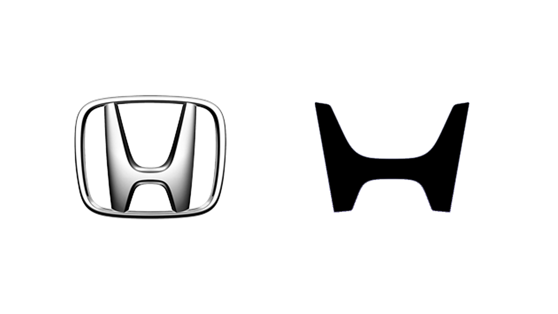
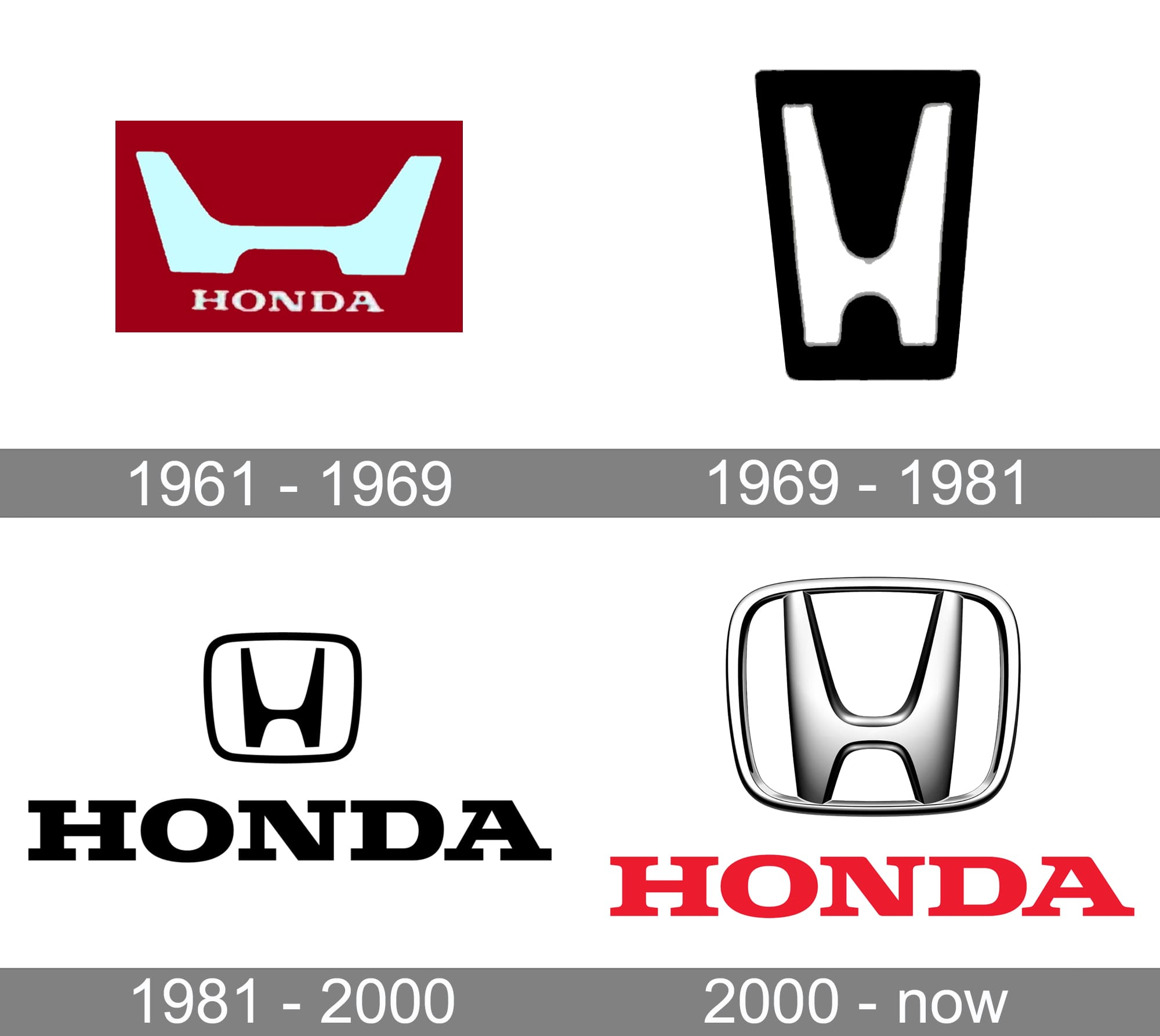
At this year's CES, Honda revealed a bunch of new electric cars featuring an updated 'H' logo. Like most car brands over the last few years, Honda has finally moved away from the skeuomorphic metallic look. Honda has indeed opted for a flatter, simpler version of the symbol – but with its sharper lines and more outwardly angled points, this one actually harkens back to the brand's 1961 original. (For design inspiration, check out the best logos of all time.)

Gone is the border surrounding the 'H' mark, while Honda claims that the more sharply angled lines are designed to resemble a pair of "outstretched hands" (yeah, I'm not quite seeing it either). Honda says the new H mark will be used exclusively for the next-generation EV models of Honda.

"The current “H mark” has a long history, dating back to 1981 when it was renewed from the previous version," Honda says "To commemorate the development of the next-generation EVs, Honda decided to design a new H mark, which represents Honda automobiles, to express Honda’s determination to pursue the transformation as well as Honda’s corporate attitude of going beyond the origin of Honda and constantly pursuing new challenges and advancements. This design expression, like two outstretched hands, represents Honda’s commitment to augment the possibilities of mobility and sincerely serve the needs of the users of Honda EVs. This new H mark will be used on next-generation EVs of Honda, including Honda 0 Series models."
It'll be a while until the new logo hits the road, with the Series Zero Saloon model not due to enter mass production until 2026. But like the updated Burger King, Burberry and Pepsi logos, the new Honda mark proves that, like last year, what's old is new again in 2024.
Get the Creative Bloq Newsletter
Daily design news, reviews, how-tos and more, as picked by the editors.

Thank you for reading 5 articles this month* Join now for unlimited access
Enjoy your first month for just £1 / $1 / €1
*Read 5 free articles per month without a subscription

Join now for unlimited access
Try first month for just £1 / $1 / €1

Daniel John is Design Editor at Creative Bloq. He reports on the worlds of design, branding and lifestyle tech, and has covered several industry events including Milan Design Week, OFFF Barcelona and Adobe Max in Los Angeles.
