Wow, people actually LIKE a new Google logo
New Google Fonts icon is a winner.
Sign up to Creative Bloq's daily newsletter, which brings you the latest news and inspiration from the worlds of art, design and technology.
You are now subscribed
Your newsletter sign-up was successful
Want to add more newsletters?
Five times a week
CreativeBloq
Sign up to Creative Bloq's daily newsletter, which brings you the latest news and inspiration from the worlds of art, design and technology.
Once a week
By Design
Sign up to Creative Bloq's daily newsletter, which brings you the latest news and inspiration from the worlds of art, design and technology.
Once a week
State of the Art
Sign up to Creative Bloq's daily newsletter, which brings you the latest news and inspiration from the worlds of art, design and technology.
Seasonal (around events)
Brand Impact Awards
Sign up to Creative Bloq's daily newsletter, which brings you the latest news and inspiration from the worlds of art, design and technology.
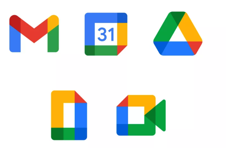
Google rolled out a whole lot of new logos last year, with pretty much the entire of Google Workspace getting a colourful new look. But with each new design, the rebrand as a whole grew more and more unpopular, with many flummoxed by the confusing similarity between the icons.
While the brand new Google Fonts logo borrows the same minimal, four-colour design language as its contentious counterparts, this is the first new Google icon that users actually seem to like. While it's unlikely to hit our best logos list any time soon, at least the new design shows it's possible for a Google icon to look a little, you know, unique.
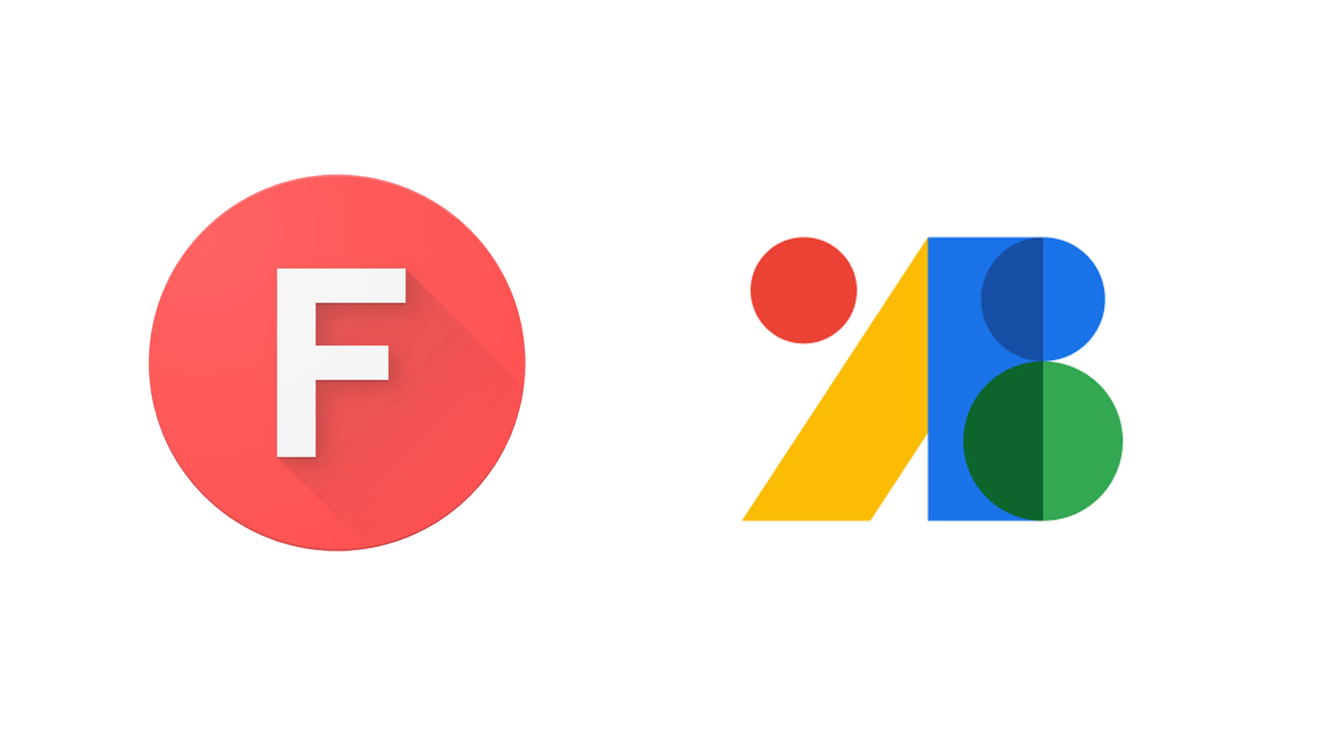
The new logo is a pleasingly typographical affair, featuring an overlapping series of colourful glyphs and shapes. It's much more distinctive that the underwhelming 'F' monogram (above) that previously graced the font library.
"We decided to rebrand our monogram "F" symbol and turn it into something new that captures the essence of the products & services that Google Fonts offers," Google says. "The new visual mark gives us greater design flexibility, as well as inspiration for the overall look and feel of the UI to better reflect our vision for the future of Fonts."
But while it's certainly a more contemporary design than the old logo, perhaps the best thing about the new version is that it manages to look truly distinct from the likes of Gmail, Google Photos, Google Drive et al, whilst retaining that familiar four-tone Google aesthetic. Indeed, with its clean, jagged edges, this one is likely to stand out in the Google Workspace crowd – something that can't be said for the rest of the new icons (below).
As well as the new logo, Google also announced (below) that Google Fonts now supports open source icons, starting with the company's own Material Design icons. If you're looking for more typographical inspiration, check out our best free fonts.
We're adding open source icons to Google Fonts, starting with Material Icons! Read all about it on the Material blog: https://t.co/SAPa5u7FY1Oh and yes, we have a new logo too! Thanks for asking 😀 pic.twitter.com/1mWK7A6q4IMarch 2, 2021
For once, it seems the internet is actually enjoying a new Google icon. Twitter's praise for the new Google Fonts logo is a far cry from the response to last year's Workspace logos, which even saw one user create a Chrome extension to bring the old logos back.
Sign up to Creative Bloq's daily newsletter, which brings you the latest news and inspiration from the worlds of art, design and technology.
the new google fonts logo???? I LOVE ITMarch 3, 2021
This is fantastic. Thank you, Google Fonts. And I dig the new logo too.March 3, 2021
Material icons are now part of Google Fonts… also the new logo is looking great.https://t.co/YIjbm4QzjKMarch 3, 2021
The new Google Fonts icon proves that it is possible to create consistent logos that don't all look the same – and we'd be glad to see Google tweak the rest of its designs to inject a touch of Fonts-inspired individuality. Still, while Google's icons might look rather alike, there are certainly worse things they could resemble than each other – as proven by Amazon's embarrassing new app icon.
Read more:

Daniel John is Design Editor at Creative Bloq. He reports on the worlds of design, branding and lifestyle tech, and has covered several industry events including Milan Design Week, OFFF Barcelona and Adobe Max in Los Angeles. He has interviewed leaders and designers at brands including Apple, Microsoft and Adobe. Daniel's debut book of short stories and poems was published in 2018, and his comedy newsletter is a Substack Bestseller.
