New GoDaddy logo is a massive improvement
GoDaddy embraces a welcoming new logo – and finally replaces that creepy ginger chap.
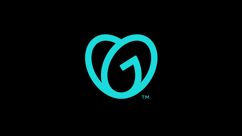
Web domain giant GoDaddy has a new logo and brand message. This dramatic redesign represents a new (and welcome) direction for the web hosting company, which was previously operating behind a somewhat quirky brand image, full of personality but projecting a confused aesthetic. One of our recommended web hosting services, GoDaddy has been operating since 1997 and is now entering a new era that aims to put all the focus on its users.
Our new logo, the GO, is all about empowering you — the everyday entrepreneur — to do what you love. Go after your dreams and make ‘em real, knowing we’re here to help every step of the way. #makeyourownway pic.twitter.com/8eVtTRrSIDJanuary 14, 2020
Announced today in the above tweet, the new logo, known as the 'Go' is an interlocking G and O. The design steers in the same direction as the recent rebrand at airbnb, with a friendly, curvy heart-like shape and minimal noise. The new GoDaddy logo was created by GoDaddy's internal design team in collaboration with external branding firms Codo and Lippincott.
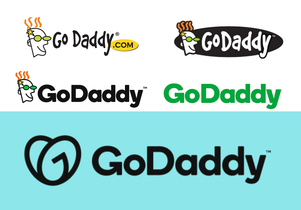
Many would say a new look is overdue for GoDaddy, which rose to popularity accompanied by an unsettling, in-your-face cartoon head. This icon was removed from the brand's website in 2018, and since then, GoDaddy has been operating without a logo, relying solely on its wordmark. The new logo marks a welcome shift in positioning for the company, and seeks to create a completely different kind of emotional response.
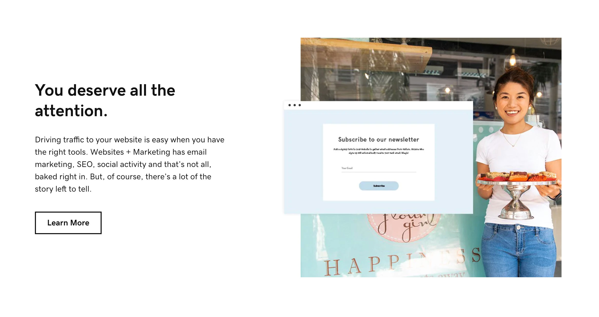
Along with the new logo and identity comes a new website and new advertising campaigns, both of which are sleek, sparse and devoid of the sales pitches and cartoon images of old. The 'everyday entrepreneurs' mentioned in the brand message are at the centre of the new advertising strategy, which features real-life GoDaddy users telling their stories.
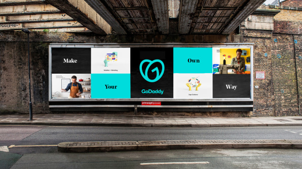
"It represents the entrepreneurial spirit," GoDaddy chief brand officer Cameron Scott told Fast Company. "All of our customers have an idea, and they all have initiative. We are there to say, ‘We’re here with you for your first step. We’re here with you for your next step. And we’ve got your back every step of the way."
The brand message clearly aims to be uplifting, but the wording (on the tweet at least) comes across as – dare we say it – a little bit twee. However, GoDaddy is deadly serious in its crossover to the new brand identity. The brand was conscious that is own personality was getting in the way of the user's story, and the streamlined design and user-centred message aims to put the customer firmly back in the driver's seat.
GoDaddy is bucking the recent rebrand trend (see Reebok and Warner Bros), which has been to refresh rather than rebrand, to build on brand history with the aim of strengthening public attachment. But since the public doesn't have the same sort of emotional attachment to GoDaddy, a change in direction is definitely welcome in this case.
Get the Creative Bloq Newsletter
Daily design news, reviews, how-tos and more, as picked by the editors.
Read more:

Thank you for reading 5 articles this month* Join now for unlimited access
Enjoy your first month for just £1 / $1 / €1
*Read 5 free articles per month without a subscription

Join now for unlimited access
Try first month for just £1 / $1 / €1

Georgia is lucky enough to be Creative Bloq's Editor. She has been working for Creative Bloq since 2018, starting out as a freelancer writing about all things branding, design, art, tech and creativity – as well as sniffing out genuinely good deals on creative technology. Since becoming Editor, she has been managing the site and its long term strategy, helping to shape the diverse content streams CB is known for and leading the team in their own creativity.
