Has Firefox accidentally revealed its new logo?
A careless tweet might have leaked Firefox's new logo design early.
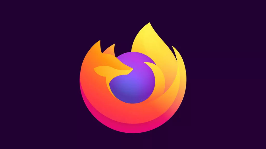
UPDATE: The new logos have now been announced. Take a look and read more here: The New Firefox logos have officially arrived.
Mozilla Firefox was due to reveal its shiny new logo design on 10 June, but you might already be able take a look at it right now. The potential redesign was discovered on the browser's developer site, as well as being leaked on social media by the Firefox's lead designer.
As far as slip ups go, this early reveal is a pretty big one. Our comprehensive guide to what makes a good logo design points out that launching an identity is an important part of any rebrand process.
The potential new logo (above) was pounced on by CNET, and we can see that the icon still retains all the familiar Firefox design elements. Orange fox? Check. Blue globe? Check. The pair are even wrapped around each other in the same way as the previous logo, which has been in use since 2017.
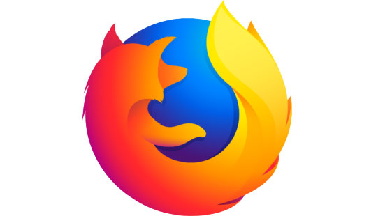
What is different though, is the fox. More sleek and stylised, the simplified logo has chopped off the poor vulpine critter's arms, and look's like its coat's been given a brush. The gradient colours are pretty similar to the previous design, but the whole thing looks that bit more polished.
Sean Martell, Firefox's communication design leader, appeared to reveal the design on Tuesday. In a photo he tweeted of a box of stickers, packs of the new logo can clearly be seen. There are two versions of the logo, including the regular orange and yellow design, plus a blue and purple variation that could be used in the browser's developer platform.
A purple and green version can also be seen on the developer platform. This design matches the image Martell tweeted, making it likely that this is the logo users can expect to see soon.
Get the Creative Bloq Newsletter
Daily design news, reviews, how-tos and more, as picked by the editors.
I am ready. pic.twitter.com/TaB3tX8UZZJune 4, 2019
If you're a fan of all things Firefox, you might remember that last year we covered how the open-source web browser already asked people to help design its new logo. Back then, creative director Tim Murray also presented people with two potential design systems (see image below) and invited the internet to share feedback.
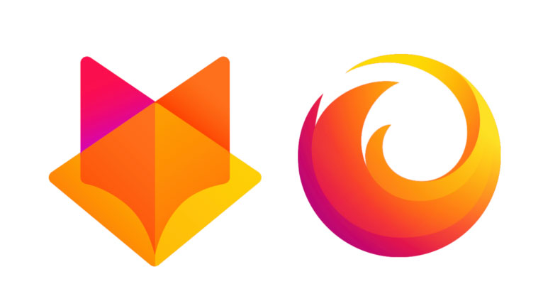
And out of those systems it looks like Firefox settled a version that falls halfway between the two. This makes it difficult to predict how the accompanying icons will appear. But if the Firefox tweet Martell replied to is anything to go by, users can expect to see line-based graphics from the second design system.
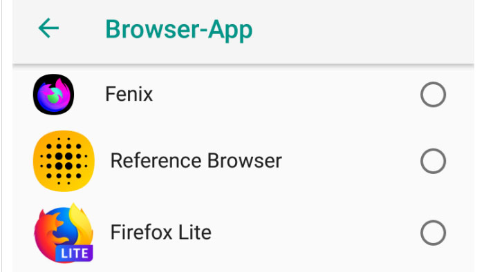
While it's very likely that this is the new Firefox logo design, we have to wait until next week to be certain. The non-profit organisation will officially reveal its new logo on 10 June.
Related articles:

Thank you for reading 5 articles this month* Join now for unlimited access
Enjoy your first month for just £1 / $1 / €1
*Read 5 free articles per month without a subscription

Join now for unlimited access
Try first month for just £1 / $1 / €1

Dom Carter is a freelance writer who specialises in art and design. Formerly a staff writer for Creative Bloq, his work has also appeared on Creative Boom and in the pages of ImagineFX, Computer Arts, 3D World, and .net. He has been a D&AD New Blood judge, and has a particular interest in picture books.
