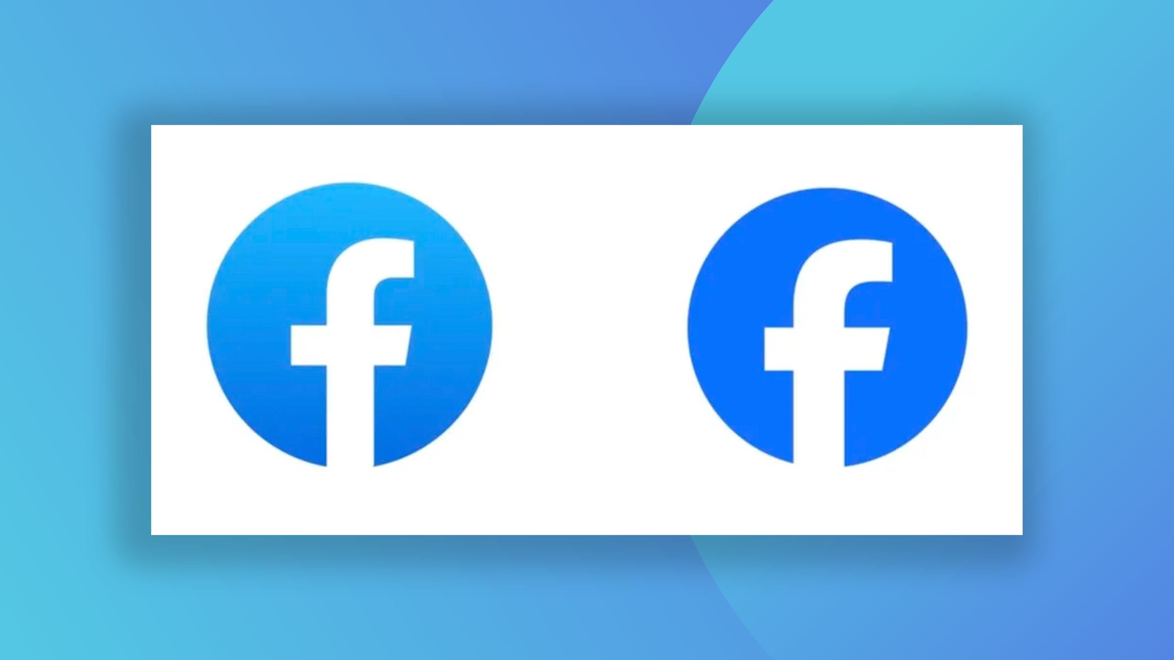
Facebook has a new logo, apparently
People are roasting the subtle changes.

New logos for big brands tend to be headline-grabbing things, accompanied by social media hot takes and a ton of explanation and rationale from the brand. But if the new Facebook logo had passed you by, you're not alone.
Meta has announced a "refreshed design" for the Facebook logo, including a tweaked typeface and brighter colour. The company calls it a bolder expression of Facebook's core blue, but users are struggling to tell the difference. (Looking for design inspiration? Check out the best logos of all time.)
"Our intention was to create a refreshed design of the Facebook logo that was bolder, electric and everlasting. Each of the distinctive, new refinements drive greater harmony across the entire design as a key element of the app’s identity. We’ve done this by incorporating a more confident expression of Facebook’s core blue color that is built to be more visually accessible in our app and provides stronger contrast for the “f” to stand apart," Meta explains in a blog post.
Basically, it's a bit bluer. And the Facebook wordmark has a changed a bit too. “Using our custom typeface, Facebook Sans, we redesigned the wordmark and logo to create a consistent treatment and improve overall legibility across Facebook,” Meta announced. “Similar to the changes to the logo symbol, these refinements allowed us to build upon the heritage of our identity, while creating a stronger relationship between how the wordmark pairs with the rest of the typeface.”
Let's be honest, Meta could probably have got away with dropping these tweaks without an announcement. But big companies love to explain the ethos behind their every design decision (just look at this ridiculous Pepsi logo design document). And as you might expect, Twitter (sorry, X) users are roasting the minor change.
https://t.co/Zt3GlrexyT pic.twitter.com/aIOwKcYEP8September 21, 2023
it’s giving https://t.co/OAn60MAuBF pic.twitter.com/2Z1oaYgl4bSeptember 21, 2023
me when i say i will change https://t.co/iSbu2sTZJqSeptember 21, 2023
Facebook isn't the only brand to drop a very subtle new design – just last week, we almost didn't notice the new Ford logo. If you're inspired to create something as game-changing as Meta's latest, take a look at our guide on how to design a logo.
Sign up to Creative Bloq's daily newsletter, which brings you the latest news and inspiration from the worlds of art, design and technology.

Daniel John is Design Editor at Creative Bloq. He reports on the worlds of design, branding and lifestyle tech, and has covered several industry events including Milan Design Week, OFFF Barcelona and Adobe Max in Los Angeles. He has interviewed leaders and designers at brands including Apple, Microsoft and Adobe. Daniel's debut book of short stories and poems was published in 2018, and his comedy newsletter is a Substack Bestseller.
