New Evernote logo is more evolution than revolution
But there's a new elephant in the room.

It's been 10 years since Evernote hit the scene. Throughout the last decade, the mobile note-taking app has been there to help us record ideas and remember what we're doing.
To celebrate its anniversary, Evernote released a rebrand and new logo design earlier this week, after partnering with DesignStudio to bring its vision to life. This involved a long, hard exploration of what the Evernote brand meant and stood for, to create a design that signalled change – without reducing brand recognition.
On Evernote's Medium post about the overhaul, it's interesting to see the team acknowledge that there's more to a rebrand than simply changing a logo. The new design (above) is a polished – yet contrasting – version of the previous iteration (below) and gives a good indication of the concept underlying the design: this is a brand that’s rooted in heritage, but has expanded into new areas.

A purer colour palette, refined shape and more sophisticated font can all be found in the new logo. To keep the redesign focused, the teams kept a number of questions in mind at every strep of the rebrand. Namely: is it distinct? Does it embody the DNA of the brand? And is it better than what they already have? These considerations also influenced the new typography, textures and photography on the Evernote app and site.

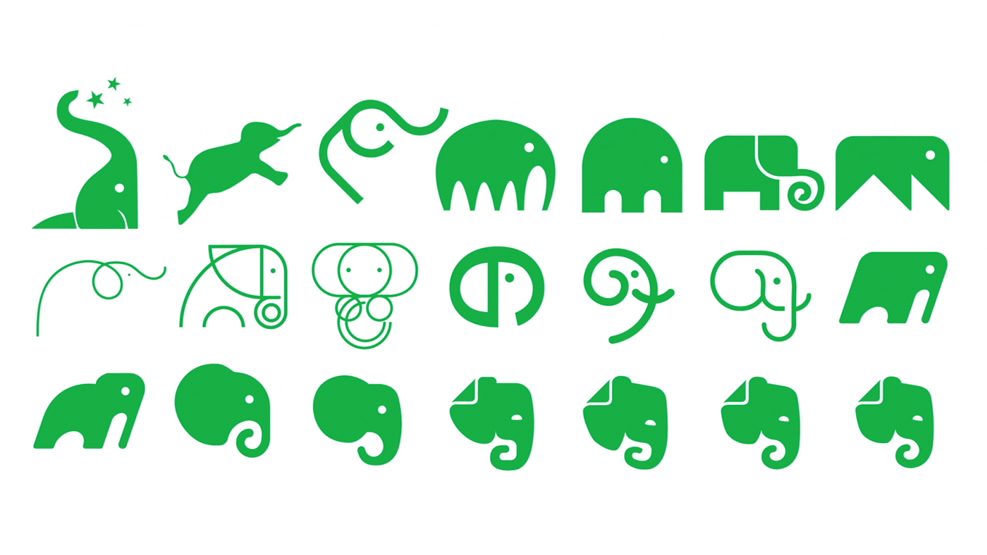
No design element went left unchallenged during the rebrand process. At one stage, even the familiar Evernote elephant mascot, Mads, almost got the chop in favour of a different logomark altogether.
Our brand now reflects our broader purpose
Chris O'Neill
"Throughout the process of evolving our brand, we have looked to our past for inspiration for our future," explains Evernote CEO Chris O'Neill. "We started as a place to remember everything, and that will never go away."
"But bringing ideas to action and helping people to work together have become equally important to our customers, and therefore equally important in the products and experiences we build. Our brand now reflects our broader purpose and is a public declaration of our excitement and optimism for Evernote’s future."
Get the Creative Bloq Newsletter
Daily design news, reviews, how-tos and more, as picked by the editors.
The rebrand isn't over yet though. Evernote's redesign is set to change and evolve along with the company, but you can watch the first step towards the new look in the video below.
Related articles:

Thank you for reading 5 articles this month* Join now for unlimited access
Enjoy your first month for just £1 / $1 / €1
*Read 5 free articles per month without a subscription

Join now for unlimited access
Try first month for just £1 / $1 / €1

Dom Carter is a freelance writer who specialises in art and design. Formerly a staff writer for Creative Bloq, his work has also appeared on Creative Boom and in the pages of ImagineFX, Computer Arts, 3D World, and .net. He has been a D&AD New Blood judge, and has a particular interest in picture books.
