They say that sometimes you have to go backwards to move forwards. Citroen has a new logo that manages to look leaner and bolder but also incredibly familiar. In fact, it's come full circle, or should we say, full oval? To develop a more modern logo better suited to digital uses, the French carmaker has travelled back 100 years to revisit its original oval-shaped symbol from 1919.
With a few tweaks, the result is a more prominent logo to spearhead the brand's transformation as it looks to "clarify its future". It's no retro gimmick, though, feeling like a genuine return to the logo's roots. It has new colours, type and a tagline too. And while I'm not saying it's one of the best logos of all time, it is a marked improvement on the current design.
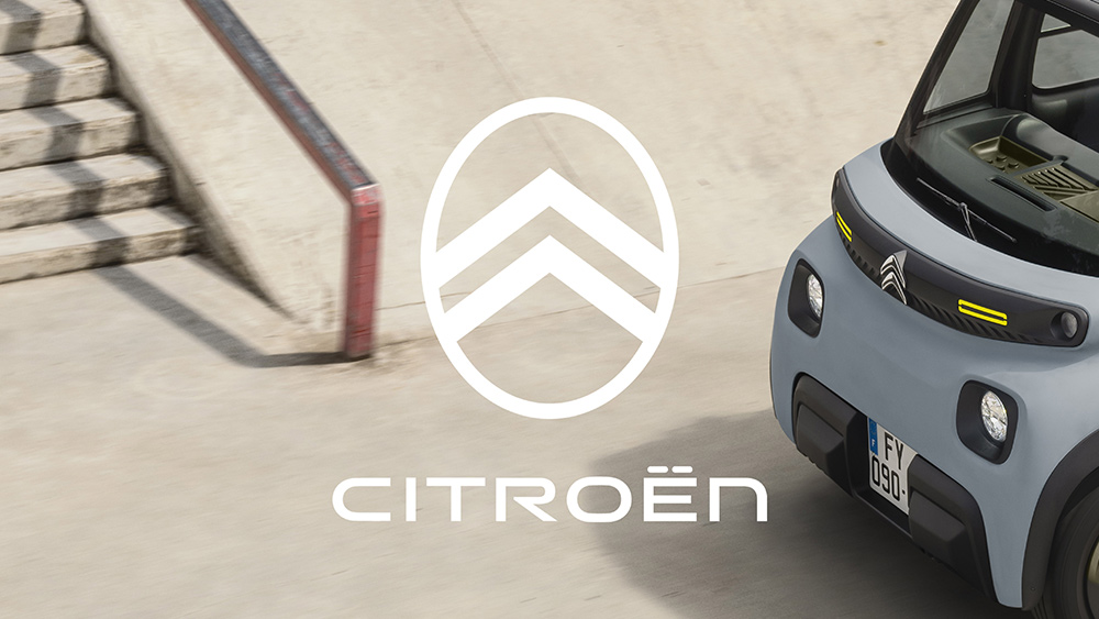
The current Citroen logo (left) and the new Citroen logo side by side (Image credit: Citroen)
The new Citroen logo sports the familiar deux chevrons that have been on every logo in the company's 103 years of history (of interest for trivia fans, apparently they're a nod to founder André Citroën’s first company, which was a metalworking business that produced chevron-shaped herringbone gear systems). The chevrons have been made wider and more prominent, and they're contrasted by a softer ("almost humanly soft", according to Citroen) vertical oval frame.
Latest Videos From Creative Bloq
As you probably already guessed, the logic behind the new logo is to achieve a better appearance "in the digital environment", but it’ll also be seen in all other uses, including signage at dealerships and as a prominent badge on all Citroen vehicles.
Image 1 of 2
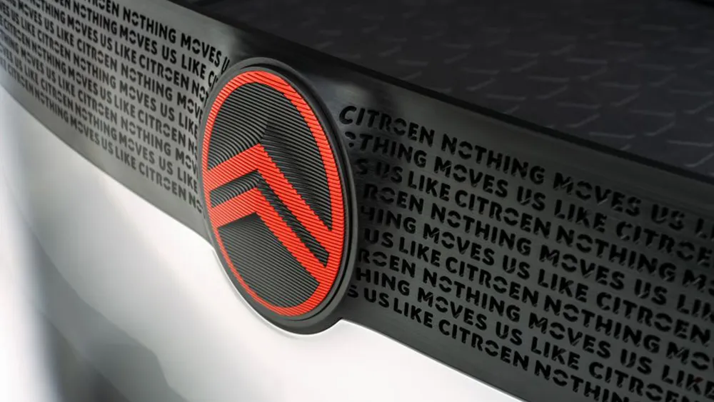
The new Citroen log was inspired by non-automotive brands(Image credit: Citroen)
The oval has an "almost human softness"(Image credit: Citroen)
Citroen’s global brand designer Alexandre Revert says: “As we look to clarify our future focus, it was logical for us to close the loop by coming back graphically to André Citroën’s first logo which represented the genuine promise of affordable and innovative mobility for all."
He describes it as a "significant if subtle evolution, where the precision of the technical, functional chevrons are embraced by and contrasted with the warmth and almost human softness of the oval that surrounds them.” The in-house design team, working with Stellantis Design Studio, took inspiration from non-automotive brands, including cosmetics and clothing, "to create a warmer expression of the brand". That's perhaps most clear when the logo's seen with the new colours and the wordmark, which is based on Citroen’s current proprietary fonts.
White and cold grey aim to communicate calm serenity while two contrasting colours will be used for details: Monte Carlo Blue, inspired by the 2CV and the DS, makes a comeback for corporate and retail applications, and a more energetic 'Infra-Red' will add dynamic contrast. There's also a new tagline, “Nothing Moves Us Like Citroën". Citroen says the new branding will debut on a new concept car at the end of September before rolling out across its range from the middle of next year.
Get the Creative Bloq Newsletter
Daily design news, reviews, how-tos and more, as picked by the editors.
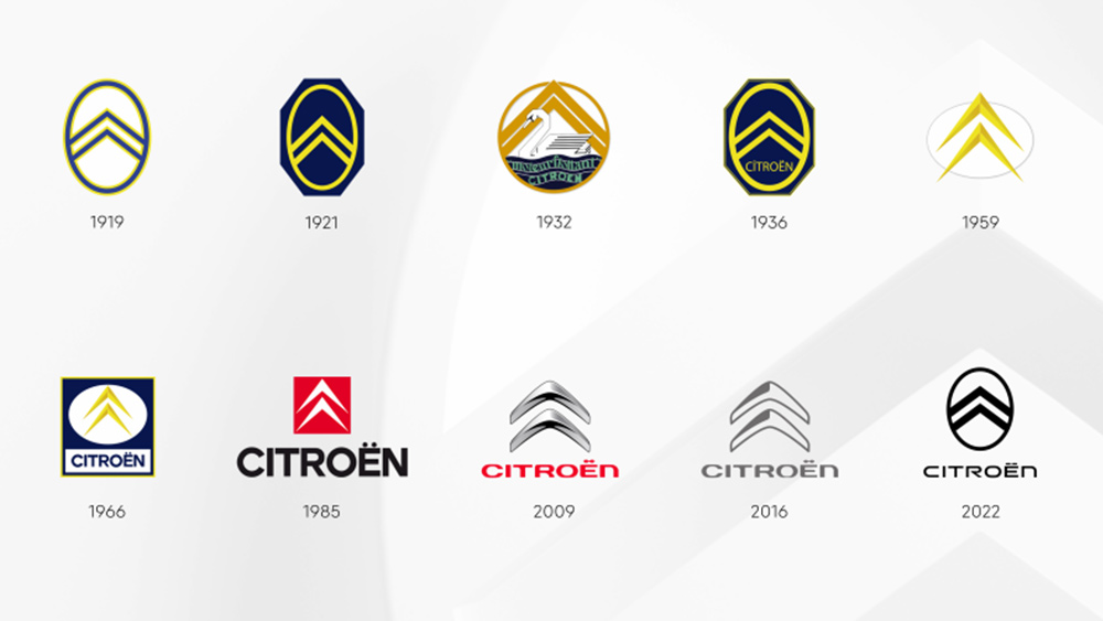
The Citroen logo history
The evolution of the Citroen logo (Image credit: Citroen)
The first Citroen logo was created in 1919. It's gone through several iterations since then, with one constant always remaining in some form – the 'deux chevrons'. However, in recent years they've been getting less chevron-like after going full-on 3D in 2009 and then being flattened while retaining shading from the 3D version, which made them look more like boomerangs, becoming only a reference to the original concept.
The new Citroen logo takes things back to the original logo with an oval outline and flat chevrons, but they've been made thicker. The type has also been made cleaner, with a more pleasing iteration of the previous font, which had retro futurist cyber feel to it. The logo is the latest in a string of recent logos from car makers, from a sharp new Aston Martin logo to a confusing new Skoda logo and the more radical Dacia rebranding.
Joe is a regular freelance journalist and editor at Creative Bloq. He writes news, features and buying guides and keeps track of the best equipment and software for creatives, from video editing programs to monitors and accessories. A veteran news writer and photographer, he now works as a project manager at the London and Buenos Aires-based design, production and branding agency Hermana Creatives. There he manages a team of designers, photographers and video editors who specialise in producing visual content and design assets for the hospitality sector. He also dances Argentine tango.