Can a new Byron logo save the struggling burger chain?
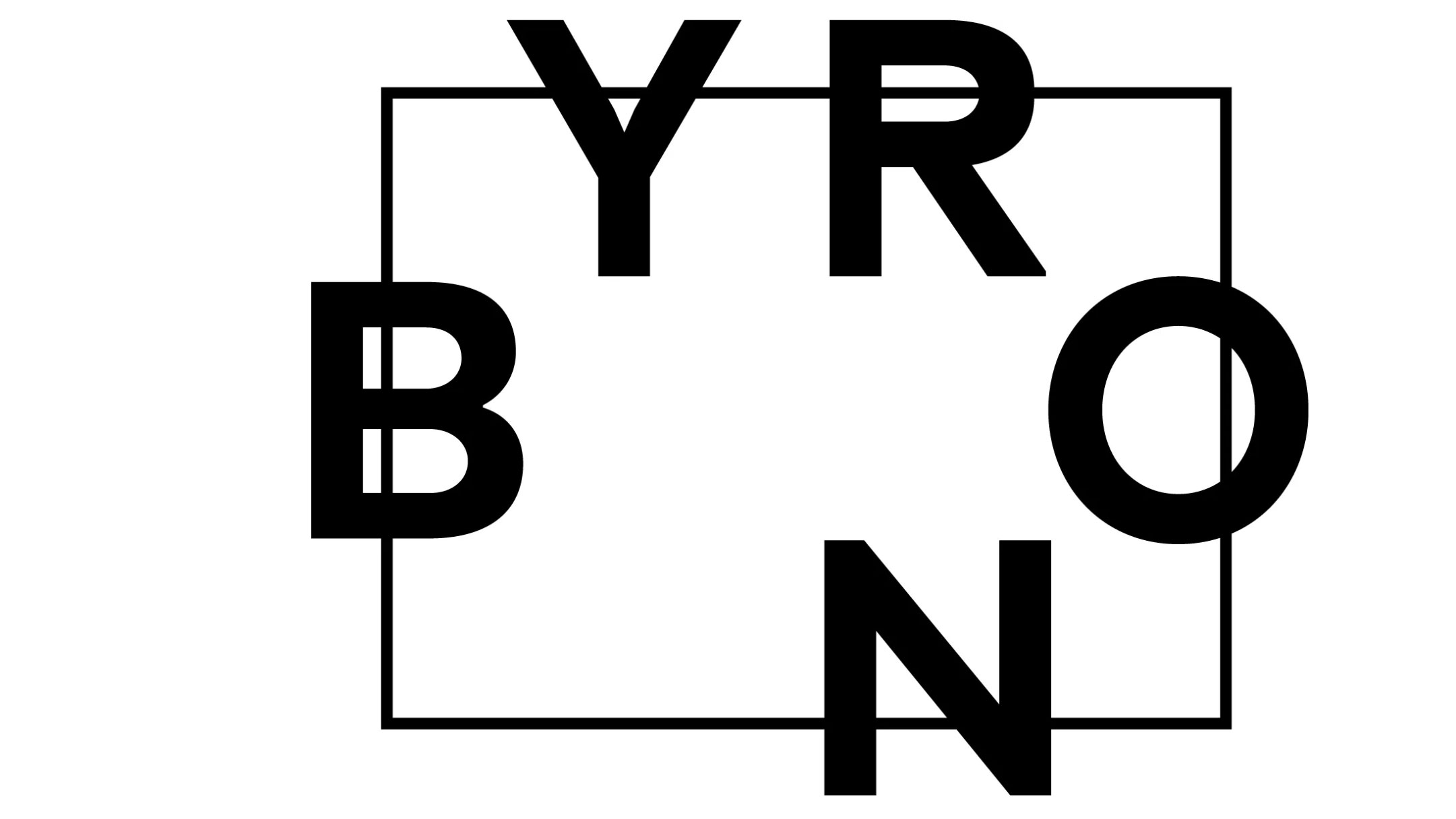
Byron's new logo seats its letters round a table.

Hamburger chain Byron has revealed a new logo, which forms part of a wider redesign for the struggling UK brand. The new logo aims to bring people back together, with each letter of 'Byron' representing a person around a dining table, accompanied by the tagline 'All Hail the Table'.
The brand redesign comes at a tricky time for Byron, which has faced financial difficulties and a wave of restaurant closures in recent years – not to mention a scandal involving its treatment of immigrant workers in 2016 that put a serious dent in its reputation. It looks like the chain is hoping the rebrand will help improve public perceptions – but will it provide the fresh start the company needs?
The new look is set to roll out to restaurants later this year. You can watch the logo in action, and see how the letters or 'people' in the logo come together around a table, in the video below. Alternatively, see our guide to logo design to see how the best logos have created impact.
According to Food Service News, Byron’s CEO Simon Wilkinson said, "The rationale behind the logo stems from our desire to bring people back around the table, to connect with each other and share quality time with friends. The logo is quite a literal translation of this, and brings Byron’s sense of fun to the visuals.
"As the UK dining scene continues to evolve, our logo represents the way we hope people will experience Byron in the future – together. It's a very simple idea, but one that we really believe in."
We're not 100 per cent sure that we "believe in" the new design, but it does make a refreshing change from many of the similar-looking sans-serif wordmarks we've seen lately, such as in the Uber rebrand. This new design feels like a paring back more in the style of the BT logo, yet with more of an edge. It's simple, yet feels surprisingly clever.

It's also worth noting that Byron has had a pretty experimental approach to its branding in the past. In the chain's early days, the logo often appeared in different iterations across different locations. So perhaps this new look also represents the brand becoming more unified.
Get the Creative Bloq Newsletter
Daily design news, reviews, how-tos and more, as picked by the editors.
The new logo unveil also coincides with a shake-up on the brand's social media. The chain's Facebook page looks to have been removed, and the brand's Twitter handle (unverified but linked from the official website) is new this month. Its only activity so far is a note to its rival, GBK, saying its burgers were better. It seems a slightly aggressive way to turn over a new leaf – is Byron perhaps looking to start a rivalry in the style of McDonald's vs Burger King?
@gbkburgers our burgers are betterAugust 6, 2019
The company's Insta account remains the same – presumably because those likes are too precious to lose. The new logo is in pride of place as its profile picture, but so far, there aren't any posts about it.
Watch this space to see how this one unfolds.
Read more:

Thank you for reading 5 articles this month* Join now for unlimited access
Enjoy your first month for just £1 / $1 / €1
*Read 5 free articles per month without a subscription

Join now for unlimited access
Try first month for just £1 / $1 / €1

Rosie Hilder is Creative Bloq's Deputy Editor. After beginning her career in journalism in Argentina – where she worked as Deputy Editor of Time Out Buenos Aires – she moved back to the UK and joined Future Plc in 2016. Since then, she's worked as Operations Editor on magazines including Computer Arts, 3D World and Paint & Draw and Mac|Life. In 2018, she joined Creative Bloq, where she now assists with the daily management of the site, including growing the site's reach, getting involved in events, such as judging the Brand Impact Awards, and helping make sure our content serves the reader as best it can.
