New Burberry logo is stripped of knighthood
The fashion brand jumps aboard the monogram trend.

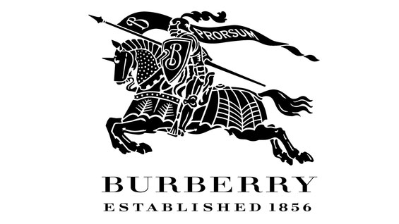
Just as fashions come and go, so too do logo designs. Even a design classic and wardrobe staple such as the Burberry logo (above) has to be consigned to the sale rail at some point. That's just what happened today as Burberry launched its new logo and monogram on Instagram.
The new logo (below) was designed in collaboration with Burberry and Peter Saville, and replaces the famous Burberry Equestrian Knight Logo which in one form or another has been going strong since 1901.
Before being put out to pasture, this chivalric design was last updated in 1999 when the brand dropped the letter 'S' from its name, switching from Burberrys to Burberry.
New @Burberry logo by Peter Saville pic.twitter.com/UKWdjjpzV2August 2, 2018
As you can see, the new logo goes for a straightforward text-based approach. The only design element to be carried over appears to be the black colour scheme, which in the original logo represented strength and durability.
Meanwhile, Italian designer Riccardo Tisci's new monogram takes the initials of the fashion brand's founder, Thomas Burberry, and weaves them into an interlocking and colourful design decked out in orange, white and beige. Accompanied by the hashtag #newera, Tisci is pinning his colours to the mast as he takes the company in a new creative direction.
The #ThomasBurberry Monogram August 2018 Burberry
A photo posted by @burberry on Aug 2, 2018 at 4:57am PDT
In a series of Instagram post published simultaneously by Tisci and Burberry, we get a unique glimpse into the creative process behind the new logo and monogram. It appears that the fashion label imposed an incredibly tight turnaround time of just four weeks for a project that usually takes at least four months.
We wonder if these email transcripts have been airbrushed, "you must be crazy" sounds like a restrained way to respond to that deadline.
Get the Creative Bloq Newsletter
Daily design news, reviews, how-tos and more, as picked by the editors.
A conversation between #PeterSaville and #RiccardoTisci Burberry
A photo posted by @burberry on Aug 2, 2018 at 2:29am PDT
So are the new designs trend setters or fashion victims? As we've come to expect from a rebrand, public opinion on social media has been split, with many mourning the loss of the recognisable equestrian logo. (One user commented that they should BurBURY the new look.)
It is a shame to see the back of the knight and horse motif, however we're not so upset to wave goodbye to that old font. And if Burberry want to add a dash of contemporary style to their look, we'd say it's mission accomplished.
As the 'prorsum' standard on the old logo used to say: 'forwards'.
Related articles:

Thank you for reading 5 articles this month* Join now for unlimited access
Enjoy your first month for just £1 / $1 / €1
*Read 5 free articles per month without a subscription

Join now for unlimited access
Try first month for just £1 / $1 / €1

Dom Carter is a freelance writer who specialises in art and design. Formerly a staff writer for Creative Bloq, his work has also appeared on Creative Boom and in the pages of ImagineFX, Computer Arts, 3D World, and .net. He has been a D&AD New Blood judge, and has a particular interest in picture books.
