Is BMW's radical logo redesign the car rebrand of the decade?
The first of many flat designs we saw in 2020.
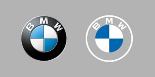
For many reasons, 2020 was quite an event. Among other things, it turned out to be the year of the new car logo, with everyone from Nissan to Rolls-Royce revealing new designs – almost all of which can be described in one word: flat. But perhaps the best of the bunch was the first to be revealed, a year ago this month.
Topping our list of the best car logos on the road, BMW's redesigned logo is a transparent, flat reimagining of its previously metallic emblem. Gone is the classic black outer ring (now completely transparent), and the 3D and lighting effects have been removed to create a minimal new look. The circle design remains, as do the white and blue colours of the company's home state of Bavaria.
A photo posted by on
We're big fans of the clear design. Its simplicity suggests it has been refreshed with digital in mind, but it also acknowledges the logo's 103-year heritage – a solid example of both classic and modern logo design. While it was met with some initial skepticism online, it soon became clear that the transparent design lends itself extremely well to both physical applications as well as digital – such as the fun reveal video above.
Jens Thiemer, senior vice president customer and brand, said in a press release, "BMW is becoming a relationship brand," (what, like Tinder?) and the transparent logo was designed to "radiate more openness and clarity".

BMW has since added the 2020 design to its article on the history of the logo. Seen in context (below), the boldness of this redesign is more obvious – the removal of the black ring appears to be the biggest change to the logo since its introduction in 1917.
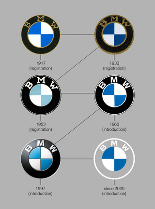
When BMW first published the article in 2019, we were particularly interested in its debunking of the common misconception that the logo itself represents a propeller. This stemmed from a 1929 ad (below) showing the logo in a rotating aircraft propeller to promote a new aircraft engine BMW was building.
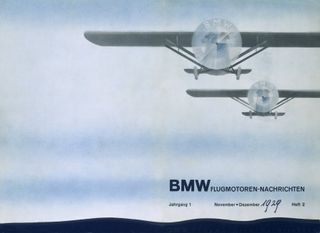
“For a long time, BMW made little effort to correct the myth that the BMW badge is a propeller,” the article states, "so sticking to the story that the BMW is a propeller would not be entirely wrong". In a world of red tape and impossibly strict guidelines, it's nice to hear a brand suggest that its logo can be whatever you want it to be.
Get the Creative Bloq Newsletter
Daily design news, reviews, how-tos and more, as picked by the editors.
It seems the flat car logo trend is set to continue into 2021, with Renault quietly unveiling a new design just last week. And possibly the most ridiculous logo reveal of all time took place this January, with Kia's grand ceremony putting even the most extravagant New Years' celebrations to shame.
Related articles:
- 10 of the best logos ever
- Where to find logo design inspiration
- Did Stellantis just reveal the worst car logo?

Thank you for reading 5 articles this month* Join now for unlimited access
Enjoy your first month for just £1 / $1 / €1
*Read 5 free articles per month without a subscription

Join now for unlimited access
Try first month for just £1 / $1 / €1

Daniel John is Design Editor at Creative Bloq. He reports on the worlds of design, branding and lifestyle tech, and has covered several industry events including Milan Design Week, OFFF Barcelona and Adobe Max in Los Angeles.
Related articles
-

-

-

-
