Ah, sports team logo updates. They can cause more debate, controversy and ridicule than a team's performance on the pitch. Football clubs have learned the hard way that imposing a new design without consulting fans can be major own-goal, but a more democratic approach isn't guaranteed to result in a win either.
The new Aston Villa logo is the result of a vote among members of the club. And the choice has sparked one of the fastest international meme fests we've seen – all thanks to the design's resemblance to the badge of another Premier League club (if you're looking for new tools to make your own logo designs – or just to design the memes – see our pick of the best graphic design software.

There are several reasons a football club might want to update its logo design. Sometimes its to modernise or make the logo easier to apply in contemporary uses, such as in app icons. The more cynical might even claim it's to sell new merchandise. But to look more like one of club's main rivals normally isn't one of the reasons.
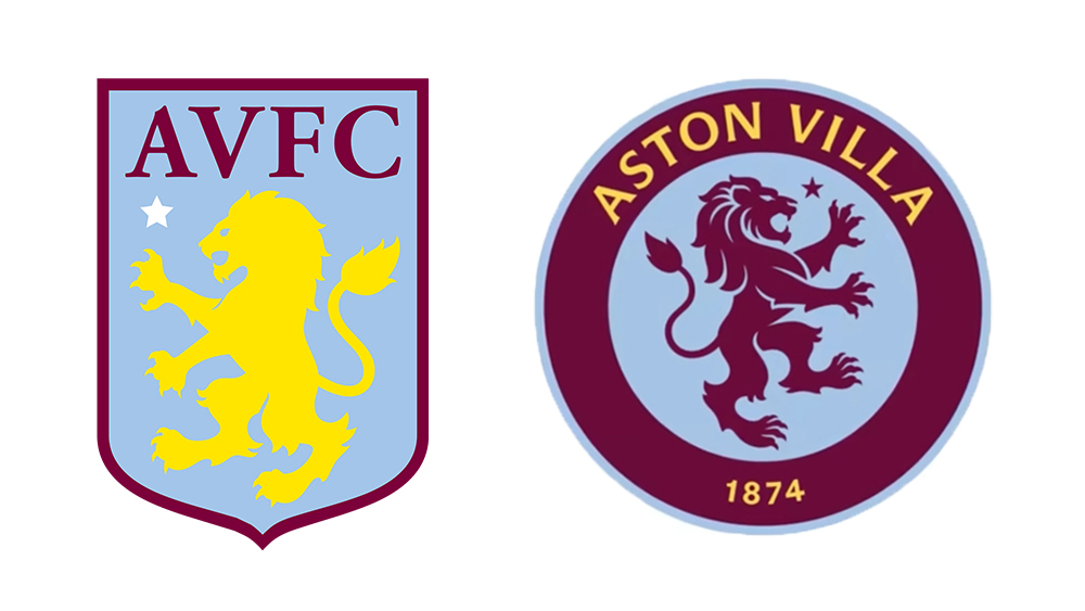
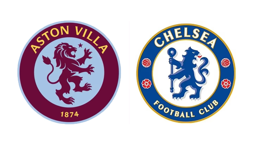
Nevertheless, the unveiling of a new Aston Villa logo has caused surprise among football fans all over the world for its undeniable resemblance to that of rival Premier League side, Chelsea. After a vote by fans, the Birmingham-based team will replaces it current shield with a roundel.
It features the club's lion in a blue centre with the club's name and the year it was founded, 1874, in the claret surrounding. In contrast to the existing logo, the lion is facing to the right, as in Chelsea's badge, and font has more understated serifs, again making it look more like Chelsea's design.

Chelsea fans have been merciless. "Congratulations on your new Chelsea badge," one person wrote on Twitter. "From this day forward, I will call Villa the purple Chelsea," someone else said.
Even Villa fans don't seem convinced by the results of the democratic process. Club historian Richard Whitehead told ITV News: “There's a fine line between respect for history and tradition and lazy nostalgia, and this feels like the latter." He also said he thought that such regular changes to the badge weakened the club´s brand.
Get the Creative Bloq Newsletter
Daily design news, reviews, how-tos and more, as picked by the editors.
Introducing: Aston Villa Football Club's new crest from the 2023/24 season. 🟣November 10, 2022
Aston Villa new logo 🤝 Chelsea logo pic.twitter.com/1vL3RE7IQbNovember 13, 2022
Intanto l’Aston Villa ha presentato il suo nuovo logo, il quale è stato votato dai tifosi e sarà utilizzato a partire dalla prossima stagione.Non lo so Rick…#Chelsea #AstonVilla pic.twitter.com/hwiSg5AnfXNovember 12, 2022
Chelsea fans when they see the new Aston Villa Logo pic.twitter.com/5VF6CTh1SWNovember 11, 2022
pic.twitter.com/PO8WTnQXoSNovember 10, 2022
Let's hope the first team give it 108% on the pitch tonight!🤔 pic.twitter.com/guckauy6Z8November 10, 2022
Introducing: Cook Street United Football Club's new crest from the 2023/24 season 🔵 pic.twitter.com/CcBeNF8RVvNovember 10, 2022
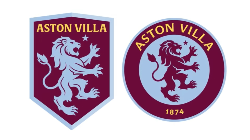
Villa say their new design was the result of "an extensive period of fan consultation, creative exploration and crafting". Two designs were shortlisted and, out of 23,500 fans who voted, 77 per cent favoured the winning design over the alternative – a gas lamp-shaped design more in keeping with the existing Aston Villa crest (see below).

Some fans have suggested that a few small details could have made all the difference to prevent the crest from looking quite so similar to Chelsea's, from keeping the existing typeface to including a shield in the roundel.
These Retro Retakes by @DanKNorris is a hundred times better than all of the club crests of @AVFCOfficial untill now.This is class. Im just in love with theseespecially how those details on the lion go verywell with those retro fonts. 👌Not unlike the Myriad pro used by AVFC pic.twitter.com/7hB8AhJUO6November 11, 2022
pic.twitter.com/CG2OcHeHAPNovember 10, 2022
To be fair, we should point out that Aston Villa did not really copy the new design from Chelsea – at least not this time round. A look back at the club's past logos shows that it has used a circular logo on several occasions before.
A circular logo is hardly unique to Chelsea either. In 2015, Manchester City switched from an elaborate crest to a circle logo – also through the decision of fans. In fact, many teams have switched to roundel's too, presumably deciding that it creates a cleaner design that's easier to apply in social media. But it's starting to look all a bit samey, as if clubs are taking a template and adding their own name and colours.
Es cierto, ya el Aston Villa había usado ese tipo de logo hace 49 años y usaron primero el león 🦁 antes que el Chelsea. pic.twitter.com/NJmJJy5Q6QNovember 10, 2022
Oh look another round badge pic.twitter.com/VLHc8Gw7UMNovember 10, 2022
The Aston Villa logo looks especially similar to Chelsea's because of the unlucky coincidence that team also has a lion as its symbol, but then Villa fans will be keen to point that they had a lion before Chelsea... so did Chelsea actually copy Villa? Or did they both copy Rangers FC? Either way, perhaps it doesn't really matter considering how badly fans could draw football team logos from memory in a recent study.
Read more:

Thank you for reading 5 articles this month* Join now for unlimited access
Enjoy your first month for just £1 / $1 / €1
*Read 5 free articles per month without a subscription

Join now for unlimited access
Try first month for just £1 / $1 / €1

Joe is a regular freelance journalist and editor at Creative Bloq. He writes news, features and buying guides and keeps track of the best equipment and software for creatives, from video editing programs to monitors and accessories. A veteran news writer and photographer, he now works as a project manager at the London and Buenos Aires-based design, production and branding agency Hermana Creatives. There he manages a team of designers, photographers and video editors who specialise in producing visual content and design assets for the hospitality sector. He also dances Argentine tango.
