New Adidas site takes it back to the '90s
The Yung Series site is straight out of the dark days of early web design – but it's all thoroughly modern underneath.
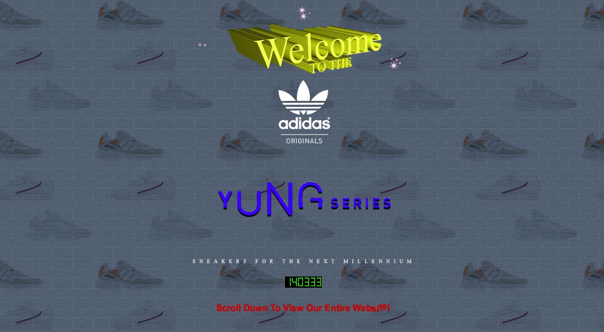
If you're feeling retro, we have a real old-skool treat for you today. Adidas has always had a keen eye for design, not only with its sneaker designs but also in its promotional work, and its latest effort is no exception.
To promote the latest additions to its '90s-inspired Yung series, the company has gone full retro and unleashed a site that's steeped in the questionable aesthetic of all those GeoCities websites from the exuberant youth of the World Wide Web, and which also hooks hard into the current trend for Brutalist websites. Needless to say, we absolutely love it.
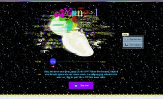
The new Yung Series website gleefully raids the old GeoCities dressing-up box and flings everything it finds at the screen, to retina-searing effect. You name it, it has it, from flagrant abuse of animated GIFs through to rampant colour cycling, horrible tiled backgrounds, awful 3D renders, system fonts and the obligatory 'UNDER CONSTRUCTION' banners. The only thing missing, as far as we can see, is an invitation to join an Adidas webring, but there is at least an appalling animated button imploring you to join the Adidas mailing list.
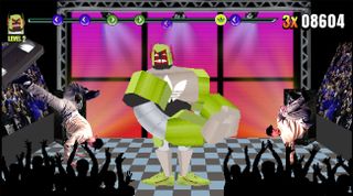
Other cool stuff includes Yung Rappa, an actual game you can play in your web browser – it's a Dance Dance Revolution-style rhythm action game set to some banging hip-hop – as well as some splendidly glitchy video and a variety of tasteful desktop wallpaper that you can download in all the sizes, from a sensible '90s 640x480 to an unthinkable 1920x1080. How big a monitor would you need for that?

Perhaps the best thing about it from a web design perspective, though, is that despite its over-excited use of literally all the visual tropes from the dark days of the early web, it's actually an incredibly slick responsive site that delivers all its crimes against design in a bang up-to-date style. It might look like it's made of GIFs, tables and RealVideo, but if you take a closer look you'll discover that it's made with JavaScript, using loads of clever SVG and CSS animation tricks as well as Flexbox, Canvas and WebGL, to do its thing.
Don't take our word for it though; head straight to the Adidas Yung Series site to experience this ludicrous web nostalgia fest for yourself.
Related articles:
Get the Creative Bloq Newsletter
Daily design news, reviews, how-tos and more, as picked by the editors.

Thank you for reading 5 articles this month* Join now for unlimited access
Enjoy your first month for just £1 / $1 / €1
*Read 5 free articles per month without a subscription

Join now for unlimited access
Try first month for just £1 / $1 / €1
Jim McCauley is a writer, performer and cat-wrangler who started writing professionally way back in 1995 on PC Format magazine, and has been covering technology-related subjects ever since, whether it's hardware, software or videogames. A chance call in 2005 led to Jim taking charge of Computer Arts' website and developing an interest in the world of graphic design, and eventually led to a move over to the freshly-launched Creative Bloq in 2012. Jim now works as a freelance writer for sites including Creative Bloq, T3 and PetsRadar, specialising in design, technology, wellness and cats, while doing the occasional pantomime and street performance in Bath and designing posters for a local drama group on the side.
