Graphic design gets a sense of humour in new Netflix campaign
Mother Design’s Netflix Is a Joke Fest ads are a whole lot of fun.

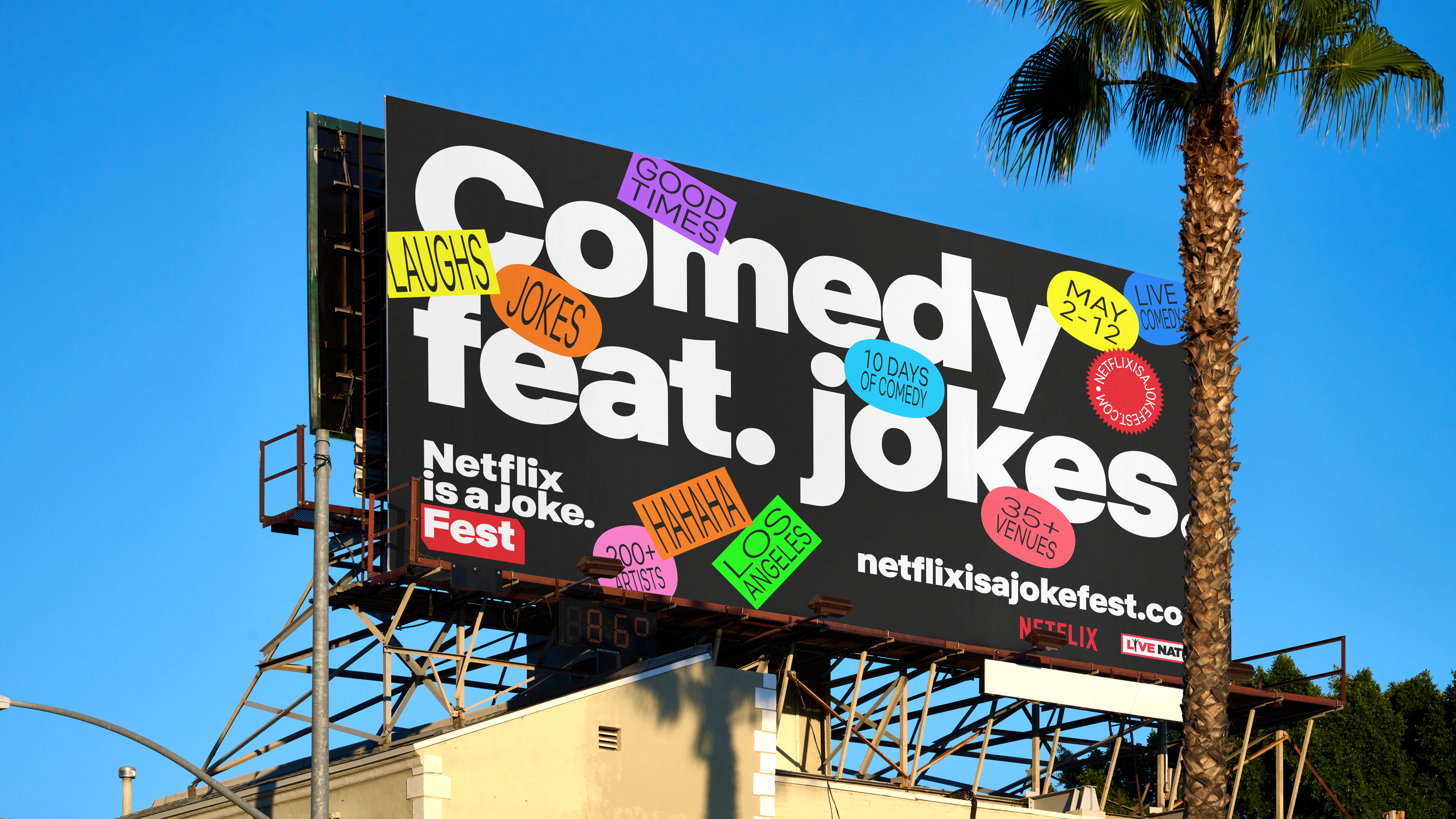
Netflix returned to LA for its annual Netflix is a Joke festival this month, with the event accompanied by a brand new visual system created by Mother Design. Entitled Slap, Stick, the campaign centres around the question the team had never been asked before: is graphic design funny?
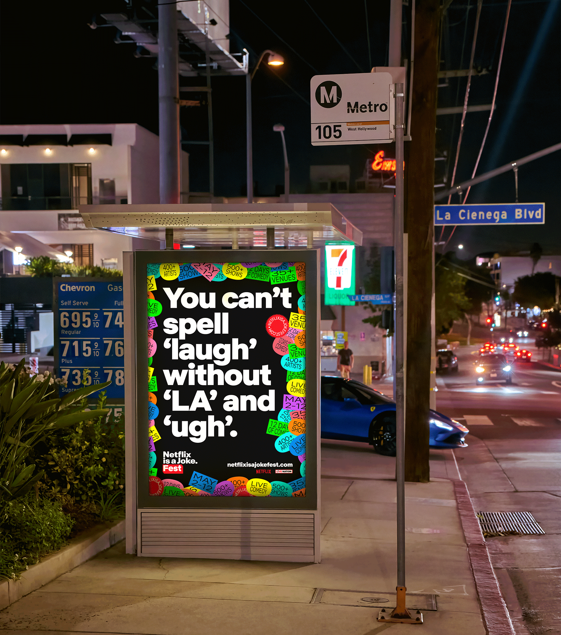
The campaign features an "obnoxious-but-friendly, self-vandalistic" style, with monochrome images punctuated by bright and colourful 'stickers'. It's a simple campaign, but remarkably fun for a global streaming platform. (Inspired to create a fun poster of your own? Take a look at our guide on how to download Photoshop.)

“The answer to most questions about design is obvious. Is it transformative? Is it collaborative? Does it solve problems? Yes, yes, yes," says Elliot Vredenburg, Associate Creative Director of Mother Design. "But Netflix posed a question we hadn’t been asked before: Is graphic design funny? The answer: no. But it doesn’t have to take itself seriously, nor do we. By attacking Swiss modernism with a pricing gun, we made the system deadpan, dead simple, and dead easy to use."
The studio found the stickering system to be the perfect tool for situational humor, allowing the work to be placed anywhere—from garbage trucks, facades, and billboards, to the performers themselves. "The visual identity worked perfectly for a Festival that embraces a dry, self-aware, self-deprecating sense of humour," Vredenburg added.
And then there's the tongue-in-cheek tagline: “You can’t spell ‘laugh’ without ‘LA’ and ‘ugh’”. It was important for the team to embrace the brand’s dry, self-aware humour without sounding pandering or fraudulent to LA natives. "The writing, therefore, forgoes location-based “inside jokes” in favor of resonating tonally with locals, comedy enthusiasts, and generally conscious people anywhere."
From AI movie posters to botched straight lines, we've seen a few creative missteps from Netflix in recent months, but this delightfully playful campaign is a winner in our book. To find out more about the studio behind the work, take a look at a day in the life of the partners at Mother Design.
Get the Creative Bloq Newsletter
Daily design news, reviews, how-tos and more, as picked by the editors.

Thank you for reading 5 articles this month* Join now for unlimited access
Enjoy your first month for just £1 / $1 / €1
*Read 5 free articles per month without a subscription

Join now for unlimited access
Try first month for just £1 / $1 / €1

Daniel John is Design Editor at Creative Bloq. He reports on the worlds of design, branding and lifestyle tech, and has covered several industry events including Milan Design Week, OFFF Barcelona and Adobe Max in Los Angeles.
