NatWest reveals new logo
The bank's original logo gets updated as part of a new, optimistic brand identity.
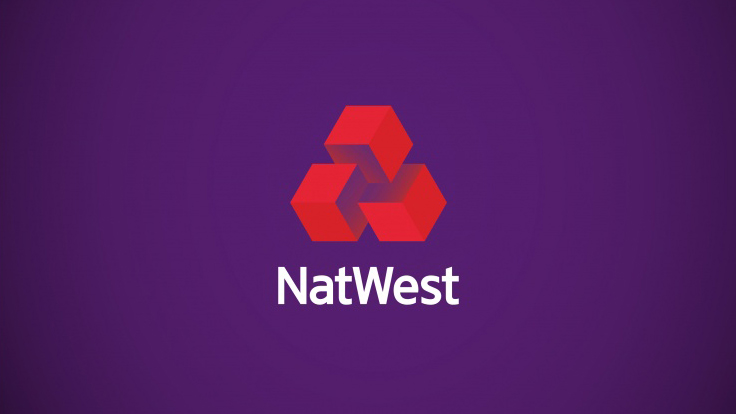
A 3D cube logo design is at the heart of NatWest's new identity, which sees the bank return to its original brand guidelines. Designed by Futurebrand, this new identity follows a similar route as the recent Co Op redesign, which featured a revived and polished version of its iconic four leaf clover logo.
Made up of three interlocking cubes, the NatWest logo represents the coming together of the National Provincial Bank, Westminster Bank and District Bank. The cubes originally appeared in the company's 1968 brand guideline manual, and have formed the basis of the new graphic system.
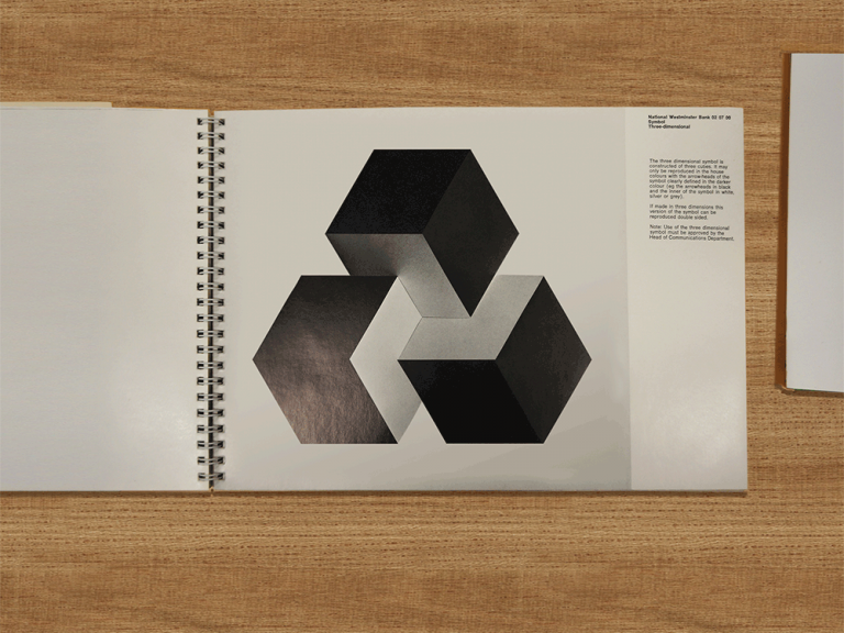
Creating an approachable and lively identity is no easy feat, especially when it comes to banking. However the team at Futurebrand are confident that the logo, along with vibrant illustrations and a unique 3D typeface, will create an engaging identity that will stand out both on the high street and online.
“The cube has always been an intrinsic part of their identity," explains Futurebrand executive creative director Dan Witchell. "We wanted to build on something that was always there rather than create something new.”
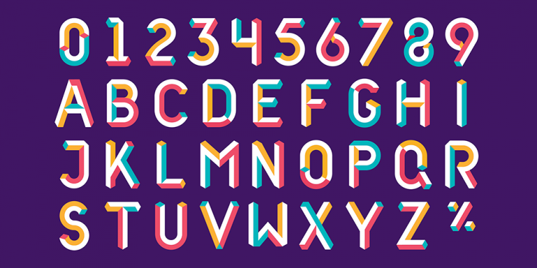
Thanks to the rebrand's bright visual elements and colourful typography, the designers also hope to attract a younger audience to NatWest. At the same time, the "vibrant and optimistic" palette had to come across as trustworthy and reliable.
“Banking has been through a tough time in recent years," says Witchell. "I suppose we wanted to try and draw a line under that and look to a more positive future in a way.”

As well as updating NatWest's identity, FutureBrand were also tasked with creating a redesign for the RBS Group. This took the form of colourful posters and promotional material that moved away from cliché tartan, choosing instead to use twill-inspired patterns.
Get the Creative Bloq Newsletter
Daily design news, reviews, how-tos and more, as picked by the editors.
In both cases, the branding aims to reassure customers by returning to faithful designs, while at the same time giving them a thoughtful modern spin that fits into a contemporary design landscape.
“Going back and modernising an existing mark makes perfect sense if it’s been well designed in the first place,” Witchell adds. “Certainly with a lot of the 1960's logos, because the aesthetic at the time was to create something strong and simple, a lot of those still have value today.”
[Via design week and Creative Review]

Thank you for reading 5 articles this month* Join now for unlimited access
Enjoy your first month for just £1 / $1 / €1
*Read 5 free articles per month without a subscription

Join now for unlimited access
Try first month for just £1 / $1 / €1

Dom Carter is a freelance writer who specialises in art and design. Formerly a staff writer for Creative Bloq, his work has also appeared on Creative Boom and in the pages of ImagineFX, Computer Arts, 3D World, and .net. He has been a D&AD New Blood judge, and has a particular interest in picture books.
