Nationwide rebrands for the first time in 36 years
(But some think the new logo looks familiar.)

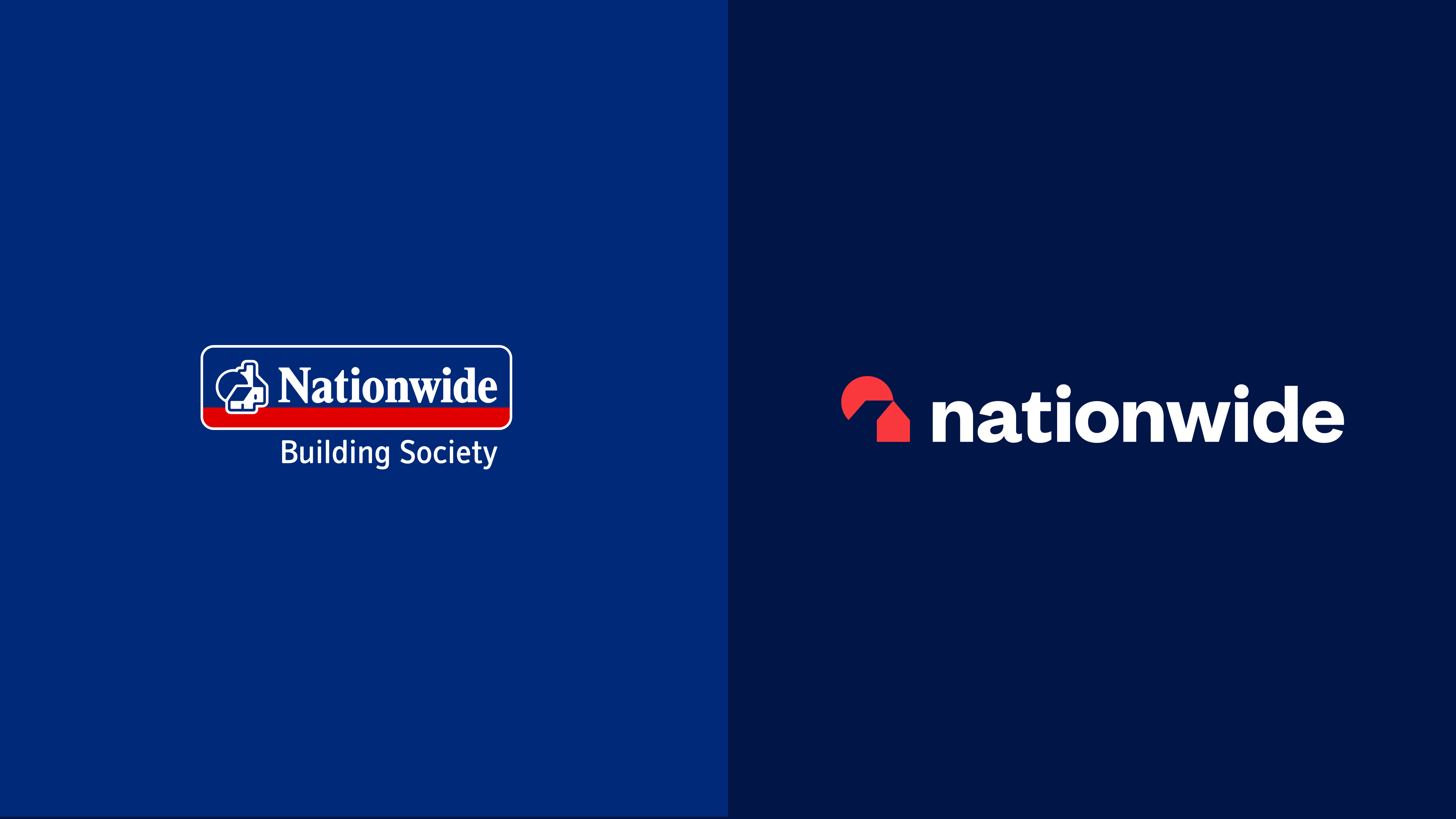
Nationwide, the world's largest building society, has unveiled its first major rebrand in over 35 years, featuring a new logo, wordmark and visual identity. Designed to communicate the (somewhat oxymoronic) idea of the brand as a "dependable disrupter", the new look is set to help Nationwide take on both traditional banks, and newer fintech offerings such as Monzo.
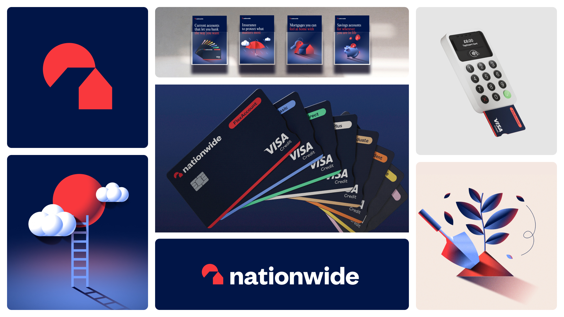
Designed by New Commercial Arts (NCA), the new identity is a complete visual overhaul, with a much simpler and more abstract logo, and a smoother, now all-lowercase wordmark. It's a boldly contemporary look for Nationwide. But as several users have pointed out, it does somewhat resemble the identity of another bank. (Looking for design inspiration? Check out the best logos of all time.)

The simplified logo does away with the fussiness of the previous 'house' design, reducing it to a pair of geometric shapes, in a new, darker red-and-blue colour palette. NCA has also adjusted the wordmark to feature a lower-case 'n'.
Along with the new identity, Nationwide has also dropped a brilliant new ad (below) featuring Dominic West as an obnoxious smoothie-swigging banker, closing down branches whilst insisting on keeping his own top-floor office. The campaign is designed to emphasise Nationwide's commitment to keeping branches open, while debuting the new slogan, "A good way to bank".
It's certainly a sleek new look for Nationwide, with the simple, flat design placing it more comfortably next to the likes of Monzo and Revolut. But the brand is keen to position itself between the newcomers and the more traditional banks. The brand “doesn’t do banking in the way that traditional banks do,” claims brand and engagement officer Catherine Kehoe, and yet it has, “more trust and experience” than new banks or fin-techs," hence the "dependable disrupter" moniker.

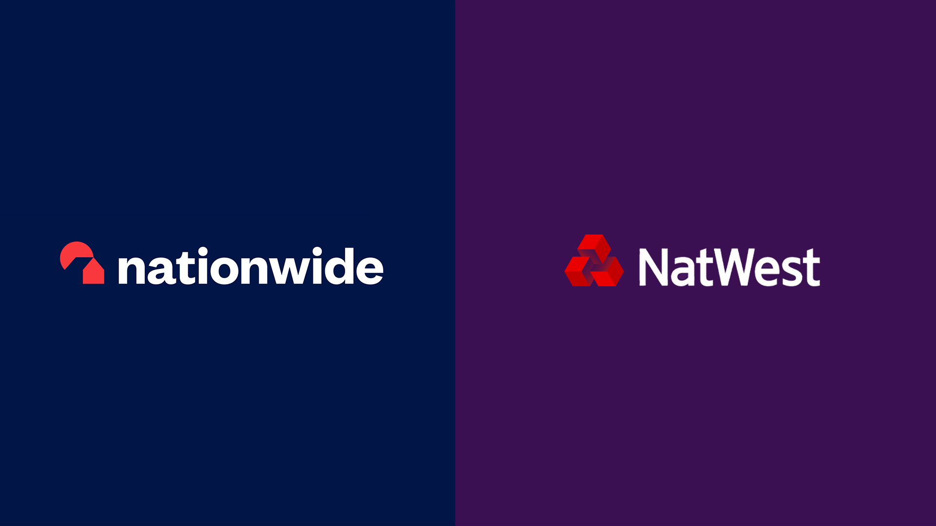
But as is always the case with high profile rebrands, the new look is drawing some heat on Twitter. Several users have spotted that with the darker colours and new, geometric logo, the branding looks rather a lot like rival bank NatWest's:
Did nobody from Nationwide consider putting their new logo side by side with NatWest's? pic.twitter.com/zm2YXu3vvQOctober 7, 2023
How much did Nationwide spend to rebrand themselves as Natwest? pic.twitter.com/jyaDBllhTZOctober 7, 2023
Sometimes rebrands don't make a company stand out the way they'd hoped. Meet Nationwide's new logo... @AskNationwide @NatWest_Help pic.twitter.com/WIQTJOqyitOctober 8, 2023
I know you can identify how you like these days but I can't help wondering why Nationwide wants to identify as NatWest pic.twitter.com/FsiPOHDKSxOctober 7, 2023
Of course, a few subtle colour tweaks would probably fix the issue, but it's somewhat surprising that the brand has chosen a new look that's so similar to a rival – especially one whose name starts with the same letter. Still, there are worse things for an app icon to resemble – just ask Amazon.
Get the Creative Bloq Newsletter
Daily design news, reviews, how-tos and more, as picked by the editors.

Thank you for reading 5 articles this month* Join now for unlimited access
Enjoy your first month for just £1 / $1 / €1
*Read 5 free articles per month without a subscription

Join now for unlimited access
Try first month for just £1 / $1 / €1

Daniel John is Design Editor at Creative Bloq. He reports on the worlds of design, branding and lifestyle tech, and has covered several industry events including Milan Design Week, OFFF Barcelona and Adobe Max in Los Angeles.
