(Image credit: Glacier Range Riders/National Park Service)
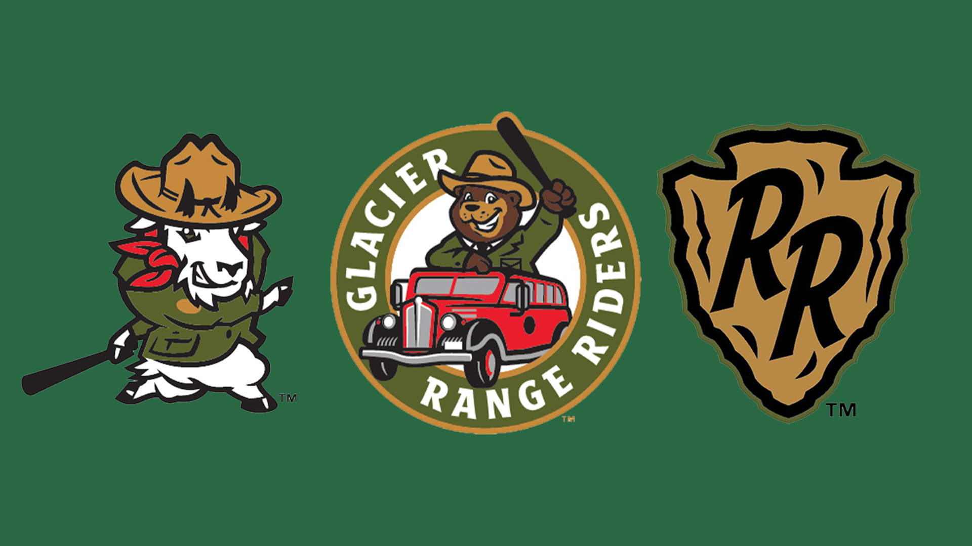
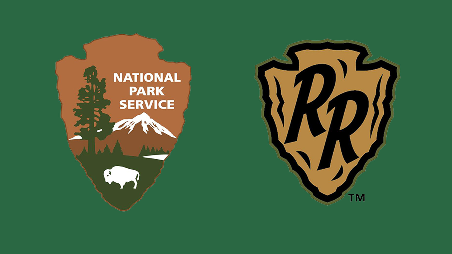
A Montana-based minor league baseball team is the subject of a "relentless" legal battle with the US Interior Department over alleged similarities in logo design. Both the National Park Service (NPS) and the Glacier Range Riders logo feature a distinctive arrowhead frame, which could supposedly cause continuity confusion between the brands.
There are no strict guidelines on how to design a logo, but creating a design that embodies your brand is essential to forming a memorable identity. While the silhouettes of the conflicting designs certainly share similarities, there's little else to connect the two, making the legal conflict a puzzling debate.
The contentious logo in question has some distinct differences from the NPS design, namely its more minimalist look. While the arrowhead silhouette is the source of the dispute, the logo itself is understated, featuring a simple "RR" in the centre of the emblem. In comparison, the NPS logo features a more graphic look, with a mountain and a grazing buffalo pictured alongside the NPS wordmark.
Latest Videos From Creative Bloq
In a press release, Glacier Range Riders criticised the "unwarranted and relentless trademark claims", stating that the legal pressure had caused a "significant financial and administrative burden" on the team. “The arrowhead represents the strength and resilience of this land." says Chris Kelly, President of the Glacier Range Riders. "We will fight for our ability to use it in our branding to bring together our communities, as well as the ability for it to be freely accessible to other organizations,” he adds.
For more design disputes, check out the Rockstar Games logo controversy that bemused gaming fans. If you're up for a challenge, take a look at the tricky logo quiz that stumped even the biggest logo design nerds.
Get the Creative Bloq Newsletter
Daily design news, reviews, how-tos and more, as picked by the editors.
Thank you for reading 5 articles this month* Join now for unlimited access
Natalie Fear is Creative Bloq's staff writer. With an eye for trending topics and a passion for internet culture, she brings you the latest in art and design news. Natalie also runs Creative Bloq’s Day in the Life series, spotlighting diverse talent across the creative industries. Outside of work, she loves all things literature and music (although she’s partial to a spot of TikTok brain rot).